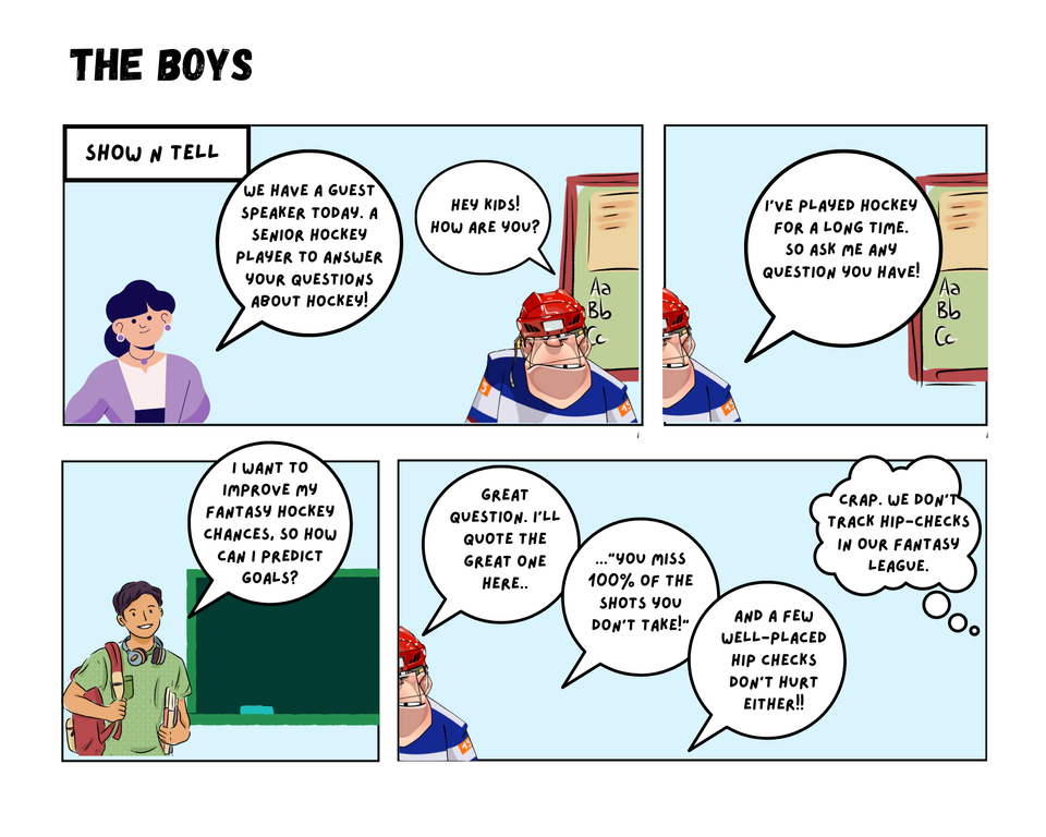
What is a good predictor for goals?
In this Edition
- Breaking Down the Question
- Why are Goals Important?
- Considerations for Predictive Models
- Modeling Goals Prediction Walkthrough
Breaking Down the Question
The question in this edition seems fairly straightforward:
- What is a good predictor refers to one or more events that have the potential to predict goals
- for goals is what we are trying to predict
We say "seems" because a goal is a measurable outcome of a team working together offensively to score on their opponent. For example, goals can result from line combinations playing well, defensive breakdowns, shots, the position of the shots, and so on. In short, there's a lot happening before the red light goes off!
Why are Goals Important
Goals are the ultimate determinants of victory and defeat. Each goal signifies not just a point on the scoreboard but a psychological boost for the scoring team and a blow to the opposition. It also represents the culmination of a set of smaller events, such as a shift beginning and line taking the ice, teammates passing and executing plays, shot attempts, and so on. Thus, while goals are a raw hockey statistic, they are the aggregation of highly dynamic and strategic on-ice play. In short, each goal is a testament to a team's skill, strategy, and determination.
Because momentum shifts so quickly in hockey, psychology plays an important role when it comes to goals. A single goal can shift the momentum, energize a team, and demoralize opponents. Other factors such as home-crowd advantage can also impact this psychological advantage. And when it happens, you can see it. The team with the psychological advantage "has the jump" – their passes connect, the players are in the right spot, they are skating one step ahead of their opponents, and their attempts to score increase more aggressively. The excitement generated by a goal and this momentum shift is palpable, igniting the fervor of fans and motivating players to push harder. Momentum swings triggered by goals are often game-changers.
However, hockey statistics (at least in a broad sense) do not collect psychological markers that can be analyzed by the armchair analyst. Raw and calculated hockey statistics are often what's available for the data analyst/data scientist to use when modeling a player or team's performance. This is what we'll focus on here: a sample of raw and calculated hockey statistics that might be used to predict goals.
Considerations for Predictive Models
Building predictive models must in some way take the real world into account. And typically, the real world involves thousands if not millions of micro-events happening simultaneously. This is especially the case in hockey. There are many unseen variables happening during a game that from a data perspective go uncollected. As we’ve just discussed, the psychological aspect is a major one.
So, when building a model what should you take into consideration? If you know you can't build the perfect model that is modeled off all factors, what do you use? Below are four examples of what you could look at when thinking about your predictive models.
- Player Skill and Position: Player skill and position are fundamental predictors of goal-scoring. Forwards, who typically have superior offensive skills, are more likely to score than defensemen. The ability to shoot accurately, handle the puck, and read the game are crucial for goal-scoring success. To create this type of predictive model, you could create a composite skill metric (e.g., goals, assists, shots, puck possession, passing, etc.) for the players on a team and then give the team an average score.
- Shot Type and Location: The type and location of shots are significant factors. A well-placed wrist shot or a precise one-timer has a higher probability of finding the net than a desperate slapshot from the blue line. Shots taken from high-scoring areas, such as the slot or high slot, in hockey analytics, are more likely to result in goals. To create this, you could use a shot metric (raw or calculated). To get better results, you could also factor in the location of the shot – shots within 15 feet of the net have a higher probability of going in.
- Power Play and Special Teams: Power plays and special teams play a pivotal role in goal-scoring. Teams with effective power plays can capitalize on the opponent's penalties, creating goal-scoring opportunities. Special team strategies, including penalty kills and power-play setups, greatly influence goal outcomes. Here you could look at line combinations on the power play and power play percentage of the overall team. Keep in mind, though, that power plays comprise approximately 10% of a team's overall playing time. So, you'd need to factor this into your overall model.
- Goaltender Performance: Goaltenders are the ultimate barriers to goals, and their performance is a significant predictor. A hot goaltender can single-handedly thwart an opponent's scoring attempts, while a struggling one may yield more goals. Factors like save percentage and goals-against average are indicative of a goaltender's effectiveness.
The above are just some examples. In your own sports organization, you'll likely have both the normal raw and calculated statistics and custom statistics you've created. The goal for you should be to experiment as much as you can to find the most interesting and compelling variable(s) for the use case at hand. Further, scope the use case such that you can increase the likelihood that your model doesn't over- or under-fit.
How can you model out predictors of goals?
After you collect the data, there are several ways to build a predictive model for goals. To follow are three examples.
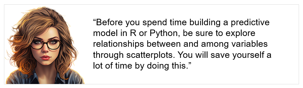
- Exploratory Data Analysis: When exploring the relationship between variables, an easy way to determine if there's a positive, negative, or neutral relationship across them is to use line charts, scatter plots, and simple regressions. These are widely available in many software programs, such as Microsoft Excel and Power BI.
- Regression Analysis: Regression analysis is a common statistical technique used to model goal predictors. Multiple linear regression, for example, allows analysts to assess the relationship between multiple predictors (e.g., player skill, shot location, power-play effectiveness) and the dependent variable (goals scored). It helps quantify the impact of each predictor.
- Machine Learning: Machine learning algorithms, such as decision trees, random forests, and neural networks, have gained traction in hockey analytics. These models can handle complex interactions among predictors and offer predictive accuracy. Machine learning algorithms can predict goal-scoring probabilities for specific scenarios.
Modeling Goals Prediction Walkthrough
This walkthrough comprises three steps:
- Creating a scatter plot to explore the relationship between specific hockey statistics and goals.
- Conducting a correlation analysis to further explore the relationship between and among the hockey statistics.
- Testing the strength of predictors using a random forest algorithm.
For all of the above steps, we used RStudio.
Scatter Plot Analysis
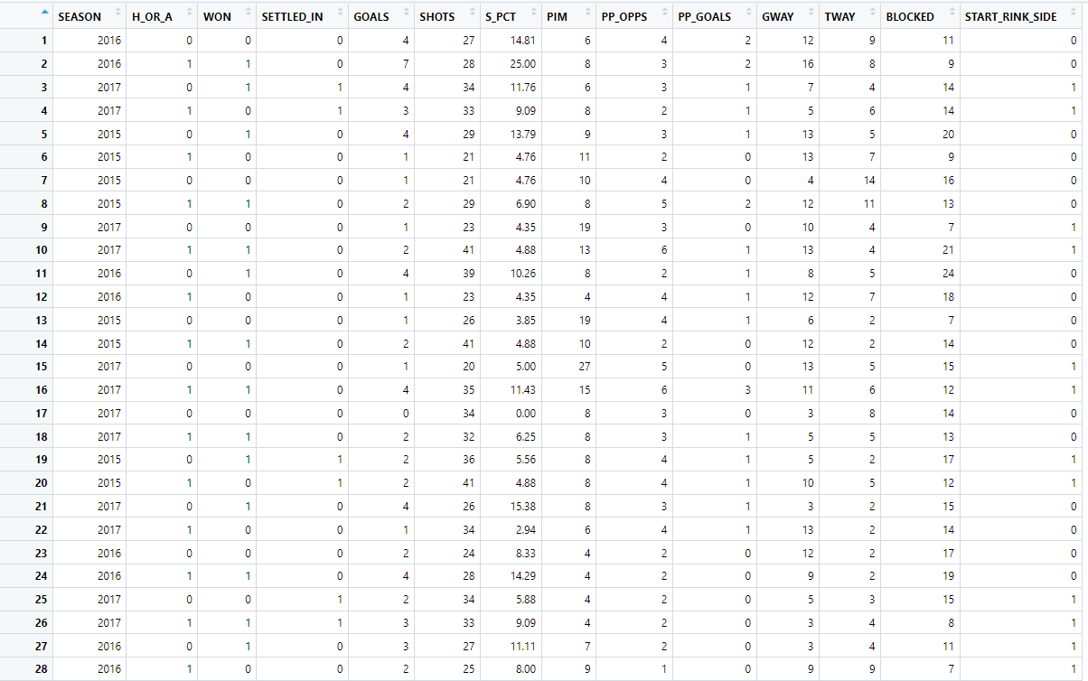
The first step for the scatter plot analysis was to load the game data into a data frame. In R, the read.csv() function loads the data into RStudio.
scatter_df <- read.csv("Multiseason_Game_Statistics.csv")
After you load the data, you can view the data frame by clicking in the Environment tab. You should see something like the one below.
We then transformed the data using the gather() function, which transforms the data from a wide format to a long format. In a wide format, each variable has its own column, whereas, in a long format, all variable names and their values are in two columns: one for variable names and one for values.
The mutate() function adds new variables or modifies existing ones. In the following code snippet, the mutate() function converts the "variable" column to a factor and specifies the order of the levels. This is important for controlling the order of the panels when you create the scatterplots with facet_wrap.
After this step, the "variable" column in your data frame is a factor with a specific order, and you're ready to create the scatterplots using facet_wrap.
This code prepares the data for creating a series of scatterplots, where each plot shows the relationship between GOALS and one of the other variables, with each variable having its own panel in the final plot.
…
data_long <- scatter_df %>%
  gather(key = "variable", value = "value",
   c(H_OR_A, SHOTS, S_PCT, PP_OPPS, PP_GOALS, GWAY, TWAY, START_RINK_SIDE)) %>%
  mutate(variable = factor(variable, levels = c('H_OR_A', 'SHOTS', 'S_PCT', 'PP_OPPS', 'PP_GOALS', 'GWAY', 'TWAY', 'START_RINK_SIDE')))

ggplot(data_long, aes(x = value, y = GOALS)) +
  geom_point(alpha = 0.6) +
  geom_smooth() +
  facet_wrap(~ variable, scales = "free_x") +
  theme_bw() +
  theme(strip.text = element_text(hjust = 0.5))
…
The result of the above code are the following plots.
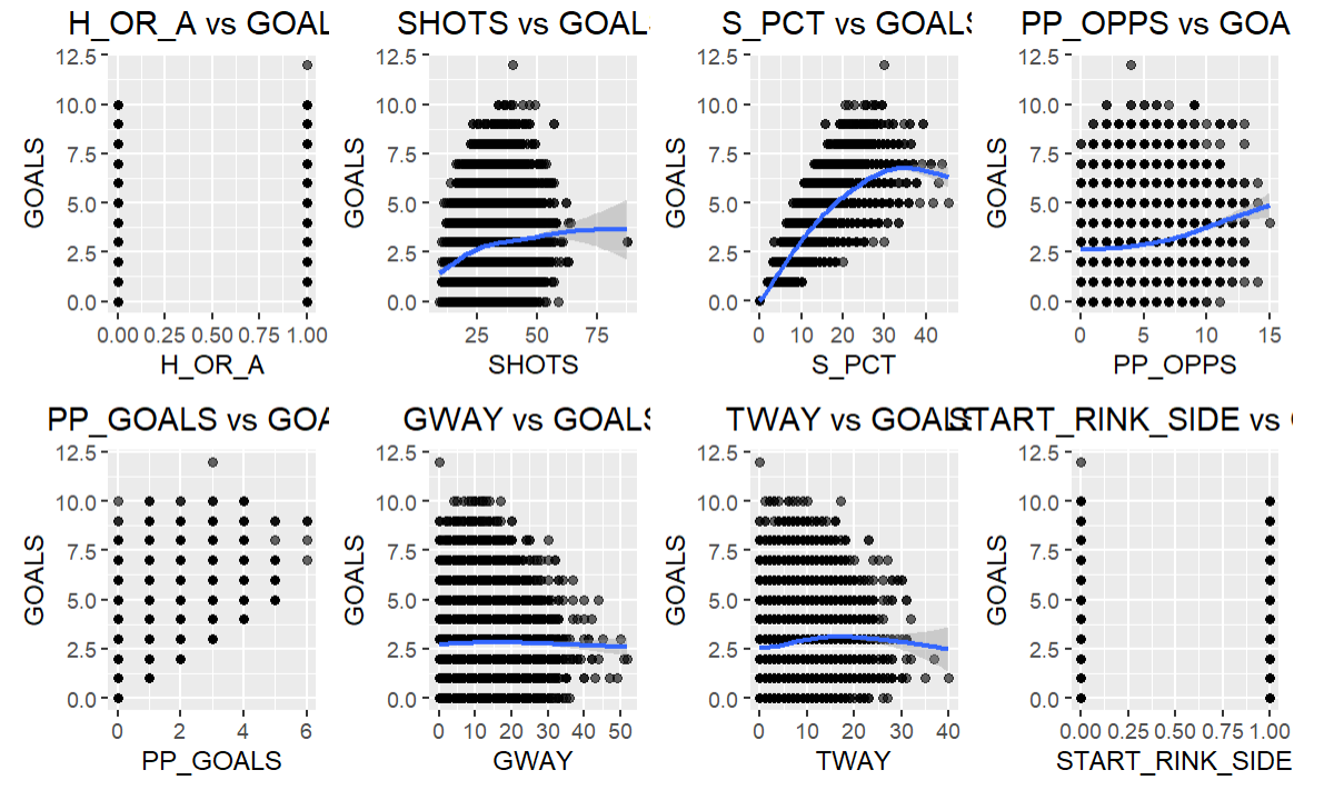
The key takeaways from the above are as follows:
- H_OR_A vs GOALS: This plot shows the relationship between home/away status (H_OR_A) and goals. The values in H_OR_A are categorical (0 for away, 1 for home), so we can see two distinct vertical lines of points. It seems like there is no clear trend indicating that playing at home or away has a consistent impact on the number of goals scored.
- SHOTS vs GOALS: There seems to be a positive correlation between the number of shots and goals, which is expected as more shots on goal increases the chances of scoring.
- S_PCT vs GOALS: The shooting percentage (S_PCT) shows a somewhat positive relationship with goals. Compared to the other variables, it arguably has the highest positive correlation to goals.
- PP_OPPS vs GOALS: There seems to be a positive correlation between power play opportunities (PP_OPPS) and goals, indicating that more power play opportunities can lead to more goals.
- PP_GOALS vs GOALS: As expected, there is a strong positive correlation between power play goals (PP_GOALS) and total goals, indicating that power play goals contribute significantly to the total goals scored.
- GWAY vs GOALS: There is no clear trend between giveaways (GWAY) and goals.
- TWAY vs GOALS: Similarly, there is no clear trend between takeaways (TWAY) and goals.
- START_RINK_SIDE vs GOALS: The side of the rink where the game started (START_RINK_SIDE) does not show any clear relationship with the number of goals scored.
As you can see the scatter plot analysis is quick to produce, assuming your data is in good shape. But it's good practice to try different methods to test the relationship between and among variables. So, let's move to the correlation analysis.
Correlation Analysis
Using a correlation analysis, you can create one visualization that shows how positively or negatively correlated variables are within a dataset. The following code snippet creates a new data frame called num_df by selecting the numeric data types in the original scatter_df data frame. It then uses the corrplot() function to plot the variables.
...
{r, fig.width=8, fig.height=6}

num_df <- scatter_df %>%
  select_if(is.numeric)

corrplot(cor(num_df),
         method = "color",
         addCoef.col="black",
         order = "FPC",
         number.cex=0.80,addgrid.col = 'black',
         col=colorRampPalette(c("red","white","lightblue"))(50))
...
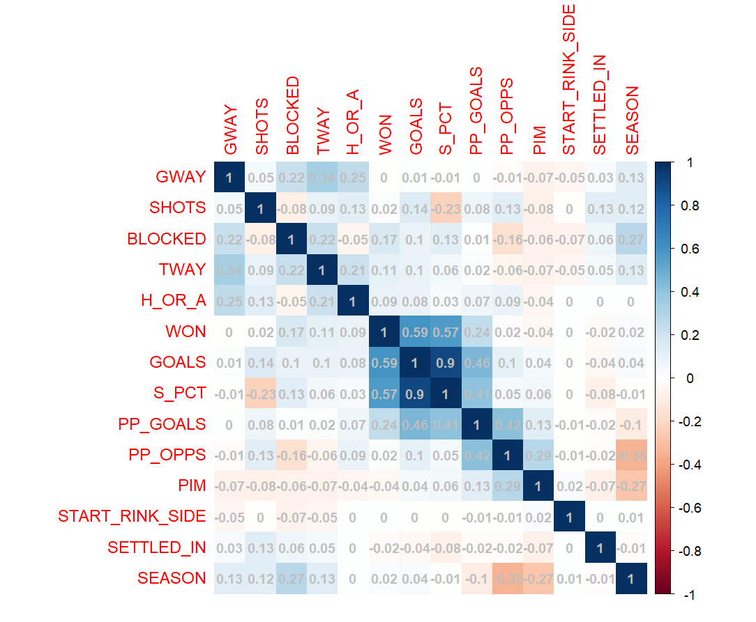
Below are the results of the correlation analysis. It follows the scatter plot analysis relatively closely; however, the correlation coefficient S_PCT is 0.9 – a very strong positive correlation.
Random Forest Algorithm
A random forest is a versatile machine learning algorithm capable of performing both regression and classification tasks. It's a type of ensemble learning method, where the prediction is made based on the consensus of multiple decision tree models.
Here's a high-level overview of how a random forest algorithm works:
- Bootstrap Aggregating (Bagging): The random forest algorithm begins by creating a "forest" of decision trees using a technique known as bootstrap aggregating or bagging. This involves creating multiple subsets of the original dataset with replacement (meaning the same data point can appear in a subset more than once), and each subset is used to train a separate decision tree.
- Feature Randomness: When splitting a node during the construction of the tree, the best split is chosen from a random subset of features. This adds diversity to the model and is one reason a random forest is more robust than an individual decision tree.
- Prediction: For a classification task, each tree in the forest votes, and the most popular class is chosen as the final prediction. For regression tasks, the average prediction from all trees is used.
- Reduction of Overfitting: Since each tree in the random forest is trained on a different subset of the data and a different subset of features, the algorithm is less likely to overfit the training data compared to a single decision tree.
Random forests are useful for exploratory analyses because they provide insights into the relative importance of different predictors, even when there are complex non-linear relationships and interactions between them.
Below is a snippet of R code that uses the scatter_df data frame to create a variable importance plot using the varImPlot() function. It helps to visualize which variables have the most significant impact on the prediction of goals.
...
library(randomForest)

random_forest<-randomForest(as.factor(GOALS)~., data=scatter_df)
random_forest$importance

varImpPlot(random_forest)
...
As you can see below, the plot typically displays each variable along the y-axis and their importance scores along the x-axis, allowing you to see which features are most important in the Random Forest model.
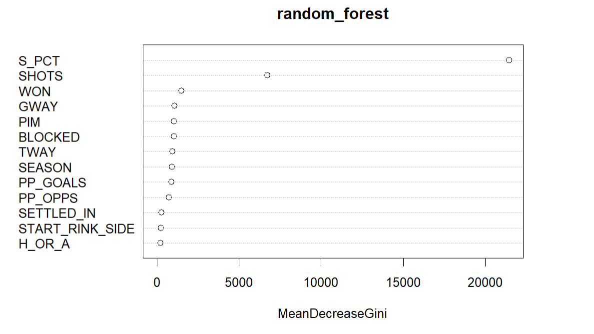
The above plot is the default view in R and while it shows SHOTS and S_PCT as higher predictors of goals, the aesthetics inspire little more than a nap. Fortunately, you can refactor the plot to be more aesthetic so you can improve it in your stakeholder presentations.
...
rf = random_forest$importance
rd_df <- as.data.frame(rf)
df <- cbind(newColName = rownames(rd_df), rd_df)
rownames(df) <- 1:nrow(rd_df)
colnames(df) <- c("STATISTIC", "MEAN_DECREASE_GINI")
df
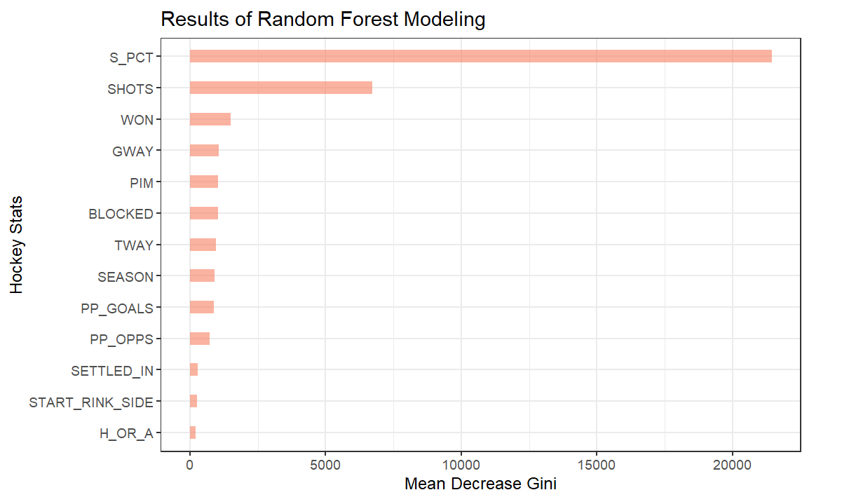
df_3 <- df %>%
mutate(HOCKEY_STAT = fct_reorder(STATISTIC, MEAN_DECREASE_GINI))
ggplot(df_3, aes(y=HOCKEY_STAT, x=MEAN_DECREASE_GINI)) +
geom_bar(stat = "identity", fill="#f68060", alpha = .6, width = .4) +
theme_bw() +
ggtitle("Results of Random Forest Modeling") +
xlab("Mean Decrease Gini") +
ylab("Hockey Stats")
...
The below is a better, more visual representation of the variable importance plot from the random forest model.
To watch a quick-hit video tutorial, check out the YouTube video below.
Summary
In this edition, you learned about correlation analysis (which can be used to explore the relationships between data points) and random forest trees (which are versatile machine learning techniques to implement classification and regression tasks).
From the correlation analysis, S_PCT scored .9 in terms of the relationship with goals. This makes logical sense given you need shots to score goals and shot percentage is a representational measurement of shots to goals. The random forest model also resulted in S_PCT being a strong predictor for goals, more so than any of the other variables.
An exercise for your own scenario or use case would be to take a broader range of single variables or multi-variate analyses and try out which variable(s) are the best predictors for your data point of choice.
Subscribe to our newsletter to get the latest and greatest content on all things hockey analytics!
Member discussion