Using Linear Regression to Predict Goals

In this Edition
- What is Linear Regression?
- What are the Different Types of Linear Regression Models?
- Which Models are Most Popular?
- Walkthrough: Using Shot Statistics to Predict Goals
What is Linear Regression?
Linear regression is a statistical method used to understand and model the relationship between two or more variables. Think of it as finding the best straight line that goes through a set of points on a graph. This line helps us predict the value of one variable based on the value of another. The line of regression indicates the strength and direction of the relationship between the dependent and independent variables.
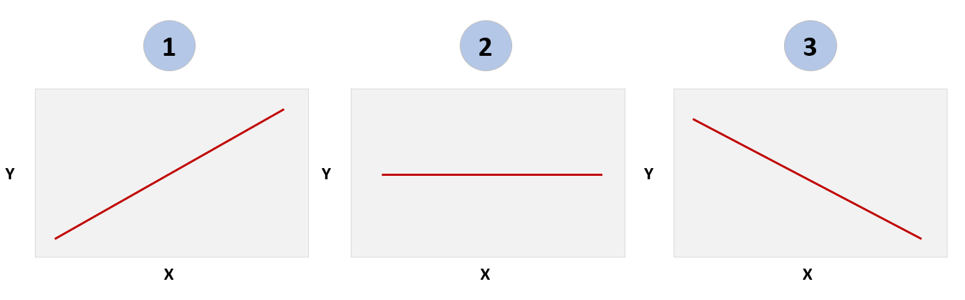
The slope of the linear regression line manifests in three directions: 1) positive, 2) neutral or 3) negative (see the diagram below). For example, if you want to test the hypothesis that rain (independent variable) results in umbrella usage (dependent variable) in Seattle between the months of October and April. You collect the data, build a linear regression model, plot the results and you'll likely find a linear regression similar to #1 below. That is, as rainfall increases, so does the likelihood that people will use umbrellas.
When discussing linear regression, it's often the correlation coefficient (r) or the coefficient of determination (R²) that is referred to when mentioning numbers like 0, close to 1, or close to -1. Let's clarify what these values indicate:
The correlation coefficient (r) measures the strength and direction of a linear relationship between two variables.
- r = 0: This implies no linear correlation between the variables. In other words, knowing the value of one variable gives you no information about the value of the other (a straight line, similar to #2 above).
- r = 1: This suggests a strong positive linear correlation. As one variable increases, the other variable also increases in a nearly proportional manner (a line moving up and to the right, similar to #1 above).
- r = -1: This indicates a strong negative linear correlation. As one variable increases, the other variable decreases in a nearly proportional manner (a line moving down and to the right, similar to #3 above).
The coefficient of determination (R²) is the square of the correlation coefficient and indicates how well the regression predictions approximate the real data points.
- R² = 0: This means that the linear model explains none of the variability of the response data around its mean. The model does not improve prediction over simply using the mean of the dependent variable.
- R² = 1: This suggests that the model explains nearly all the variability of the response data around its mean. The model provides a very close fit to the data.
Let's take a hockey example: exploring the relationship between puck possession and goals scored.
- An r value close to 0 between puck possession and goals scored would mean there's no linear relationship between these variables.
- An r value close to 1 between puck possession and goals suggests that higher puck possession results in more goals.
- An r value close to -1 between puck possession and goals would mean an increase in one variable is associated with a decrease in another.
Using five seasons worth of data, below is a representation of the linear model between puck possession (represented through Corsi) and goals.
Note that a scatter chart (or scatter plot) is a quick way to explore the relationship between two variables and is useful in the exploratory data analysis phase of your projects.
Linear Regression Formula
The most basic formula for simple linear regression is Y = mX + b, where Y is the response (dependent) variable, X is the predictor (independent) variable, m is the estimated slope, and b is the estimated intercept. The puck possession and goals example above can be explained through the linear regression formula as follows:
- Y represents the dependent variable, which in this case would be the number of goals scored by a player or a team.
- X is the independent variable, representing the measurement of possession (Corsi Percent).
- m is the slope of the regression line, which indicates the average increase in goals scored for the increase in Corsi Perent. If m is positive, it implies that higher puck possession is generally associated with more goals. The magnitude of m tells you how strong this relationship is – a larger m means a stronger relationship between puck possession and goals.
- b is the y-intercept of the regression line, representing the expected number of goals when puck possession is zero.
Let's look at other types of linear regression models.
What are Different Types of Linear Regression Models?
Linear regression models are categorized based on the number of predictor variables they use and the type of relationship they model. Here are the main types:
- Simple Linear Regression (Univariate): This involves one independent variable (predictor) and one dependent variable (outcome). It's used when you want to understand or predict the relationship between two variables. For instance, in hockey, you might use simple linear regression to understand the relationship between the number of shots a player takes and the number of goals they score.
- Multiple Linear Regression (Multivariate): This involves multiple independent variables influencing one dependent variable. It's useful for more complex scenarios where several factors influence the outcome. In hockey, you could use multiple linear regression to predict a player's scoring rate based on various factors like ice time, shot percentage, and assists.
- Polynomial Regression: A form of regression that models a non-linear relationship between the independent and dependent variables. It's still considered a form of linear regression because it models the relationship linearly in the coefficients. In hockey, polynomial regression could be used for cases where the relationship is not straightforward, like predicting a team's performance across a season where performance might fluctuate in non-linear ways.
- Ridge Regression (L2 Regularization) and Lasso Regression (L1 Regularization): These are variations of multiple linear regression that include a penalty term to regularize the coefficients. This is particularly useful to prevent overfitting when dealing with large datasets. For example, when analyzing player performance metrics across many seasons, these methods could help create more generalizable models.
- Elastic Net Regression: A combination of Ridge and Lasso Regression. It's used when there are multiple correlated variables, and you want to maintain the model's complexity while preventing overfitting. In hockey, this might be applied in sophisticated models attempting to predict player success based on a wide range of correlated statistics, like shooting percentage, assists, penalties, etc.
Each of these models is applied based on the specific research question and the nature of the data available. In hockey analytics, the choice of model would depend on factors like the number of variables being considered, the relationship between these variables (linear or non-linear), and the complexity of the dataset.
Which Models are Most Popular?
Choosing what linear regression model to use depends on the use case and the nature of the data.
- Multiple Linear Regression: This is the most popular due to its ability to handle multiple predictors. It's widely used in hockey analytics to understand how multiple factors (like time on ice, shot percentage, and assists) collectively influence an outcome (like goals scored or games won).
- Ridge Regression (L2 Regularization) and Lasso Regression (L1 Regularization): These are valuable when you have many predictors by preventing overfitting (when a model is too closely tailored to the specific data it was trained on and performs poorly on new data). This is important in hockey analytics when dealing with complex datasets, such as player performance metrics across multiple seasons.
- Elastic Net Regression: This model combines the benefits of Ridge and Lasso Regression and is particularly useful when dealing with correlated predictors. In hockey analytics, this might be applied when you have a dataset where the predictors are interrelated, such as different player performance metrics that may influence each other.
Simple Linear Regression and Polynomial Regression are also used, but they are more specific in their application. Simple Linear Regression is used to understand the relationship between two variables, but it's less common in complex sports analytics scenarios. Polynomial Regression is used when the relationship between variables is non-linear, but it's not as widely applied as the others due to the complexity and the risk of overfitting with higher-degree polynomials.
Overall, the reliability of these models in hockey analytics depends on proper application, including correct model selection, careful data management and handling, and appropriate interpretation of results. Each model has its strengths and weaknesses, and the choice depends on the research question, data characteristics, and the specific context of the analysis.
Walkthrough: Predicting Goals using Shot Statistics
Linear regression is one way to model the predictive relationship between a predictor and an event. In this walkthrough, we'll show you how you can take a sample of shot statistics and explore the linear, predictive relationship with goals.
This walkthrough comprises three steps:
- Sourcing the data
- Exploring data relationships through a correlation analysis
- Building the linear regression
Sourcing the Data
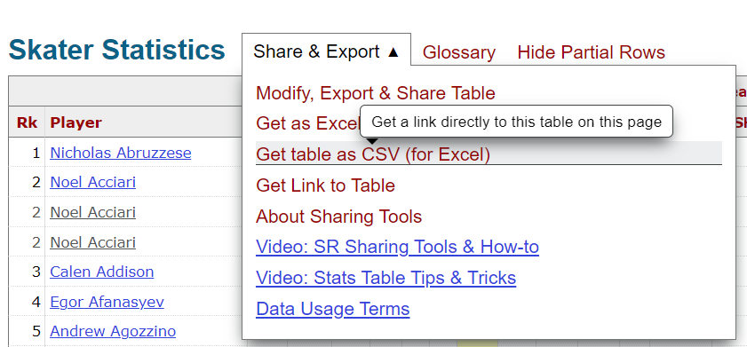
The data for this walkthrough was sourced from Hockey-Reference, which is a great site with a ton of stats. To get the data:
- Click Seasons and then Summary for a given season.
- Click Get table as CSV (for Excel) and download the CSV file – see below.
We downloaded five seasons worth of data – so we could explore trends across multiple seasons. To stitch the files together, we downloaded five CSVs and created a generic Python script, which is below, to append the CSV files to one another. (The files were structured in the same way, so no programmatic cleaning/transformation was required.)
import pandas as pd
import os

folder_path = "c:/hockey_data"

my_dataframe = []

for filename in os.listdir(folder_path):
    if filename.endswith('.csv'):
        file_path = os.path.join(folder_path, filename)
        my_dataframe.append(pd.read_csv(file_path))

combined_df = pd.concat(my_dataframe, ignore_index=True)

combined_df.to_csv(folder_path + 'combined_team_stats_file.csv', index=False)
After running the script, you have a single CSV file with five season's worth of hockey stats.
Exploring Data Relationships through a Correlation Analysis
The next step is to create a correlation plot using the five seasons worth of data. To do this:
- Open RStudio and click File, New Project.
- Select Existing Folder and navigate to the folder where you created the combined hockey stats file from the first step. Name the project.
- Create a new file and copy and paste the following R code into that file.
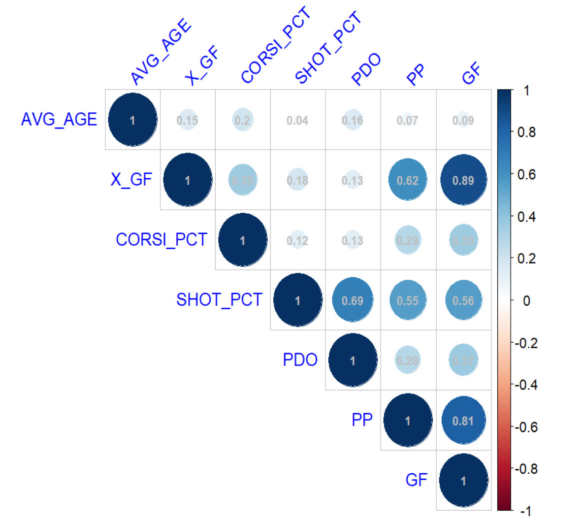
This code loads a set of libraries, trims the original dataset to a few variables and then creates a correlation matrix and plot.
library(dplyr)
library(reshape2)
library(corrplot)
library(caTools)
library(caret)

summary_team_shot_data_df <- read.csv("combined_team_stats_file.csv")

corr_model_data <- summary_team_shot_data_df[, c('AVG_AGE', 'X_GF', 'CORSI_PCT', 'SHOT_PCT', 'PDO', 'PP', 'GF')]

cor_matrix <- cor(corr_model_data, use = "complete.obs")

melted_cor_matrix <- melt(cor_matrix)

corrplot(cor_matrix, method = "circle", type = "upper",
         tl.col = "blue", tl.srt = 45,
         addCoef.col = "gray",
         number.cex = 0.7)
When you execute the code, you should see something similar to the below – which illustrates the relationship between each of the variables. You can see from the correlation plot that X_GF and PP perform well and SHOT_PCT is just above a coin flip.
Next we'll take the same variables and demonstrate building a multivariate linear regression model.
Building the Linear Regression
To build the multivariate linear regression model, return to RStudio and the code you created in the last step. Copy the code below into your R file and execute.
predictors <- c('AVG_AGE', 'X_GF', 'CORSI_PCT', 'SHOT_PCT', 'PDO', 'PP')
results <- data.frame(Predictor = character(),
R_squared = numeric(),
MSE = numeric(),
stringsAsFactors = FALSE)
for (pred in predictors) {
formula <- as.formula(paste("GF ~", pred))
data_clean <- na.omit(summary_team_shot_data_df[, c(pred, 'GF')])
set.seed(42)
split <- sample.split(data_clean$GF, SplitRatio = 0.8)
train_data <- subset(data_clean, split == TRUE)
test_data <- subset(data_clean, split == FALSE)
model <- lm(formula, data = train_data)
predictions <- predict(model, newdata = test_data)
mse <- mean((predictions - test_data$GF)^2)
r2 <- summary(lm(predictions ~ test_data$GF))$r.squared
results <- rbind(results, data.frame(Predictor = pred, R_squared = r2, MSE = mse))
}
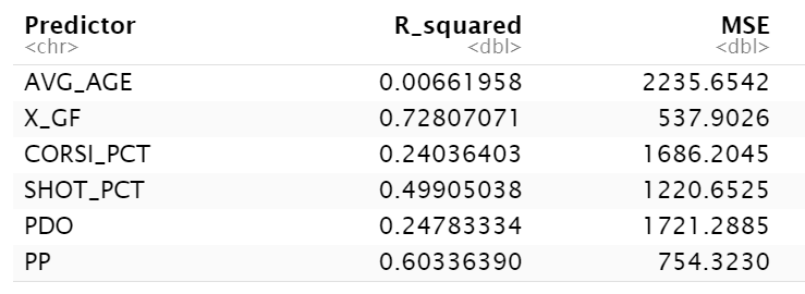
print(results)
The results should be something similar to the below. Note that for variables that are better predictors the R-Squared value should be higher and the MSE should be lower (and reverse where the variables are less predictive). Here again, you can see that X_GF, PP and SHOT_PCT are higher than the others, but the numbers when running the model are lower than just running a straight correlation analysis.
Plotting the R-Squared values into a bar chart makes it easier to see the predictive value for each of these variables within the multivariate linear regression model.
The last step we'll do in this walkthrough is to isolate the X_GF variable and create a scatter plot to explore the linear relationship between it and GF. To do this, simply add the following code to the above R file (which already has the libraries loaded in to run this code).
xgf_goals_df <- summary_team_shot_data_df %>%
  select(GF, X_GF)

ggplot(xgf_goals_df, aes(x = X_GF, y = GF)) +
  geom_point() +
  geom_smooth() +
  labs(title = "Expected Goals vs Goals For (GF)",
       x = "Expected Goals",
       y = "Goals For (GF)") +
  theme_bw()

write.csv(xgf_goals_df, "xgf_vs_goals.csv", row.names = FALSE)
Note this code both will print out a plot to the R console and write a CSV file to local disk. We used that CSV file to create a more aesthetic bar chart.
Here you can see a strong relationship between the Expected Goals For stat and Goals.
Check out the following quick-hit walkthrough on YouTube.
Summary
In this edition, we introduced you to the linear regression model, which comes in different flavors such as univariate and multivariate. You learned that the strength of the relationship within this model is represented by the line between the independent and dependent variables. That is, a strong, positive relationship is sloped up and towards the right (and trends towards 1); a strong, negative relationship is sloped down and towards the right (and trends towards -1); and a neutral relationship is more of a straight line (and trends towards 0).
It's good practice to explore how different variables correlate before you spend the time implementing these variables in any model. For example, here we created a correlation analysis to test the relationship between different statistics and goals – using five seasons worth of data. We found two predictors fared more strongly in the multivariate linear regression model.
To explore the resource files associated with this edition, go to the Barn.
Subscribe to our newsletter to get the latest and greatest content on all things hockey analytics!
Member discussion