Chart 6: Spider Chart to Compare Player Metrics

Creating a Spider Chart using Microsoft Excel
What is Microsoft Excel?
Microsoft Excel is a software application designed for data organization, analysis, and visualization. It is part of the Microsoft Office suite and is available for Windows, macOS, and mobile devices. Excel is popular for its versatility and user-friendly interface, making it a go-to tool for personal, academic, and professional tasks involving numerical data.
For data analysts that work in sports, Microsoft Excel is a heavily-used spreadsheet application. Typically, you'll do a ton of analyses in Excel, which will include the creation of different types of visualizations. The great thing about using Excel is that you can export the data, visualization or process that you used in the analysis to other tools. This allows you to take advantage of the features that other platforms and tools offer.
What is a Spider Chart?
A Spider Chart, also known as a Radar Chart or Web Chart, is a graphical representation of multidimensional data. It displays values for multiple variables on axes that radiate from a central point, forming a shape like a spider web. Each axis represents a different metric, and the data points are connected to create a polygon.
Spider charts support a multidimensional visualization, where you can plot multiple metrics for one or more entities on the same chart. You can then do a comparative analysis (e.g., players, teams, etc.) using the metrics in the chart. Spider charts are great visually because you get an immediate sense for how the entities compare across those metrics given the shape of the polygon.
For hockey, you might use a Spider chart in the following ways:
- Compare players across multiple performance metrics (e.g., Goals per Game, PIM, etc.).
- Evaluate the strength of a team across multiple metrics (e.g., Power Play Percentage, Penalty Kill Percentage, etc.).
- Profile players to get a sense of their balance across offensive and defensive metrics.
- Compare player performance across eras (e.g., comparing Gordie Howe and Wayne Gretzky).
The advantages of Spider charts over other visualizations are 1) you can quickly identify strengths and weaknesses, 2) the chart acts as a direct comparison method (as you overlay players and teams) and 3) you can customize metrics tailored for specific roles and situations.
The limitations of Spider charts are 1) you need to manage the number of metrics you use to avoid crowding the visualization, 2) one should take care in the range of axes you use (so as to not misrepresent the data) and 3) they're useful for more qualitative analyses than precise statistical analyses.
In this tutorial, we'll build a Spider chart that answers the following question: Where did Keith Tkachuk perform better than Gordie Howe?
Getting the Resource Files
There are two resource files for this tutorial. One has all of the family data for the Howes and the Tkachuks. The second has only the summary data for Gordie Howe and Keith Tkachuk.
Click the links below to download the aforementioned resource files:
You'll only use Microsoft Excel (or equivalent spreadsheet application) in this tutorial.
Let's get started!
Step 1: Download the Data
For this tutorial, download the distilled data for Gordie Howe and Keith Tkachuk. You'll be comparing their stats using the Spider chart.
After you create a new folder and download the player data, open it using Microsoft Excel to verify it downloaded correctly.
When you open the data, it should look like the below.
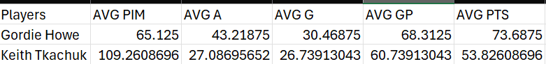
In the data, you can see there are five metrics we'll compare using the Spider chart:
- Average Penalty Minutes (AVG PIM), which we'll use as a proxy for grit.
- Average Assists (AVG A), representing one's playmaking ability.
- Average Goals (AVG G), representing the ability to score goals (and close).
- Average Games Played (AVG GP), which represents the average number of games played per season.
- Average Points (AVG PTS), which represents the average points achieved by a player.
Each of the statistics is calculated by season and then averaged across all seasons of play.
Step 2: Create a Visualization
We're creating a Spider chart for this tutorial. To do this:
- Save the Gordie Howe and Keith Tkachuk dataset as an Excel Workbook file.
- Create a new tab called Spider_Chart.
- Copy and paste the data from the first tab into this new tab, but when pasting select the Transpose option, similar to the below.
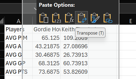
The data will now be formatted in way better suited for creating the visualization.
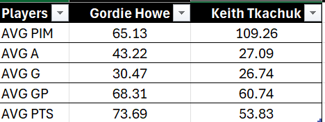
- Select the data and then click Home, Format as Table and click OK.
- Format the decimal places to be rounded to two decimal places to make the data more readable.
The original data should now look like the below.
- Select the data, click Insert, Charts, All Charts, and Radar.
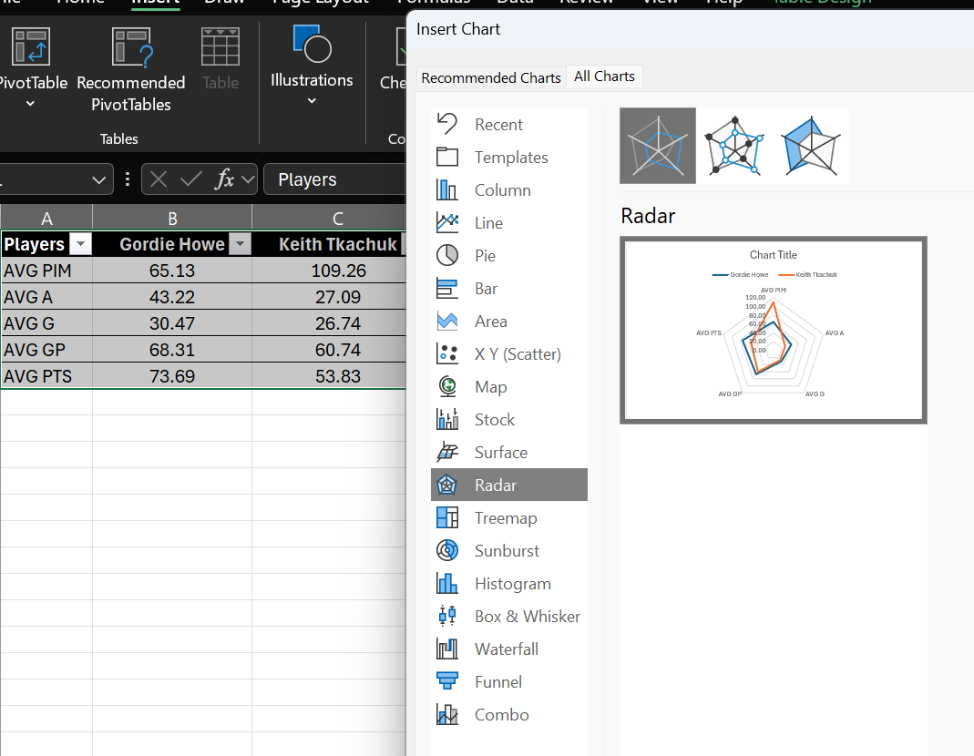
- You will now have a Spider chart (or Radar chart in Excel) that you can format.
For example, in the below Spider chart, we've formatted the title, font family, size and color and adjusted the chart colors for better contrast.
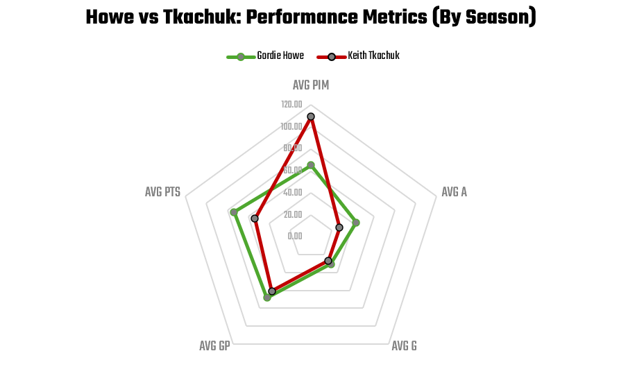
Based on the above Spider chart, the answer to the question for this tutorial (Where did Keith Tkachuk perform better than Gordie Howe?) is as follows:
- Gordie was better at point production and playmaking.
- Tkachuk had a grittier game with higher penalty minutes.
- They were roughly even on goal scoring and games played.
Looking for more datasets and tutorials? Check out our Resources page!
Member discussion