More Money, More Wins?

In this Edition
- What is the NHL Salary Cap?
- Does More Money Translate into a Winning Team?
- Exploring Salary Cap and Team Performance
- Walkthrough: Exploring the Relationship between Salary Cap and Wins
What is the NHL Salary Cap
The NHL Salary Cap is a limit on the amount of money that teams can spend on player salaries. This is a key feature of the NHL's Collective Bargaining Agreement (CBA) designed to promote parity among teams by preventing wealthier teams from outspending others on player talent.
The goal of the Salary Cap is to ensure a level playing field by capping team spending, which promotes competitive balance across the league. The cap is set annually based on a percentage of projected league revenues. It can vary year to year depending on the financial performance of the league. Teams must comply with the salary cap, and there are penalties for exceeding it, including fines, loss of draft picks, and voided contracts.
The NHL Salary Cap has been steadily growing alongside the growth in popularity of the NHL and hockey. Below is a snapshot of the NHL Salary Cap from the 2005-2006 season to the most recent 2023-2024 season, where the Cap has more than doubled in that timeframe.
Imposing the Salary Cap does not mean that every team must spend that amount of money on fielding a team. What the Salary Cap for each team implies (i.e., whether they come in under, on target or over the cap) is that they implement a spending strategy to buy talent for a specific result. Below is a snapshot of where teams are falling either above or below the NHL Salary Cap this season. Note that most teams come in slightly above or under the Cap; however, there are several notables that exceed the Cap by two million or more.
Spending notwithstanding, the question in this edition is does more money translate into a winning team?
Does More Money Translate into a Winning Team?
The relationship between spending under the NHL Salary Cap and team performance is complex and not necessarily linear. Simply spending more money does not guarantee a better team. Several factors contribute to a team's success, and understanding the efficiency and effectiveness of spending is important when evaluating the strategic impact of a team's spend strategy.
Here are some indicators and aspects to consider when evaluating if a team is getting its money's worth.
Performance Metrics vs. Spending
- Win-Loss Record: Compare the team's win-loss record relative to its salary expenditure.
- Playoff Success: Teams that spend more should ideally have better playoff performances.
- Points in the Standings: Higher spending should correlate with more points in the regular season.
Cost Efficiency
- Cost Per Win: Calculate the cost for each win by dividing the total salary by the number of wins.
- Cost Per Point: Similar to cost per win, but using points in the standings.
- Salary Spending Relative to Cap: Compare how close teams are to the salary cap limit and their performance.
Player Contribution
- Player Performance Metrics: Goals, assists, points, plus/minus, time on ice, etc., relative to their salary (i.e., value for money).
- Star Players vs. Depth Players: Assess how star players (who are typically higher-paid) are contributing versus the depth players.
Long-Term Sustainability
- Development and Utilization of Talent: Assess how well a team develops and utilizes its younger, less expensive talent.
- Contract Management: Evaluate the structure of contracts and how they impact team performance and flexibility under the cap in the long term.
Comparative Analysis
- League-Wide Comparisons: Compare similar teams in terms of salary cap spending and performance.
- Historical Comparisons: Look at how spending has affected team performance over multiple seasons.
Additional Factors
- Injuries: High-salary players may be injured, impacting team performance.
- Team Chemistry and Management: The effectiveness of coaching, management strategies, and team chemistry.
Analytical Approaches
- Statistical Analysis: Use regression models and other statistical methods to find correlations between spending and performance.
- Data Visualization: Leverage tools like charts and heat maps to visualize spending vs. performance.
In short, there is no guarantee that a higher salary cap hit results in higher levels of success due to the variability and complexity of sports performance. More important are smart spending (getting the best value for each dollar under the cap) and a balanced approach to investing in talent (balance between spending on star players and investing in depth players and development).
Exploring Salary Cap and Team Performance
In this section, we'll talk more about the cost efficiency of an NHL team vis-a-vis their spending cap and then create a dashboard that integrates Salary Cap numbers, wins and cost efficiency metrics. For example, the following table provides a snapshot of Salary Cap along with four cost efficiency metrics: Cost per Win, Cost per Loss, Cost per Shot, and Cost per Point. These cost metrics give us a high-level view for the cost of a single event such as a win. They don't, per the aforementioned metrics and methods, give you a detailed view of that investment, such as the depth of the bench, the super-star factor, the age of the team, and so on. This requires more analysis within the team to the players and their performance as it relates to the Salary Cap. They also don't explore relationships across the data, which dashboards can help us achieve.
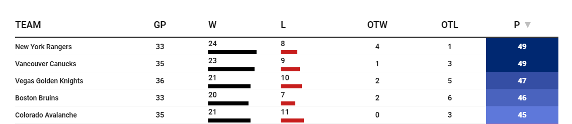
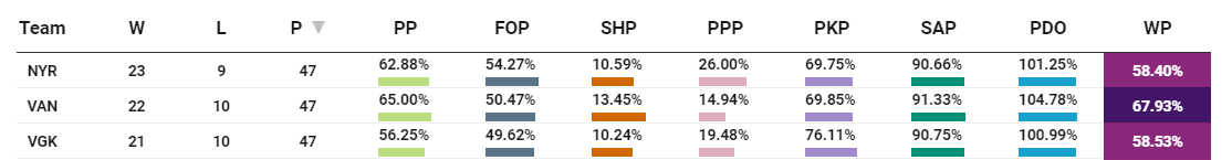
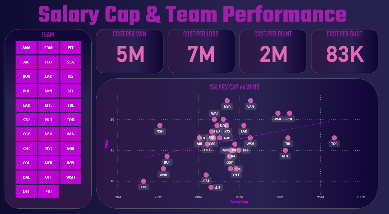
An interesting takeaway from the above chart is that as of the writing of this edition, the New York Rangers are in first place overall, with Vancouver and Vegas Golden Knights coming in second and third respectively. New York are close to the Salary Cap but their Cost per Win is the lowest in the league, just above Vancouver. This is impressive.
And when you click one level down into their team stats, you can begin to see where they are strong or weak compared to Vancouver and Vegas. For example, New York looks strong on the power play (PPP) and faceoffs (FOP), but weaker on goaltending (SAP) and winning percentage (WP).
Let's now turn to the walkthrough to more deeply explore the relationship between Salary Cap and wins.
Walkthrough: Exploring the Relationship between Salary Cap and Wins
In this walkthrough, we'll complete three tasks:
- Clean the data, which will include Salary Cap and performance stats.
- Create a simple scatter chart to explore the relationship between Wins and Salary Cap.
- Create a dashboard (with a custom design) that expands on the Wins vs Salary Cap to include other performance and cost efficiency metrics.
Cleaning the Data
The original dataset is a snapshot of NHL team stats from our data provider along with a merge on the Salary Cap data from Cap Friendly. And we'll use R and RStudio to do the data cleaning.
In this first code snippet, we load the Salary Cap data with stats into R. There isn't a lot of clean-up required for our analysis, so we clean the headers up and transform the Salary Cap (SALARY_CAP) field from a character data type to a numeric (and remove the commas in the process).
library(dplyr)

all_salary_cap_data <- read.csv("salary_cap_data_with_stats.csv")

sub_salary_cap_df <- all_salary_cap_data %>%
  select(TEAM_ABB, PROJECTED_CAP, GAMES_PLAYED, WINS, LOSSES, POINTS, SHOTS, GOALS_FOR, GOALS_AGAINST, GIVEAWAYS)

colnames(sub_salary_cap_df) <- c("TEAM", "SALARY_CAP", "GP", "W", "L", "PTS", "S", "GF", "GA", "G_WAY")

sub_salary_cap_df$SALARY_CAP <- as.numeric(gsub(",", "", sub_salary_cap_df$SALARY_CAP))

str(sub_salary_cap_df)
...
We then added some cost efficiency metrics based on each team's Salary Cap. We didn't do all of them, so you could choose to go deep on one or two or expand your own analysis to include them all (or bring more statistics in from the original dataset).
...
sub_salary_cap_df$COST_GP <- round(ifelse(sub_salary_cap_df$GP > 0, sub_salary_cap_df$SALARY_CAP / sub_salary_cap_df$GP, NA),2)
sub_salary_cap_df$COST_W <- round(ifelse(sub_salary_cap_df$W > 0, sub_salary_cap_df$SALARY_CAP / sub_salary_cap_df$W, NA), 2)
sub_salary_cap_df$COST_L <- round(ifelse(sub_salary_cap_df$L > 0, sub_salary_cap_df$SALARY_CAP / sub_salary_cap_df$L, NA), 2)
sub_salary_cap_df$COST_PTS <- round(ifelse(sub_salary_cap_df$PTS > 0, sub_salary_cap_df$SALARY_CAP / sub_salary_cap_df$PTS, NA), 2)

print(head(sub_salary_cap_df, 5))
...
The final code snippet breaks the teams out into quartiles (based on the Salary Cap), adds a column with the quartile representation in it (e.g., Q1, Q2, etc.) and writes the data frame to file.
...
quartiles_by_salary_cap <- quantile(sub_salary_cap_df$SALARY_CAP, probs = c(0, 0.25, 0.5, 0.75, 1), na.rm = TRUE)

sub_salary_cap_df$QUARTILE <- cut(sub_salary_cap_df$SALARY_CAP,
                             breaks = quartiles_by_salary_cap,
                             include.lowest = TRUE,
                             labels = c('Q1', 'Q2', 'Q3', 'Q4'))

print(head(sub_salary_cap_df, 5))

write.csv(sub_salary_cap_df, "salary_cap_data_with_cost_metrics.csv", row.names = FALSE)
With the data written to local disk, you can now use the CSV file to build a dashboard in Power BI.
Creating a Scatter Chart for Salary Cap vs Wins
To create the scatter chart:
- Open Microsoft Power BI.
- Click Get Data and import the data from the data cleaning process (salary_cap_data_with_cost_metrics.csv) by navigating to the CSV file, clicking Open and then Load.
- After your data is loaded in Power BI, click the Visualizations pane and add a Slicer and a Scatter Chart to the main canvas.
- In the Slicer control, drag TEAM to Field field.
- In the Scatter Chart control, drag TEAM to the Values field, SALARY_CAP to the X Axis and WINS to the Y Axis.
You should now see something similar to the below.
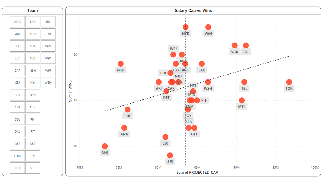
You can click on specific teams to see where they are located on the Scatter Chart. Generally, it's better if the teams are at or below the Salary Cap above the trend line. Conversely, it's less good if teams are below the trend line towards the bottom right. This means they are paying a lot for a lower number of wins.
Creating a Salary Cap and Team Performance Dashboard
To create the Salary Cap and Team Performance dashboard:
- Create a background design.
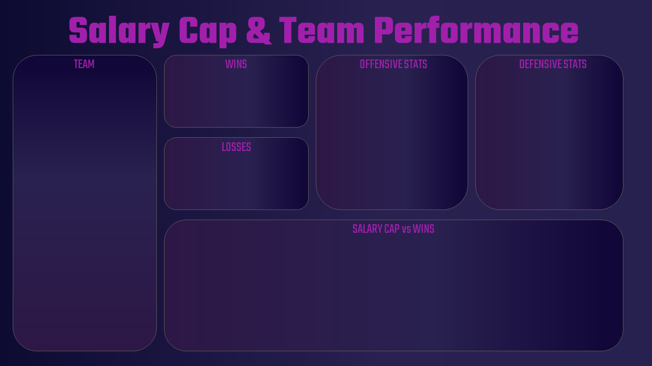
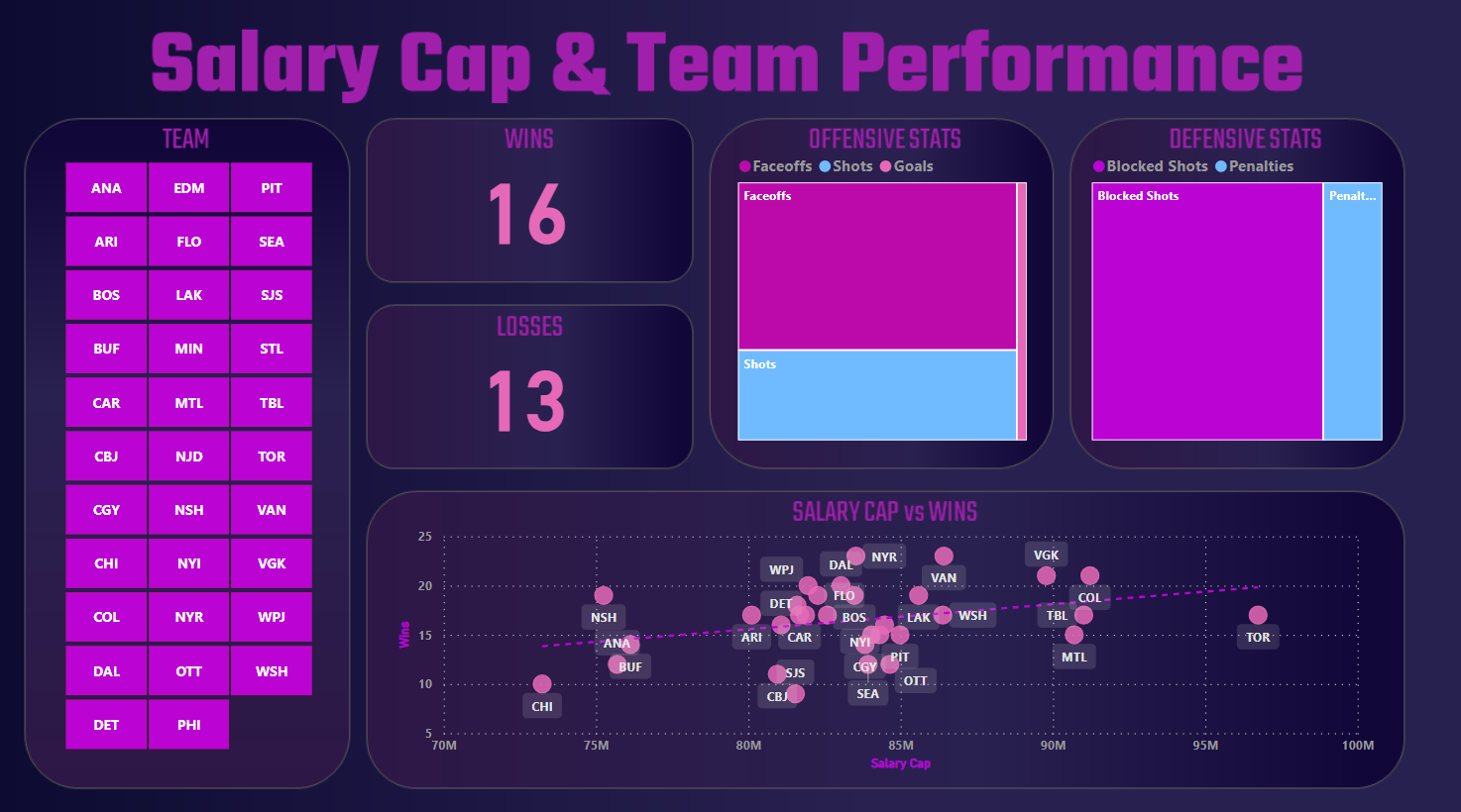
Below is the design we created for this project. We'll add a Slicer to the left, two Card controls, two Treemap controls and one Scatter Chart.
- In Power BI, click the New Page button beside the page tabs and give the new report a name – e.g., Salary Cap Report.
- Click the Visualizations page, expand the Canvas Background section, click Image and load the background image you created.
- Click (or drag) and configure each of the controls for your dashboard, so they look something similar to the below. That is:
- Add a Slicer control to the left of the report (under Team) using TEAM_ABB as the data source.
- Add two Card controls using WINS as a data source for one and LOSSES for the other.
- Add two Treemap controls. The first integrates FO_WINS (faceoffs won), SHOTS (shots for) and GOALS (goals for) to create a view for Offensive Stats. The second integrates BLOCKED_SHOTS (blocked shots for) and PENALTIES (penalties) for Defensive Stats.
- Add a Scatter Chart with SALARY_CAP and WINS.
Configure each of the controls, and the result should look similar to the below. You now have an interactive dashboard where you can select one or more teams and the other controls will update.
Check out our quick-hit video tutorial on YouTube.
For us, the main actor in this dashboard is the Scatter Chart. It explores the relationship between spend strategy (via Salary Cap) and wins. So, we created a second report that has four cost efficiency metrics along the top of the report and gives more space for the Salary Cap vs Wins scatter chart.
Having completed this dashboard, your natural next step would be to explore the salary and player performance metrics for each team. This would give you the summary view at the team level and the detailed view within each team.
Here are some ideas for additional analyses:
- Salary Cap Tier Analysis: Inter-/intra-quartile analyses to evaluate spending efficiencies versus performance.
- Goalie Performance Analysis: Analyze goalies' performance (save percentage, goals-against average) against their cap hit.
- Win Shares vs. Salary: Win Shares is a statistic that estimates the number of wins contributed by a player. Comparing this with the player's salary can show how much each win is costing the team.
- Salary Cap Efficiency: Evaluate how efficiently a team uses its salary cap. This involves comparing the total team salary with overall team performance, such as points in the standings or playoff success.
These are just a few examples.
Summary
In this edition, we introduced you to the NHL Salary Cap and discussed why there is a cap in the NHL (much like other professional sports leagues). We also discussed cost efficiency metrics, such as Cost per Win, that give you a high-level view of how much a team would pay for a win based on their Salary Cap. You should accompany this metric with other, more detailed team and player centric statistics to give a fuller picture as to why a win is costing a team more or less than others in the league.
We also built a simple Scatter Chart, exploring the relationship between Salary Cap and Wins. You can try different variables on your own, such as Goals, Shots, etc. We then expanded on the Scatter Chart to build two report versions, one with summary cards and treemaps for offensive and defensive stats and another with summary cards – featuring the scatter chart more prominently.
For more resources to use for your own personal or professional projects, check out The Barn.
Subscribe to our newsletter to get the latest and greatest content on all things hockey analytics!