Enhancing your Power BI Reports with Linear Regression Models

In this Edition
- Overview of Linear Regression and Power BI
- Why Linear Regression Models in Power BI?
- How to Enhance a Power BI Report with a Linear Regression Model
- Walkthrough: Integrating a Linear Regression Model in Power BI
Overview of Linear Regression and Power BI
In a recent newsletter (Using Linear Regression Model to Predict Goals), we discussed how you can use the linear regression model to predict different outcomes – in this case goals. In that edition, we focused on the theory and math behind linear regression models and then built one using R and RStudio. In this edition, we wanted to bring the linear regression model to Microsoft Power BI.
Power BI has native support for Python and R, which enables you to combine default and natively supported visualizations and analytics with predictive models. The inclusion of predictive or forecasting models (built using Python or R) is a great way to up-level your reports and dashboards. It gives your stakeholders an historical view through an exploratory data analysis view (e.g., descriptive and summary stats, trends, etc.) and a predictive or future view (e.g., linear regression models, correlation plots, etc.).
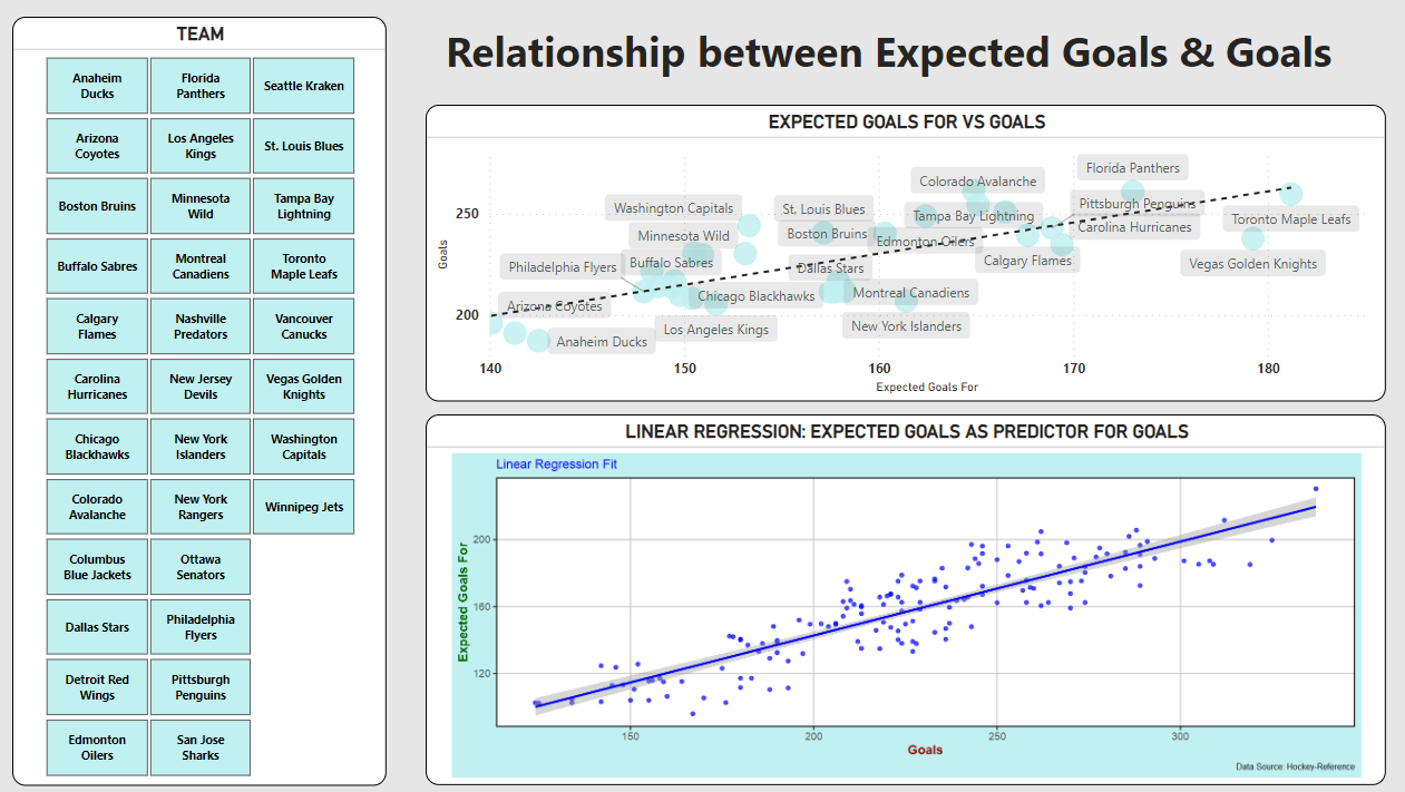
Below is a simple example (which we'll build in the walkthrough) that combines three controls within the Power BI interface. On the left, you can see the Slicer control, which acts as the filter for NHL teams. You also have a Scatter Chart to the top right of the report, which shows expected goals for versus goals. This builds from where we left off in our last newsletter, where expected goals for had one of the better results in the linear regression model. The third control, the R script visual control, is where you add your R code. In this example, we have created a simple univariate linear regression and plotted it using a scatter plot with a smoothing line.
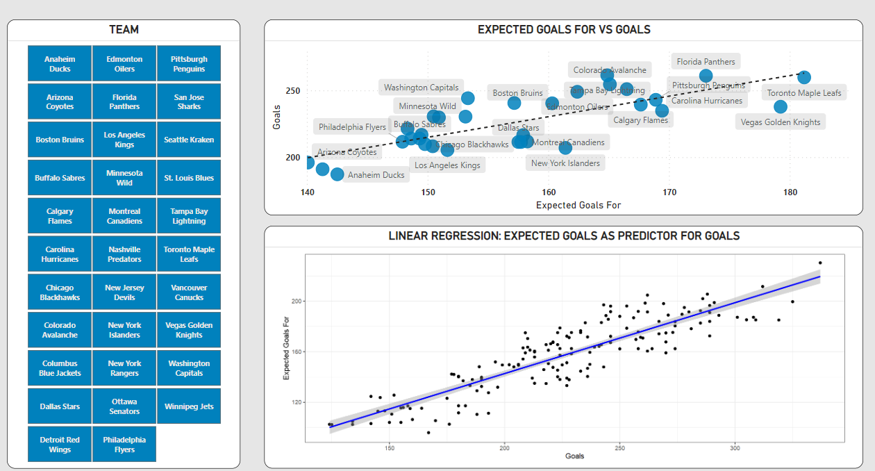
The report illustrates the nature of the relationship between expected goals for and goals (looking back using historical data) and then models that relationship out through a linear regression model (creating a future view). The trendlines are directionally similar; although, the predictive model (bottom right) shows a more steep curve up and to the right.
We'll walk through how to build the above report, but before we do that let's explore some of the reasons why you'd want to integrate linear regression models with Power BI.
Why Linear Regression Models in Power BI
You can benefit from integrating linear regression models with Power BI in several ways, which are listed as follows:
- Enhanced Data Insights: Linear regression is a powerful statistical tool used to understand relationships between variables. By integrating it into Power BI, users can easily identify and quantify the relationships between different data points. This can be particularly useful in forecasting, trend analysis, and identifying key drivers of a particular outcome.
- Improved Decision Making: With linear regression analysis, decision-makers can predict outcomes based on current data trends. This predictive capability can be crucial in business planning, resource allocation, and strategy development.
- Accessibility for Non-Statisticians: Power BI is known for its user-friendly interface. Integrating linear regression into this platform makes complex statistical analysis more accessible to those who may not have a strong background in statistics.
- Interactive Visualization: Power BI excels in data visualization. By combining linear regression with Power BI’s interactive visualizations, users can not only see the results of their analysis but also interact with it in real-time, adjusting variables to see different outcomes and scenarios.
- Data Integration and Real-Time Analysis: Power BI allows users to integrate data from various sources. Combining this feature with linear regression means that users can perform real-time regression analysis on a diverse set of data, providing up-to-date insights.
- Customization and Flexibility: Users can customize their linear regression models within Power BI to suit specific business needs and scenarios. This flexibility ensures that the analysis is relevant and tailored to specific organizational contexts.
- Reporting and Sharing: Power BI’s reporting and sharing capabilities mean that insights derived from linear regression analysis can be easily disseminated throughout an organization, fostering a data-driven culture.
In short, integrating linear regression into Power BI combines the power of statistical analysis with the strength of a leading business intelligence tool, leading to deeper insights, better decision-making, and more accessible and interactive data analysis.
How to Enhance a Power BI Report with a Linear Regression Model
We work a lot in R and RStudio and manage our application code in a code repository, so our process to integrate with Power BI is a "lift and shift" approach. Now depending on your environment (e.g., highly managed code environment, self-starter without any repo, etc.), you may choose to code directly in Power BI, take a similar approach to what we do or do something in-between.
Also, it's worth noting that there are differences in the R code when you're building in RStudio versus the auto-generated R code in Power BI. For example, the lines of code with a hashtag (#) to the left are auto-generated by Power BI – and may require some configuration (e.g., column names). You then add your own code after this default code is added.
# The following code to create a dataframe and remove duplicated rows is always executed and acts as a preamble for your script:

# dataset <- data.frame(X_GF, GF)
# dataset <- unique(dataset)

# Paste or type your script code here:

library(ggplot2)

model <- lm(GF ~ X_GF, data=dataset)

ggplot(dataset, aes(x=GF, y=X_GF)) +
  geom_point() +
  geom_smooth(method="lm", col="blue") +
  theme_bw() +
  labs(x="Goals",
       y="Expected Goals For")
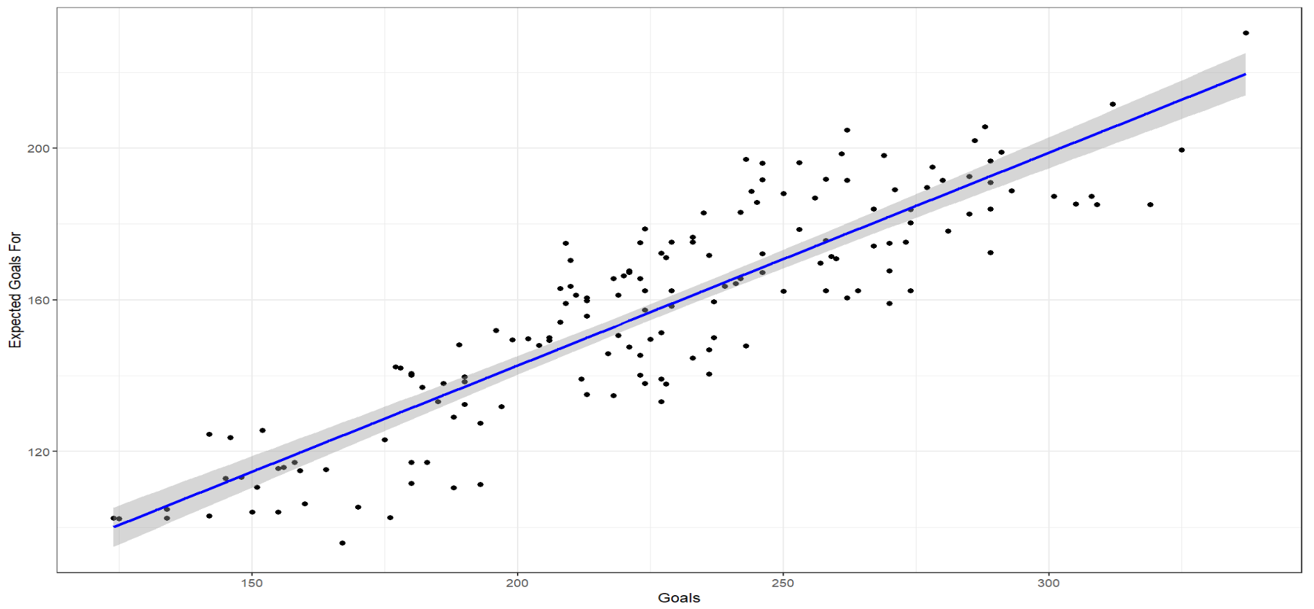
In RStudio, the above R code translates into something akin to the below.
library(ggplot2)

dataset <- read.csv("combined_team_stats_file.csv")

model <- lm(dataset$GF ~ dataset$X_GF, data=dataset)

ggplot(dataset, aes(x=dataset$GF, y=dataset$X_GF)) +
  geom_point() +
  geom_smooth(method="lm", col="blue") +
  theme_bw() +
  labs(x="Goals",
       y="Expected Goals For")
This produces a linear plot similar to what we have in the Power BI report shown earlier.
The lift and shift approach is but one way to integrate linear regression models with Power BI. For example, below are additional ways to integrate linear regression models with Power BI – each catering to different levels of complexity and customization.
- Using Power BI's Native Visuals and DAX Formulas: Power BI provides native visuals like scatter plots, which can display trend lines (simple linear regressions) for data points. For more advanced analysis, you can use DAX (Data Analysis Expressions) to create measures and calculated columns that reflect linear regression calculations.
- Python and R Integration: As discussed above, Power BI allows the integration of Python and R scripts, which can be used to run more complex linear regression models. By using Python or R, you can leverage libraries like
scikit-learn(Python) orlm()in R for robust linear regression analysis. The results from these scripts can be displayed as visuals in Power BI reports and dashboards. - Azure Machine Learning Integration: For organizations using Azure Machine Learning, Power BI can integrate with it to import and visualize the results of linear regression models built in Azure ML. This method is particularly useful for large-scale and complex data sets and for leveraging cloud computing resources.
- Custom Visuals: Power BI's marketplace offers custom visuals created by third-party developers. Some of these may support more advanced regression analysis functionalities. These custom visuals can be added to your Power BI reports for enhanced regression analysis capabilities.
- Power Query for Data Preparation: Power Query in Power BI can be used for data preparation before applying linear regression. This includes tasks like filtering, sorting, and transforming data to make it suitable for analysis. Although Power Query itself does not perform regression analysis, it's an essential step for accurate and efficient model building in whatever tool you use within Power BI.
- Using Power BI's Key Influencers Visual: The Key Influencers visual in Power BI helps identify what factors influence a metric. While it's not a traditional linear regression, it uses a form of regression analysis to determine key drivers.
- SQL Server Analysis Services (SSAS) Integration: For organizations using SSAS, you can develop linear regression models in SSAS and then visualize and explore the results in Power BI.
- External Tools and Services: You can also use external tools and services to perform regression analysis and then import the results into Power BI for visualization and further analysis.
Each of these methods has its own set of advantages and is suitable for different scenarios depending on the complexity of the analysis required, the skills available in the team, and the organization's technological infrastructure.
Best Practices for Integrating Linear Regression Models with Power BI
Integrating an R linear regression model into Power BI can involve multiple steps. The following best practices will help you maintain efficiency and accuracy when preparing and deploying models in Power BI.
- Prepare Your Data: Ensure your data is clean, accurate, and relevant for the analysis. You can use R or Python to clean the data or you can use Power BI's data transformation features to format and structure your data appropriately.
- Enable R Scripting in Power BI: To use R in Power BI, you first need to enable R scripting. Go to Power BI Desktop options, under the "R scripting" section, and set the R home directory and desired R coding environment (like RStudio).
- Write the R Script for Linear Regression: Use the R script editor in Power BI to write your linear regression model. You can use the
lm()function from base R or similar functions from other packages likeggplot2for visualization. It's important to remember that the data used in the R script comes from the data already loaded into Power BI. - Visualize the Regression Results: Once you have your model, you can create visualizations directly from R using libraries like
ggplot2orplotly. The visual output can be embedded into your Power BI report. - Refresh and Parameterization: Set up data refresh schedules in Power BI to ensure your model uses the most current data. If your model needs to be dynamic based on user input, consider using parameters in Power BI to pass dynamic values into your R script.
- Error Handling: Implement error handling in your R script to manage any potential data or execution errors. This ensures that your Power BI report remains functional even if the R script encounters an issue.
- Performance Considerations: Be mindful of the performance impact. Complex R scripts or large datasets can slow down your Power BI reports. Optimize your R code for efficiency and consider data volume when integrating R scripts.
- Testing and Validation: Rigorously test your R script and validate the output. Ensure that the linear regression model behaves as expected with different data sets and inputs.
- Documentation and Maintenance: Document your R script and the Power BI implementation. This is important for maintenance, updates, and for other team members to understand your work.
- Compliance and Security: Ensure that your implementation complies with any data governance and security policies your organization may have.
Following these best practices will help you effectively integrate a linear regression model using R (or Python) into Power BI, ensuring that your analysis is both reliable and insightful.
Walkthrough: Integrating a Linear Regression Model in Power BI
The goal of this walkthrough is to illustrate how you can build an advanced report comprising standard visualizations and analytics and predictive model controls. The walkthrough is composed of four main steps:
- Source the data needed for the linear regression model
- Build the linear regression model in RStudio
- Port the linear regression model code to Power BI
- Build an Advanced Report in Power BI
Source the Hockey data for the Linear Regression Model
For this walkthrough, we're going to reuse the data we created in our last newsletter. The dataset (called "combined_team_stats_file.csv") can be found here.
Be sure to create a new folder on your local desktop/environment and save the CSV file to that folder, e.g. c:/hockey_data.
Build the Linear Regression Model in R
To build the linear regression model:
- Open RStudio and create a new file by clicking File, New File, R Markdown.
- Add the following code to the R Markdown file.
library(ggplot2)

dataset <- read.csv("c:/hockey_data/combined_team_stats_file.csv")

model <- lm(dataset$GF ~ dataset$X_GF, data=dataset)

ggplot(dataset, aes(x=dataset$GF, y=dataset$X_GF)) +
  geom_point() +
  geom_smooth(method="lm", col="blue") +
  theme_bw() +
  labs(x="Goals",
       y="Expected Goals For")
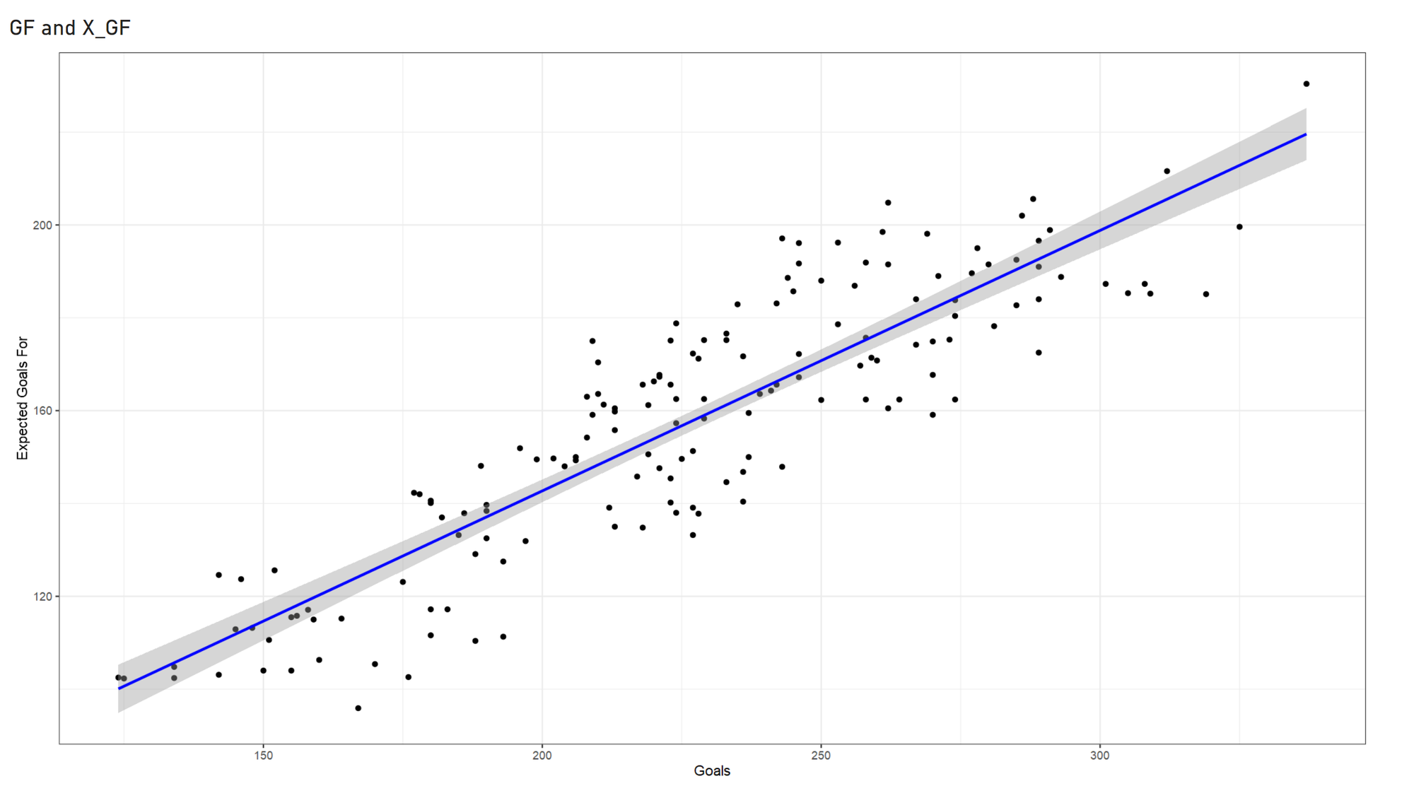
- Run the code snippet to generate a simple linear regression model.
The code generates a scatter plot based on the univariate linear model.
Rebuild the Linear Regression Model in Power BI
To rebuild the linear regression model in Power BI:
- Open Power BI.
- Import the "combined_team_stats_file.csv" by clicking Get Data, navigating to the file, clicking Open and then Load.
- Drag GF and X_GF from the Data pane to the Values field.
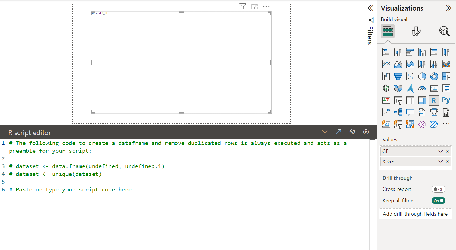
- After you've loaded the data, add a new R visual script control to the canvas. You can click the Minimize/Expand the script pane to work with the code.
Below is what you should see. Note that you will see undefined and undefined.1 as variable parameters in the data.frame() function. You will need to edit these in the next step.
- Copy, paste and edit the code you wrote in RStudio so it looks like the following picture.
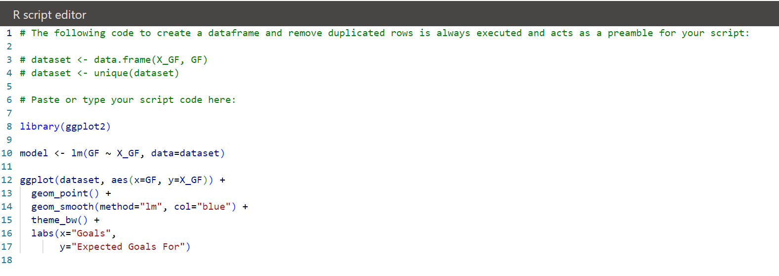
- After you've done this, you can now click the Run script button (top right-hand side of the code editor).
Congratulations! You've integrated a simple, univariate linear regression with Power BI.
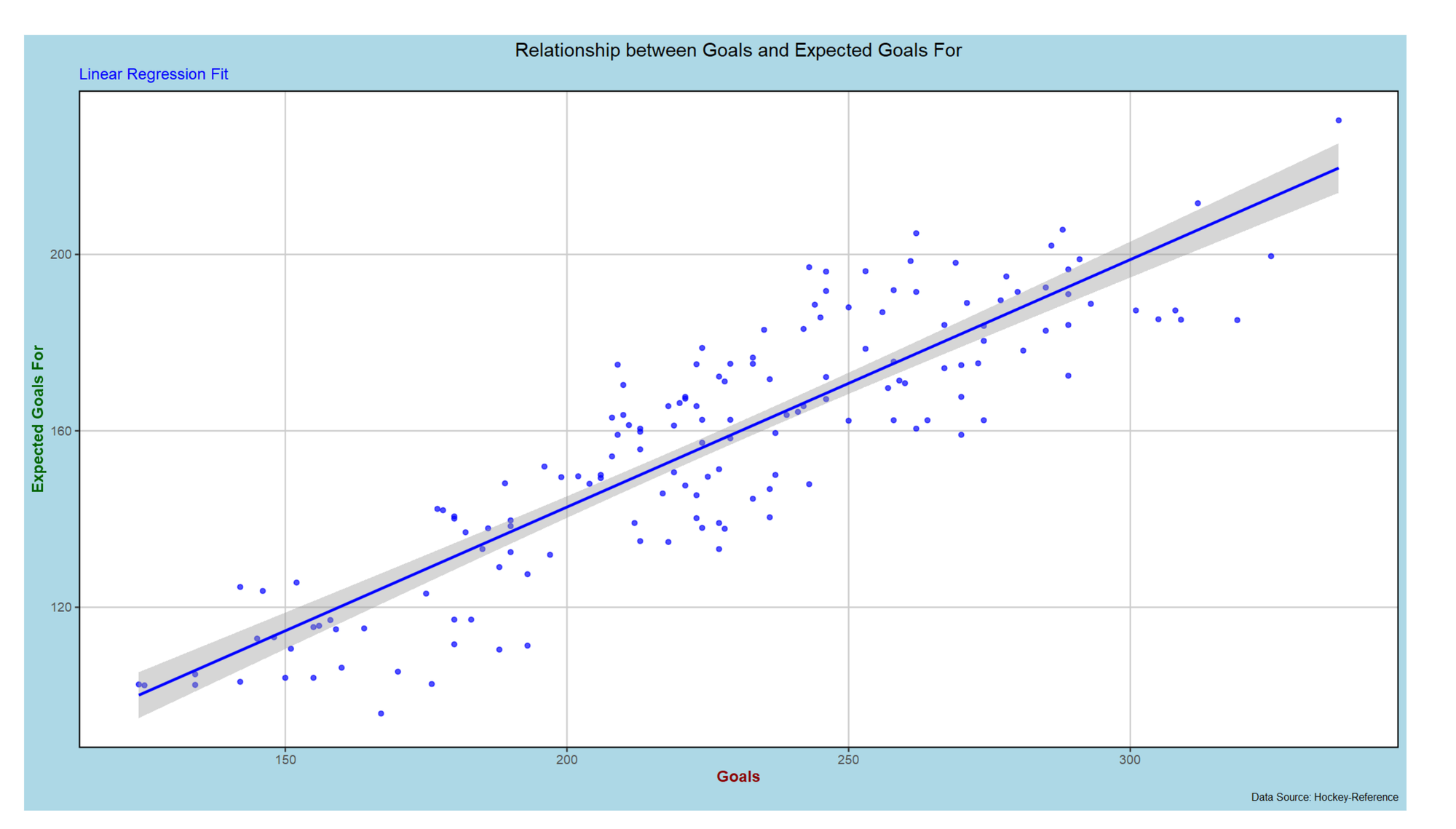
Now if you want to improve the look and feel of the visualization, you can tweak the R code. For example, update the R code in Power BI per below and then re-run the R script.
ggplot(dataset, aes(x=GF, y=X_GF)) +
  geom_point(color="blue", alpha=0.7) +
  geom_smooth(method="lm", color="blue", size=1) +
  theme_bw(base_size = 12) +
  labs(x="Goals",
       y="Expected Goals For",
       title="Relationship between Goals and Expected Goals For",
       subtitle="Linear Regression Fit",
       caption="Data Source: Hockey-Reference") +
  theme(
    plot.title = element_text(hjust = 0.5),
    plot.subtitle = element_text(color = "blue"),
    plot.caption = element_text(size = 8),
    axis.title.x = element_text(face = "bold", color = "darkred"),
    axis.title.y = element_text(face = "bold", color = "darkgreen"),
    panel.grid.major = element_line(color = "grey80"),
    panel.grid.minor = element_blank(),
    plot.background = element_rect(fill = "lightblue", color = NA),
    panel.border = element_rect(color = "black", fill=NA, size=1)
  )
The result should be similar to the below.
Build an Advanced Report in Power BI
After you successfully test and run the R script, you can add more controls to the canvas to create an advanced interactive report. To do this, we'll return to the report we referenced earlier in this edition, which included a Slicer control, a Scatter chart and the R script visual. To build this:
- Add a Slicer control and drag the TEAM data to Field.
- Add a Scatter Chart and drag the X_GF to the X Axis, GF to the Y Axis and TEAM to the Values field.
- Lastly, add the linear regression control you just created using the R script visual.
You can style each control so the design is consistent by manually configuring the controls or use the Themes feature. Below is a quick and dirty interactive report with some minimal design.
Check out the following quick-hit YouTube video for a walkthrough on integrating linear regression models with Power BI.
Summary
In this edition, we continued the discussion around linear regression models covering how to integrate linear regression models in Power BI. By integrating predictive models with Power BI, you can analyze data from an historical context, such as exploratory data analyses, trend analyses, etc. and you can also analyze data from a future-facing context, such as predictive models, forecasts, etc.
To integrate the linear regression model with Power BI, we walked through how you can write your code in RStudio and port it to Power BI. You use the R script visual control in Power BI, which has the ability to interact with other controls in a report. For example, in our walkthrough we created a Slicer control for the teams which filtered team-level data from being used by the linear regression model.
As a next step, we'd recommend building some simple univariate linear regression models of your own and integrating them with Power BI. Then move onto a broader array of predictive models using different algorithms or approaches to expand your knowledge on how to build advanced Power BI controls for hockey analyses.
Subscribe to our newsletter to get the latest and greatest content on all things hockey analytics!
Member discussion