What is a Team Performance Report?
In this Edition
- What is a Team Performance Report?
- How are Team Performance Reports Used?
- Walkthrough: Exploring Team Performance using Chat GPT
- Walkthrough: Creating a Top 25% Team Performance Report
- Walkthrough: Comparing Regular Season & Playoff Performance
What is a Team Performance Report?
A Team Performance Report (TPR) provides an analysis of a hockey team's performance across a single season or set of seasons. The TPR provides valuable insights into the team's strengths, weaknesses, trends, and patterns. It involves collecting, processing, and visualizing various metrics sourced from game data, player performances, and team outcomes.
The goal of a TPR is to help teams, coaches, fans, and analysts better understand their team's performance, assess areas for improvement, and make informed strategic decisions. By digging deep into the data, the TPR goes beyond just wins and losses to provide a more holistic understanding of how a team is performing.
How are Team Performance Reports Used?
The key uses of a TPR are vast and include, but are not limited to, the following:
- Overall Performance and Ranking: Gives you a summary snapshot of the performance of a team and where they rank vis-à-vis other teams in their division, conference or league.
- Data-Driven Decision Making: By using data-driven insights, teams and coaches can make better decisions about game strategies, line combinations, player deployment, and tactics.
- Team Evaluation and Development: Analyzing individual player statistics (as a part of the overall team metrics) can identify a player's strengths and weaknesses, aiding in player development and roster selection.
- Fan Engagement: TPRs can be shared with fans to engage them in a deeper understanding of the team's performance, sparking interest and discussions among the fan base.
- Career Development: Aspiring Hockey Data Analysts can use TPRs as portfolio pieces to showcase their analytical skills and knowledge to potential employers.
- Game Strategy: Understanding the team's strengths and weaknesses can help coaches devise effective game strategies, such as power-play setups, penalty killing tactics, and offensive and defensive systems.
- Trend Identification: Tracking performance metrics over time helps identify trends and streaks, allowing teams to capitalize on strengths or address weaknesses.
- Opponent Analysis: Comparing a team's performance against different opponents can reveal insights about their play style and how they match up against different teams.
- Injury Management: Analyzing performance metrics around injuries can help understand how injuries affect team performance and how players recover upon return.
- Scouting: For teams preparing for drafts or potential trades, individual player performance metrics can aid in scouting and talent assessment.
Let's explore different ways to create TPRs.
Walkthrough: Exploring Team Performance using Chat GPT
Chat GPT provides a way for you to upload and analyze data in different ways. In this walkthrough, you download team stats data from the NHL web site, upload it to Chat GPT and use different prompts to analyze the data.
- To download the teams stats data, navigate to the NHL Team Stats page.
- Select the data for the 2022-2023 Season, for All Franchises and ensure the Summary report is selected.
- Click Export and save the file locally.
- Navigate to Chat GPT and log in.
- Click New Chat, select GPT-4 and click Code Interpreter Beta.

- On the main Chat GPT page, click the "+" sign by the prompt to upload the team stats file you exported from the NHL site.

Now that the data is uploaded, you can submit prompts to which Chat GPT will respond. For example, we submitted the following prompts to see what Chat GPT would return:
- Can you provide me a detailed analysis of the top 25% of the teams in the attached dataset? (After which Chat GPT asked us how to partition the quartiles.)
- The quartiles should be based off of points (P). And I'd like to understand if there are any observations on the following statistics that might be interesting: FOW%, PP%, PK%, and P.
- Can you create some charts to help me better visualize the results? Specifically, would like to see scatter plots for how FOW%, PK% and PP% contribute to P for these top 25% of the teams.
Now prompt engineering is still an emerging discipline, so you'll get different results the better your prompts. But to follow are a sampling of the results Chat GPT returned from the above prompts.
FOW% (Face-Off Win Percentage)
The average FOW% is approximately 52.05%. The minimum and maximum FOW% are 46.7% and 54.8%, respectively. This indicates that top teams tend to win just over half of their face-offs.
PP% (Power Play Percentage)
The average PP% is approximately 24.01%, with a minimum of 19.8% and a maximum of 32.4%. This suggests that successful teams convert about a quarter of their power plays into goals.
PK% (Penalty Kill Percentage)
The average PK% is around 81.64%, with a minimum of 77% and a maximum of 87.3%. This suggests that the top teams successfully kill off about 82% of penalties.
P (Points)
The average points scored by the top 25% of teams is approximately 113.5. The team with the least points in this group has 108 points, while the team with the most has 135 points.
Here are the scatter plots that were also returned (not super informative), along with some summary points.
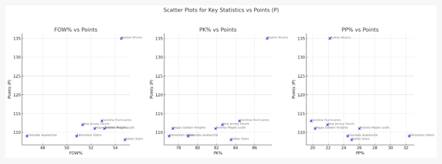
Here are the scatter plots showing the relationship between points (P) and each of the following statistics for the top 25% of teams: Face-Off Win Percentage (FOW%), Power Play Percentage (PP%), and Penalty Kill Percentage (PK%).
FOW% vs Points (P)
- There's no clear linear trend between FOW% and total points. This suggests that while faceoffs can be an important aspect of the game, they might not be the sole determining factor for a team's success in terms of points.
- The Colorado Avalanche, despite having a significantly lower FOW%, still managed to be among the top teams in terms of points.
PK% vs Points (P)
- There appears to be a slight positive correlation between PK% and total points. Teams with higher penalty kill percentages tend to have more points, though there are exceptions like the Vegas Golden Knights.
PP% vs Points (P)
- The scatter plot reveals a more noticeable positive trend between PP% and total points. The Edmonton Oilers stand out with a very high PP%, reinforcing the importance of power plays in achieving high points in the season.
As we've covered Chat GPT in other editions, it can be a useful starting place to see what initial observations the Chat GPT engine can uncover given a dataset. However, if you want to do a more detailed analysis, you will likely want to bring these results into your own environment to expand, deepen and customize your analysis.
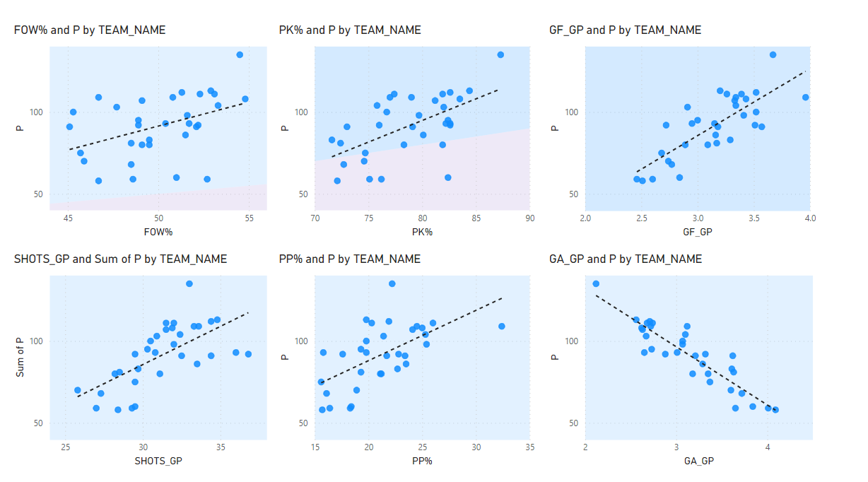
For example, we also analyzed the Team Stats data in Microsoft Power BI to compare relationships between a sampling of the metrics to points. Below are six scatter plots that give you better views of the relationships, the strength (or weakness) through the grouping and trajectory of the data points and the grade of the trend lines. From this analysis, for example, we observed stronger relationships between Goals For (strong positive) and Goals Against (strong negative) and Shots per Game Played (moderately strong positive).
So, while Chat GPT can get you started, it's good to use other tools/techniques to both validate and expand the analysis of your hockey data.
Check out the below to see how you can use Chat GPT to create a team performance report.
Walkthrough: Creating a Top 25% Team Performance Report
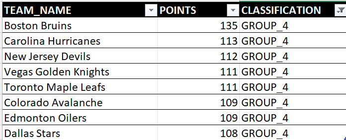
In this next walkthrough, we used quartiles to divide the teams into four different categories. Quartiles can be used as a generic way to split data four ways. In this analysis we used points (P) to segment the quartiles, which results in four groups categorized from worst to best teams based on their accumulated points. Below is GROUP_4 in the segmentation, which represent the top 25% of the NHL teams based on points in the 2022-2023 regular season.
Assuming you've created and applied the quartiles in the main tab of the downloaded Excel spreadsheet from the NHL site, you can first filter on the quartiles to get the top 25%. The column called GROUPS is where we've applied the quartiles below.
After you've done this:
- Hide all of the columns save for those below (select the columns you want to hide, right-click and select Hide). You want to compare Point Percentage (P%), Power Play Percentage (PP%), Penalty Kill Percentage (PK%) and Face Off Win Percentage (FOW%).
- After you've hidden the other stats, use the Conditional Formatting feature by selecting the cells under the column header, click Conditional Formatting, Color Scales and then choose the appropriate scale for your column.
You'll have something similar to the below – a heatmap to compare the teams – where you can visually compare each of the four stats across the top 25% of the league.
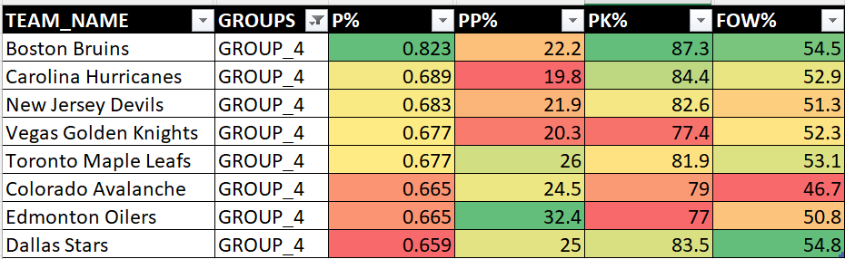
Example observations from the above are:
- While Boston finished first in the league overall in the 2022-2023 season, they were weak on the power play and strong on the penalty kill.
- Dallas were the best in the Top 25% for winning face offs.
- Edmonton was close to the bottom of the top 25% in terms of points, but were very strong in power plays and face offs.
- Vegas didn't seem to outshine anybody in the top 25%, yet they ended up winning the Stanley Cup.
These types of analyses are interesting in and of themselves, but they are also one piece in a broader story. With a comparison of this type, you'd want to dig into each team, look at individual player contributions, evaluate how teams played against one another, and so on, to get the full picture.
Check out the below to see how to create a Top 25% Team Performance Report using Microsoft Excel.
Walkthrough: Comparing Regular Season & Playoff Performance
Let's take the Top 25% analysis one step further and compare their performance across the 2022-2023 regular season and playoffs.
To do this:
- Navigate once again to the NHL Teams Stats page and select Playoffs in the Game Type filter and click Get Stats.
- After the data refreshes, click Export and save the file locally.
- You'll need to merge the playoff data into the regular season stats data, and the easiest way to do this is to create a new tab in your original Excel spreadsheet, copy the regular season data for the eight teams in the GROUP_4 category along with PP%, PK$, SF/SA and FOW%.
- From your newly downloaded spreadsheet, filter on those teams and those four stats and copy and paste those four playoff stats into the new tab.
- Create four new columns: PP% DIFF, PK% DIFF, SF/SA DIFF, and FOW% DIFF.
- Calculate the difference between the playoff and regular season performance and add conditional formatting to those columns.
You'll have something that looks like the below, but this is a bit unwieldly to look at, so hide all the columns that don't have conditional formatting.
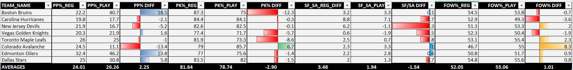
You'll now have something that looks like the below.
Example observations from the above are:
- On average, most teams improved their PP% and FOW% in the playoffs but slipped in their PK% and SF/SA.
- Boston excelled on the power play, but did really poorly on the penalty kill.
- Edmonton and Dallas also excelled on the power play in the playoffs.
- Colorado significantly improved on their face offs and their penalty kills in the playoffs.
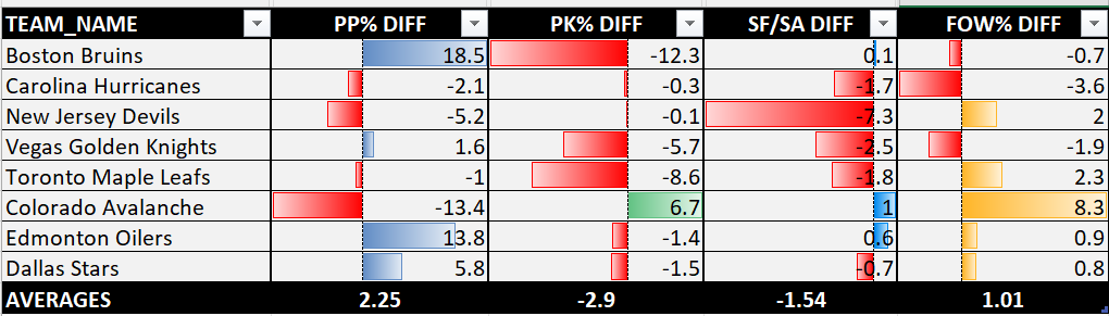
However, if we are to believe the earlier scatter plots, then PK% and PP% are marginal contributors to points (thus wins) and FOW% isn't statistically consequential when it comes to points either (at least in this analysis).
So, what about SF/SA (or shot differential), which is an indication of offensive versus defensive play?
Example observations from here were:
- Most of the teams slipped in the playoffs, so the shot differential was not in their favor. Boston, Colorado, and Edmonton were the exceptions with marginal improvements.
- New Jersey slipped the most out of the Top 25% of the teams – a significant decrease in their shot differential.
- Vegas was below the average, but again managed to win the Stanley Cup.
Check out the below to see how to create a comparative team performance report (comparing regular season stats to playoff stats).
Summary
So, what does all of these team performance reports and views tell us? As one part of a larger picture, they can give you some signal but you need to assemble a picture that takes the high-level view and then run it down. This might mean focusing more on a specific metric (e.g., Shots For/Shots Against) that is more consequential to points and wins. You also might want to include Goals Against Averages to evaluate the goaltending as well. The performance of goaltending in the playoffs is a major factor, so having this as an additional metric might better inform team performance.
Subscribe to our newsletter to get the latest and greatest content on all things hockey analytics!
Member discussion