How can I create a Team Summary Dashboard with Power BI?
In this Edition
- What is Microsoft Power BI?
- What is a Team Summary Report?
- Example Team Summary Report
- Walkthrough: Creating the Team Summary Report in Power BI
What is Microsoft Power BI?
Microsoft Power BI is a business analytics tool that allows users to visualize data and share insights across an organization, or embed them in an app or website. It's a collection of software services, apps, and connectors that work together to turn unrelated sources of data into coherent, visually immersive, and interactive insights.
Power BI is one of a range of BI development tools that is used in the sports industry – this list includes tools such as Power BI, Tableau, Qlik, Google Analytics, and so on. Hobbyists can use the free desktop version of Power BI, which is great for building interactive dashboards to various data sources through manual import or through pre-existing connectors. The professional Data Analyst or Data Scientist will likely be cleaning and transforming data to import into Power BI, so additional tools/programming languages such as RStudio and R, Python or Excel would likely also be used in building analyses.
Power BI can be used in several ways, such as:
- Connecting to Data Sources: Power BI can connect to a wide range of data sources, including cloud-based and on-premises databases, Excel spreadsheets, and even web APIs.
- Transforming and Cleaning Data: Through Power Query, analysts can transform raw data into a more usable format. This includes cleaning, reshaping, and combining data from different sources.
- Creating Reports and Dashboards: Analysts can design interactive reports and dashboards, which can include a variety of visualization tools like charts, maps, and sliders.
- Sharing Insights: Once the reports are ready, they can be published to the Power BI service for others to view and interact with.
- Automating and Monitoring Data Flows: Power BI allows the scheduling of data refreshes and sends alerts on specific triggers, making it easier to monitor key metrics and trends.
To follow are example reports a Sports Scientist might create in Power BI.
- Performance Analysis: By integrating player performance data, you can create dashboards to monitor metrics like speed, endurance, heart rate, and more.
- Injury Prevention and Health Monitoring: You can track health and fitness data to identify patterns and risk factors for injuries.
- Game Strategy Development: By analyzing game data, you can develop strategies based on the strengths and weaknesses of your team and the opposition.
Advanced users, such as Data Scientists, will use Power BI in deeper and cross-integrated ways (i.e., data integrated across multiple tools and platforms), such as the following:
- Exploratory Data Analysis: Quickly visualize and explore data to understand trends and patterns, which is crucial before diving into more complex analyses.
- Model Visualization and Explanation: After building predictive models or running statistical analyses, you can use Power BI to visualize these complex models in an understandable way.
- Integrate Advanced Analytics: Power BI can consume outputs from advanced analytics platforms and programming languages like R or Python, allowing data scientists to integrate sophisticated models directly into reports.
In this edition, we'll work through a no-code way of building a Team Summary Report in Power BI. You'll find this useful if you're a hobbyist or data analyst wanting to learn how to get started with Power BI.
What is a Team Summary Report?
A Team Summary Report in hockey is an overview of a team's performance, encompassing various metrics that provide insights into different aspects of the game. It's an important tool for coaches, team managers, and analysts to assess the team's strengths, weaknesses, and areas for improvement. It's also a way to compare teams against one another to see where one team may be stronger. Team Summary Reports are also used by the hobbyist, whether to track their favorite teams, evaluate how two teams might compete in an upcoming match or make fantasy hockey picks.
Some examples of metrics within a Team Summary Report are as follows:
Offensive Metrics
- Goals Scored: Total number of goals scored in a season or over a set of games.
- Shots on Goal: The number of shots taken that are on target.
- Shooting Percentage: Goals scored as a percentage of shots taken.
- Power Play Efficiency: Success rate of scoring during power plays.
Defensive Metrics
- Goals Against: Total number of goals conceded.
- Penalty Kill Percentage: Effectiveness in preventing goals while one or more players are in the penalty box.
- Blocked Shots: The number of shots blocked by players.
- Takeaways: Number of times the team has gained possession from the opponent.
Player Performance Metrics
- Points: Total points scored by a player, combining goals and assists.
- Plus/Minus Rating: A player's impact on the game, represented by the team’s goal differential when they are on the ice.
- Time on Ice (TOI): The amount of time a player spends on the ice during a game.
Goalie Stats
- Save Percentage: Percentage of shots on goal that the goalie saves.
- Goals Against Average (GAA): Average number of goals conceded by the goalie per game.
- Shutouts: Number of games where the goalie has conceded no goals.
Team Dynamics
- Faceoff Win Percentage: Success rate in faceoffs.
- Hits: Number of physical contacts initiated.
- Penalty Minutes: Total minutes spent by players in the penalty box.
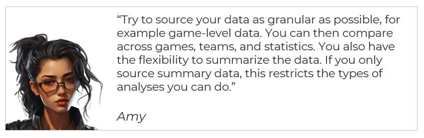
What about the Data?
Different reports require different types of data. For example, here are some examples of data that you might need to build a Team Summary Report.
- Game-by-Game Performance Data: Detailed statistics from each game.
- Player-Specific Data: Individual performance metrics for each player.
- Seasonal and Historical Data: Past performance data for trend analysis and comparison.
- Opponent Statistics: Data on opposing teams for comparative analysis.
When creating your own Team Summary Report, you can leverage different features of Power BI to make a great dashboard – whether it's just for you and your friends or it's for a professional organization. Below are a few of these features:
- Interactive Dashboards: Utilize Power BI’s interactive dashboards to present data. Users can click through different metrics and view them in real time.
- Data Visualizations: Graphs, heat maps, and charts to visualize complex data, like player heat maps or goal distributions.
- Drill-Down Features: Allow users to drill down from team-level statistics to individual player performances.
- Customizable Reports: Tailor reports for specific audiences – coaching staff may want more detailed tactical data, while management might focus on player performance and team efficiency.
- Predictive Analytics: Integration of predictive models to forecast future performance or assess potential outcomes of games.
- Real-Time Data Integration: Use real-time data for up-to-date analytics, crucial during ongoing seasons or matches.
In summary, a Team Summary Report in hockey, especially when built in a tool like Power BI, provides a dynamic and comprehensive view of a team's performance. It typically blends historical data with current season statistics, offering valuable insights for decision-making, strategic planning, and performance improvement.
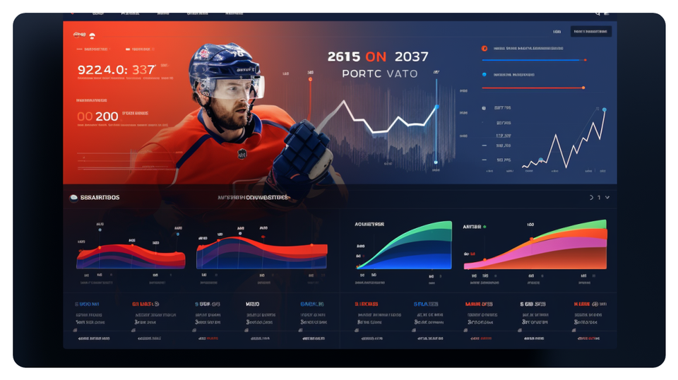
Example Team Summary Report
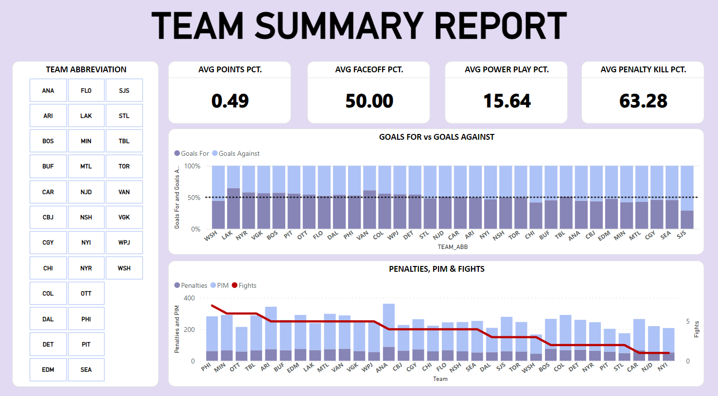
For this edition, we're going to create an interactive dashboard comprising the following metrics:
- Average Points Percentage, Faceoff Percentage, Power Play Percentage and Penalty Kill Percentage
- Goals For versus Goals Against
- Penalties, PIM (Penalties in Minutes) and Fights
This dashboard won't be comprehensive, but it will guide you on how to create a dashboard that summarizes (and enables you to compare) key metrics around offense, defense, special teams, and physicality.
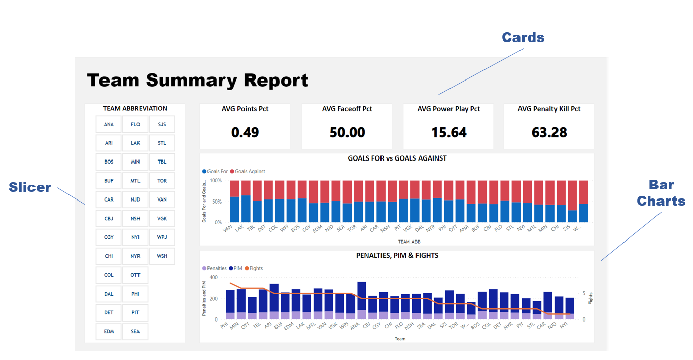
We'll use three main visualizations to create the interactive dashboard:
- Slicer – which will act as the filter for all or specific teams
- Cards – which will give a summary (average) of the percentage-based metrics
- Bar charts – which will show the ratios of goals for and against and show those teams that are taking more penalties and more physical
You can see below what this dashboard will look like, along with call-outs for each of the three visualizations.
Our design won't be too fancy, but we will add some sources we have used in the Additional Resources section that cover off on design.
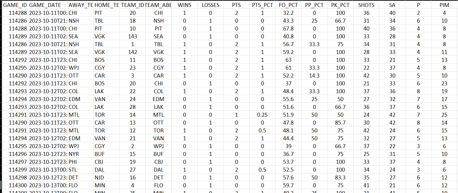
The data we will use for this report will be the game details (at the team level) from the beginning of the 2023-2024 season to the date of writing this article – so game data from 10/10/23 to 11/30/23.
For this project, we used mysportsfeeds as our data provider, but there are various data sources you can use to get game data.
The below shows that the data we used has both game metadata and stats from the game for both the home and away teams. Each row represents a single team's stats for that particular game.
We have this data stored as a CSV file locally; however, Power BI is very flexible; you can import the file manually or store the data file(s) in Cloud storage.
With your CSV file in hand, you can move onto creating the Power BI report.
Walkthrough: Creating the Team Summary Report in Power BI
To create the Team Summary Report:
- Install Microsoft Power BI if you haven't already. You can visit the Microsoft Power BI home page to download the free desktop version.
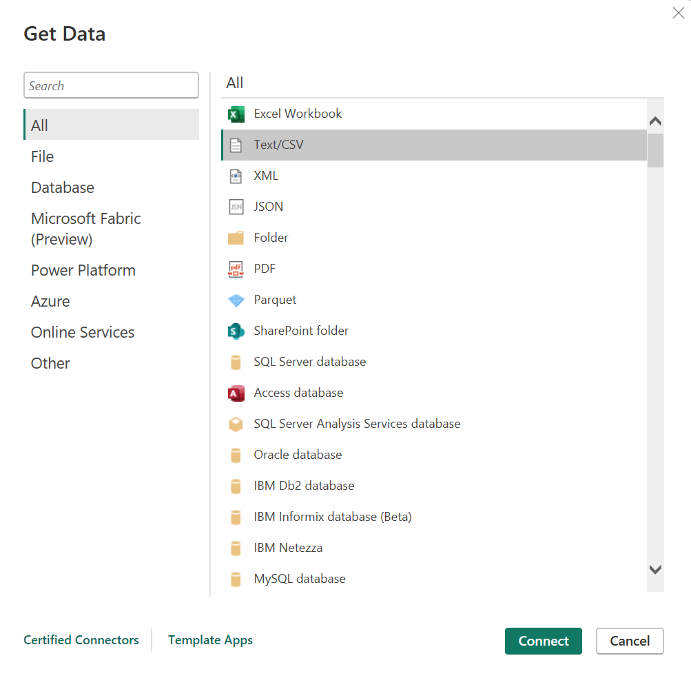
- Open Microsoft Power BI and click Get Data.
- Select Text/CSV and click Connect, per the screenshot below.
- Navigate to your team hockey data and click Load.
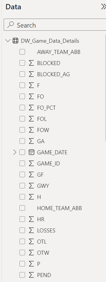
After the hockey data is loaded into Power BI, you will see the data in the Data pane. By default, you should see the summation sign beside most of the data that is loaded – you can change the calculation to suit your needs as you build your dashboard (e.g., change sum to average).
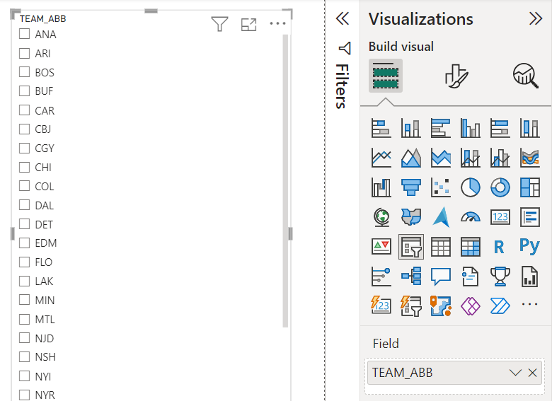
To create the different visualizations, you click the one you want to use and then drag and drop the data into the appropriate field for that visualization. For example, to create the slicer control, click the Slicer in the Visualizations pane and gallery, and then drag the data fields you want to use for the filter. For this report, we used TEAM_ABB, which are the abbreviations for each team in the NHL. Below is the default view, which you can configure to improve the look, feel and functionality.
For our Team Summary Report, we used the Tile configuration for the slicer. To change the configuration:
- Click the slicer control, Slicer Settings in the Visualization pane and select Tile in the Style drop-down list.
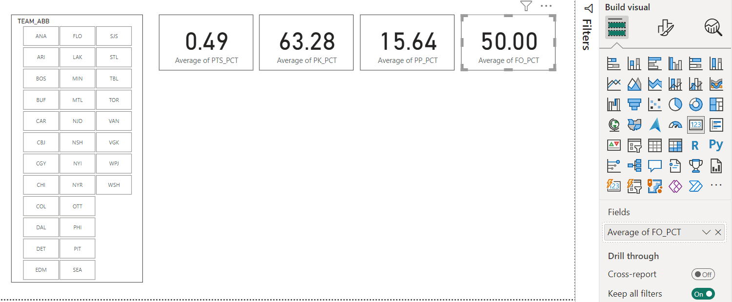
The next task is to create the cards. To add and configure the cards:
- Click Card from the Visualizations pane and gallery.
- Drag and drop the metric from the Data pane to the card.
- Adjust the formatting of the card to your liking.
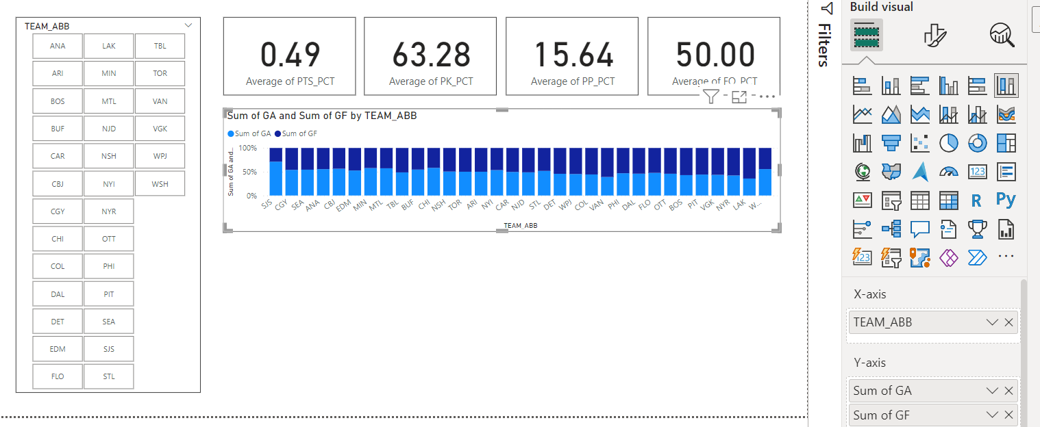
You can copy and paste the cards so your formatting is symmetric and then drag and drop new data to replace the existing data and values displayed in the card. If you've followed along, you should have something similar to the below now. These represent the averages for all of the games and teams, for example, 50% is the average Faceoff Percentage for all teams across the games in the dataset.
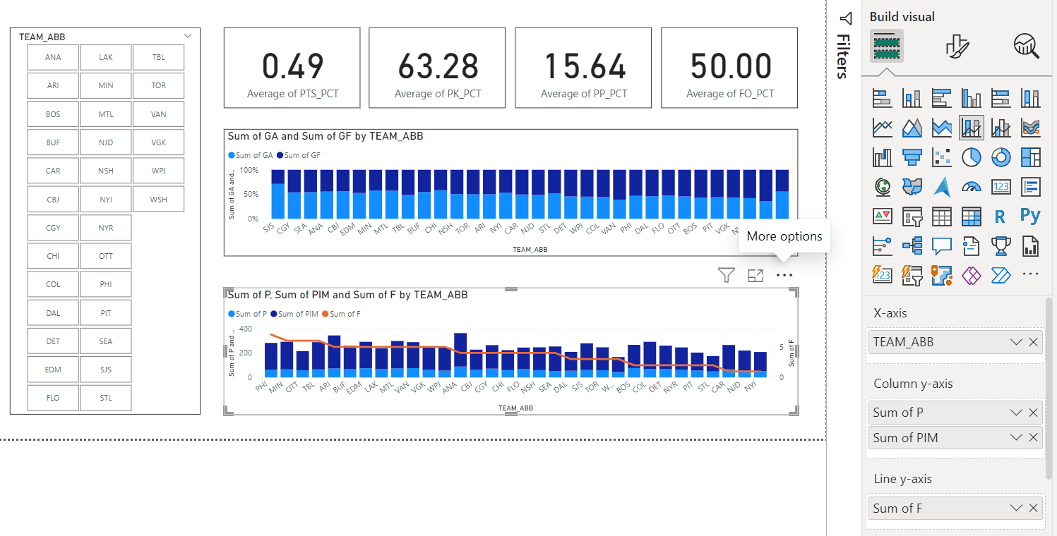
The final part are the bar charts, and similar to the other controls, you click the visualizations you want and then drag the data into the appropriate fields.
The first chart is a 100% Stacked Column Chart with the teams (TEAM_ABB) on the X-axis and Goals For (GF) and Goals Against (GA) – configured as Sum of XX – on the Y-axis. This visualization gives you a visual indication of the proportion of goals scored for and against for each team – and in comparison across the teams.
And the last visualization is the Line and Stacked Column Chart. Here you can see the team (TEAM_ABB) is again the X-axis and penalty information (P and PIM) are on the Y-axis. The line on the Y-axis is fights (F). This visualization shows which teams are higher on taking penalties and incurring more fights – so their physical game. You might look at this independently to see which teams are the most physical, but it's more useful when correlated against other factors (e.g., win/loss record, save percentage, etc.) to see how a team's physical game is impacting other parts of their performance.
The result of this is a summary report that gives you the ability to select one or more teams using the slicer with the data being updated in the other visualizations and then see the updated data for those teams represented in the charts.
After you have the essential visualizations in place with the interactivity across the dashboard, you can add your design and branding. For example, use a consistent font, adopt the colors and branding of the sports team you represent, make the colors in the charts meaningful or representative of the underlying data (e.g., red for fights). We've added some minimal design elements to at least make our dashboard a bit more palatable.
For a quick-hit video on how to create and configure the dashboard, check out the following YouTube video.
Summary
In this edition, we introduced you to Microsoft Power BI and showed you how to create an interactive Team Performance Report. The report comprised three types of controls: 1) a slicer to filter data across that report, 2) a set of cards to represent averages for the selected teams and 3) column charts for a comparative view on goal scoring and physicality.
We created this report relatively quickly, but we would recommend spending some time designing the report before opening up Power BI. For example:
- Be sure you understand the questions you are trying to answer in the report;
- Articulate the goals of the report;
- Determine where and how you will source your data (and the nature and depth of data cleaning and transformation you'll need);
- Lay out a logical interactivity within the report for your users; and
- Be sure to design contrasting colors within your visualizations so consumers can easily interpret your charts.
The above process may seem like a lot, but it will save you time in your development and design phases.
Additional Resources
If you're like us, visual design is not our forte. So, here are some additional resources for you to integrate design ideas into your Power BI dashboard.
- Freepik - Search Freepik for ideas for templates and color combinations.
- Adobe Stock - Search on 'dashboard' to get some ideas for design.
- Color-Hex - For hex codes for different colors.
We'd also recommend checking out this short video from Mara Pereira (Data Pears) for some great Power BI Design ideas.
Subscribe to our newsletter to get the latest and greatest content on all things AI and Hockey!
Member discussion