Build an Enforcer Dashboard using Power BI
This edition walks you through how to use the Enforcer Index to build an Enforcer Dashboard using Microsoft Power BI. We also show you how to analyze the hockey stats data in R and RStudio.

In this Edition
- Why an Enforcer Dashboard?
- What are Potential Reports?
- Walkthrough: Creating an Enforcer Dashboard using Power BI
Introduction
In our last newsletter, entitled "Where are all the Enforcers?", we introduced the notion of an Enforcer Index (calculated using hits, penalties and fights and counter-balanced with points) and walked through how you can use the Enforcer Index to create social media content. At the time of writing, Austin Watson turned out to be the top enforcer (using our index), so we built a mock social campaign using him.
In this newsletter, we'll expand on the Enforcer Index, inspect the data more closely (using R and RStudio) and build out a dashboard comprising four separate reports using Power BI.
Why an Enforcer Dashboard?
A single, calculated statistic can be interesting because it represents a specific part of the game, team or player. For example, the following visualization implements the Enforcer Index showing which team has the highest index.
While interesting in and of itself, what's more compelling is understanding the impact of a higher or lower level of the Enforcer Index. And this is where a dashboard is useful: it gives you a broader view of not just physical or enforcer stats, but also explores the impact of those stats in other areas of team or player performance.
That said, no matter why you're evaluating a team (whether scouting, drafting, fantasy hockey, or something else), physical aspects are important to consider. The idea of "goon-ness", though, begins to move beyond the mere physical into a deliberate form of aggression. So, how much enforcer is too much? And what are the impacts of having too much enforcer in other areas of a team's game? These are the questions we want to explore through building an Enforcer Dashboard.
Generally speaking, creating an Enforcer Dashboard is beneficial for several reasons, which are listed below.
- Comprehensive Overview: A dashboard provides an overview of different statistics, such as penalties, fights, hits, and major penalties, across all teams – through summary statistics, correlations or trend analyses. This holistic view can help identify trends, patterns, and outliers in the data, offering insights into the physicality of the game and its impact on team performance.
- Performance Benchmarking: Teams and players can benchmark their performance against the league average or specific teams. Understanding where a team or player stands in terms of physical play can inform strategies, training, and player development to either leverage physicality as a strength or mitigate its risks.
- Interactive Data Exploration: With an Enforcer Dashboard, users can drill down into specific details, filter by teams or players, and view hockey data from different perspectives. This interactivity allows for a deeper understanding of the physicality in the game across different teams.
- Visual Analytics: Power BI's strong visual analytics capabilities allow for informative visualizations – e.g., bar charts, line graphs, heat maps, and more – making it easier to digest complex datasets and derive meaningful insights.
- Historical Analysis: A dashboard enables users to analyze trends over time. This reveals how the role of physical play has evolved in the NHL, how specific rule changes have impacted player behavior, and how teams have adapted their strategies in response.
- Accessibility and Sharing: Dashboards can be shared across an organization or with the public, making it a great tool for communication. Coaches can use the dashboard to discuss strategies, analysts can present findings to management, and fans can engage more deeply with the sport.
- Data-Driven Decision Making: With detailed enforcer stats available through the dashboard, team management can make informed decisions regarding roster composition, game strategy, and player discipline. This data-driven approach can enhance a team's competitiveness and on-ice success.
In summary, a Power BI dashboard dedicated to enforcer stats can enhance the understanding of the physical aspects of hockey, inform strategic decisions, and increase engagement among teams and fans alike by leveraging the power of data visualization and analytics.
What are Potential Reports?
If we use the same dataset we created in Where are all the Enforcers?, a few stats are worth exploring. For example:
- To get a sense for ranking across physical and aggression metrics, evaluating the comparative distribution of Hits, Fights, PIM, etc. across teams would be useful.
- To explore relationships across physical and aggression metrics, creating linear models (or correlation plots) between the Enforcer Index and Hits, Fights, Penalties, etc. would be useful.
- You might want to explore the relationship between Points and Enforcer Index to see what impact overdoing it in the enforcer department has on point production.
- To understand how different positions might be more or less aggressive could also be explored by looking at Position versus Enforcer Index (and of course other physical and aggression metrics as well).
- And lastly, looking at Plus/Minus versus the Enforcer Index gives you a sense for the playmaker/enforcer balance (or imbalance) across players.
Our preferred method of exploring hockey data is initially through R and RStudio. The questions we'll explore in R are as follows:
- Is there a positive or negative impact on goal-scoring when teams have a high Enforcer Index?
- How do teams perform (using goal-scoring as the lens) above or below the average Enforcer Index?
- What do we find when we compare two teams through the lens of the Enforcer Index?
Let's tackle each of these questions.
Enforcer Index & Goals Report
A positive linear relationship between the Enforcer Index and goals roughly translates into a more physical and enforcer-minded and aggressive team results in more goals. If you've played hockey, there's likely an alarm going off in the back of your head right now. But, let's test the validity of that alarm.
In the following R code snippet, we've loaded the libraries, loaded our enforcer dataset, implemented some data transformation, filtered the main dataset and created a simple linear model using a scatter plot. Note that we've also included a final step to transform the ggplot visualization into a plotly chart (which gives you a more interactive chart).
# Load libraries for R script
library(dplyr)
library(ggplot2)
library(plotly)

# Read in enforcer stats dataset
enforcer_stats_data <- read.csv("NHL_Player_Goon_Data.csv")

# Transform some of the data
enforcer_stats_data$GOON_INDEX = round(enforcer_stats_data$GOON_INDEX, 2)
enforcer_stats_data$GOON_INDEX_SCALED = round(enforcer_stats_data$GOON_INDEX_SCALED, 2)
enforcer_stats_data$TIME_ON_ICE = round(enforcer_stats_data$TIME_ON_ICE / 60, 2)
enforcer_stats_data$AVG_TIME_PER_GAME = round(enforcer_stats_data$TIME_ON_ICE / enforcer_stats_data$GAMES_PLAYED, 2)

# Calculate the league average for enforcer index goals per player
AVG_LEAGUE_ENFORCER_INDEX = round(mean(enforcer_stats_data$GOON_INDEX_SCALED),2)
print(AVG_LEAGUE_ENFORCER_INDEX)
AVG_GOALS_PER_PLAYER = round(mean(enforcer_stats_data$GOALS),0)
print(AVG_GOALS_PER_PLAYER)

# Subset off of the main dataset (includes teams, index and goals)
team_goon_index <- enforcer_stats_data %>%
  group_by(TEAM_ABBR) %>%
  summarise(AVG_ENFORCER_INDEX = mean(GOON_INDEX_SCALED, na.rm = TRUE),
            AVG_GOALS = mean(GOALS, na.rm = TRUE)) %>%
  arrange(desc(AVG_ENFORCER_INDEX))

# Create a scatter plot linear model
linear_enforcer_to_goals_model <- ggplot(team_goon_index, aes(x = AVG_ENFORCER_INDEX, y = AVG_GOALS)) +
  geom_point(color = "blue", size = 3, alpha = 0.6) +
  geom_smooth(method = "lm", se = FALSE, color = "darkred", linetype = "dashed", size = 1) +  # Improved line
  labs(title = "Relationship between Enforcer Index and Goals",
       subtitle = "Linear model fit shown in dashed red",
       caption = "Created by Data Punk Hockey",
       x = "Enforcer Index",
       y = "Average Goals") +
  theme_bw() +
  theme(plot.title = element_text(face = "bold", size = 14),
        plot.subtitle = element_text(size = 10),
        plot.caption = element_text(size = 8, margin = margin(t = 10)),
        axis.title = element_text(size = 12),
        axis.text = element_text(size = 10),
        legend.position = "none",
        panel.grid.major = element_blank(),
        panel.grid.minor = element_blank())

# Print plot to console
print(linear_enforcer_to_goals_model)

# Optional step: Create plotly chart from above ggplot chart
p <- ggplotly(linear_enforcer_to_goals_model)

p
The result of the above code is the following scatter plot, or a negative linear relationship between the Enforcer Index and goals. The rough translation of this graph is we can see as the Enforcer Index increases, the average goals per player decreases – hence the negative relationship. So, yeah that alarm in your head? Totally justified. (Unless it's the seventies and you're a Sabres fan. Then, sadly that alarm was one of despair.)
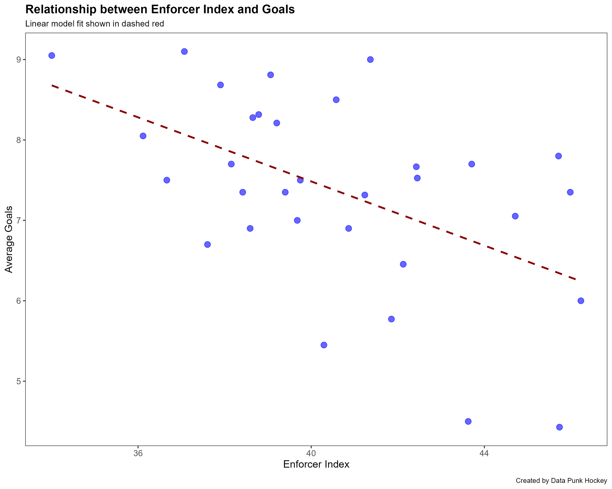
It's unlikely that a scout, coach or development staff in today's game of professional hockey will load up on the enforcers. But, this shows you that if you isolate these two variables to explore their relationship, it results (at least in our case) in a negative correlation.
Team Performance (Goal Scoring) & Enforcer Index Report
In the earlier code, we calculated the average enforcer index for the league and the average goals per player for the league, which were (model was run on 02/02/24) roughly 40% for the Average Enforcer Index and 7 for the Average Goals per Player. From this, we can discern the middle point in the league for our calculated enforcer metric. So, in this next analysis, we'll take only those teams above the average and look at their goals per player.
Let's add the following code to the earlier R snippet. This creates the average for the league for the Enforcer Index, filters the dataset against that number and creates a visualization to show the results.
...

average_goon_index <- mean(team_goon_index$AVG_ENFORCER_INDEX)

teams_above_average <- team_goon_index %>%
  filter(AVG_ENFORCER_INDEX > average_goon_index)

teams_above_enforcer_average_chart <- ggplot(teams_above_average, aes(x = reorder(TEAM_ABBR, AVG_GOALS), y = AVG_GOALS, fill = TEAM_ABBR)) +
  geom_bar(stat = "identity", show.legend = FALSE) +
  geom_text(aes(label = sprintf("%.1f", AVG_GOALS)), hjust = 1.1, color = "white", size = 3.5) +
  coord_flip() +
  labs(title = "Above Average Enforcer Index Scaled vs Average Goals",
       x = "Team",
       y = "Average Goals") +
  scale_fill_viridis_d() +
  theme_bw() +
  theme(plot.title = element_text(face = "bold", size = 14, hjust = 0.5),
        axis.title.x = element_text(size = 12),
        axis.title.y = element_text(size = 12),
        axis.text.x = element_text(size = 10),
        axis.text.y = element_text(size = 10),
        panel.grid.major = element_blank(),
        panel.grid.minor = element_blank(),
        panel.background = element_blank(),
        plot.background = element_rect(fill = "transparent", color = NA))

print(teams_above_enforcer_average_chart)
The result is the following chart, which shows a ranked view of the teams that are currently operating above the average Enforcer Index for the league in terms of average goal production.
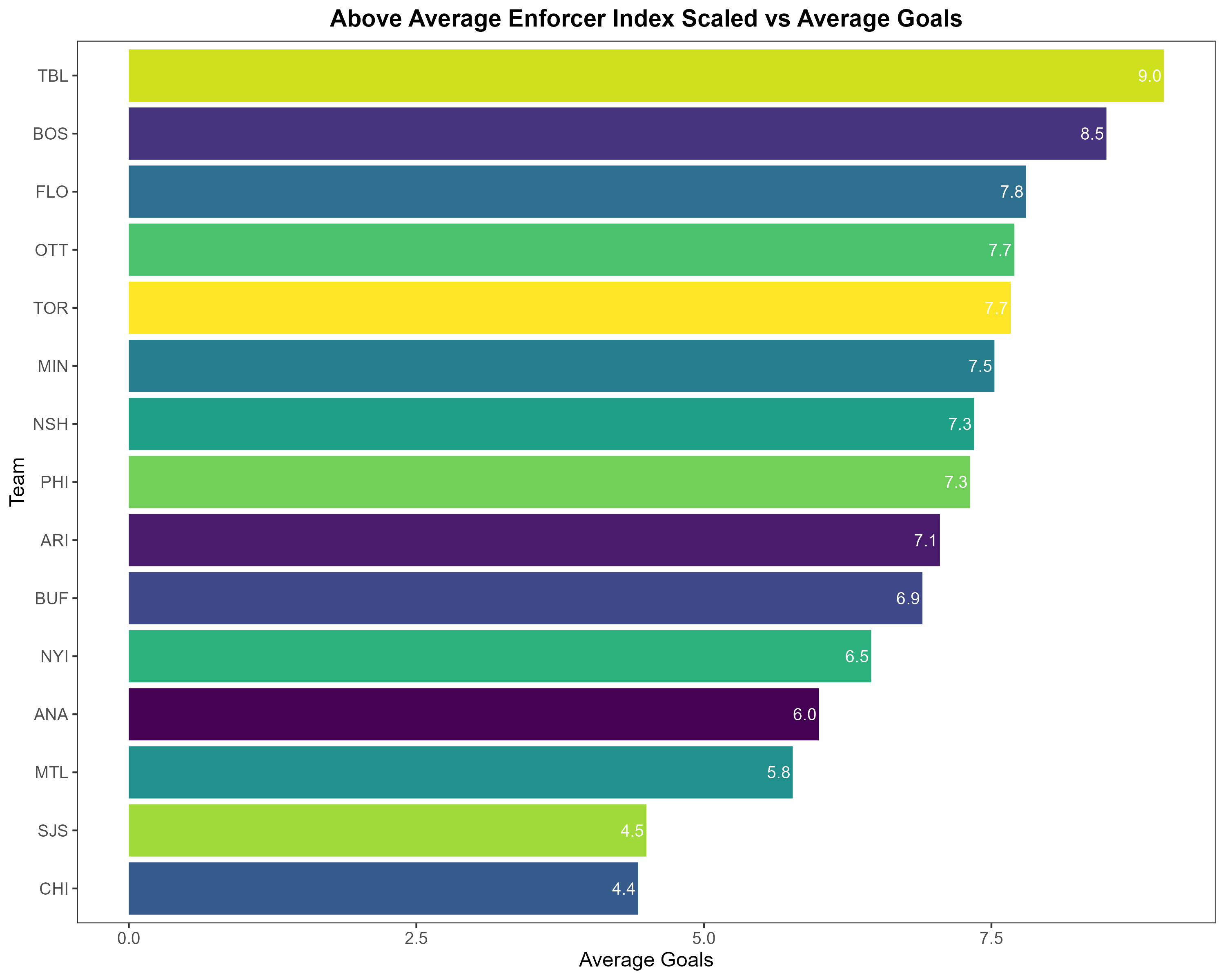
So, this is kind of cool. You get a sense for those teams that have a bit of goon-ness in them and their scoring prowess. But, we can do more. For example, what if the playoffs were to start today? How many of these teams would make the playoffs? Let's give it a try.
Here's another view of the data, but this time calling out those teams that have a playoff spot – assuming the playoffs started today. And here's where it gets interesting: five of the teams on the list would make the playoffs. So, roughly 33% of the teams that have an above average Enforcer Index have decent enough goal production to land them a spot in the playoffs. Said another way: 66% of the teams that are above average in the enforcer department would not make the playoffs.
With this data in hand, there is evidence to suggest that a more physical and aggressive team can be successful – but it's likely down to balance across other statistics. So, at this point you would want to do a deeper dive on those teams that have the playoff spot versus those teams that don't; that is, compare them to see what other contributing factors could be driving their playoff-spot success.
So, let's do that.
Team Comparison Report
Using the last chart as our starting point for this analysis, we'll explore Buffalo versus Florida. (Honestly, Buffalo, we're not trying to beat up on you today!) for expediency, we'll explore six different metrics:
- Goals
- Assists
- Fights
- Hits
- Penalties
- Plus Minus
You can do more on your own, but the above will give us a more three-dimensional sense for how each team is playing – as above average enforcer teams.
Add the following to the R script to continue your analysis. In this snippet, we're filtering the data down to Florida and Buffalo, creating a new data frame with some summary metrics in it, restructuring the data frame and then creating a visualization from the new data frame.
...
selected_teams <- enforcer_stats_data %>%
filter(TEAM_ABBR %in% c("FLO", "BUF"))
average_stats <- selected_teams %>%
group_by(TEAM_ABBR) %>%
summarise(Fights = mean(FIGHTS, na.rm = TRUE),
Goals = mean(GOALS, na.rm = TRUE),
Assists = mean(ASSISTS, na.rm = TRUE),
Hits = mean(HITS, na.rm = TRUE),
Penalties = mean(PENALTIES, na.rm = TRUE),
Plus_Minus = mean(PLUS_MINUS, na.rm = TRUE))
print(average_stats)
average_stats_long <- pivot_longer(average_stats, cols = c(Goals, Assists, Plus_Minus, Hits, Penalties, Fights),
names_to = "Statistic", values_to = "Value")
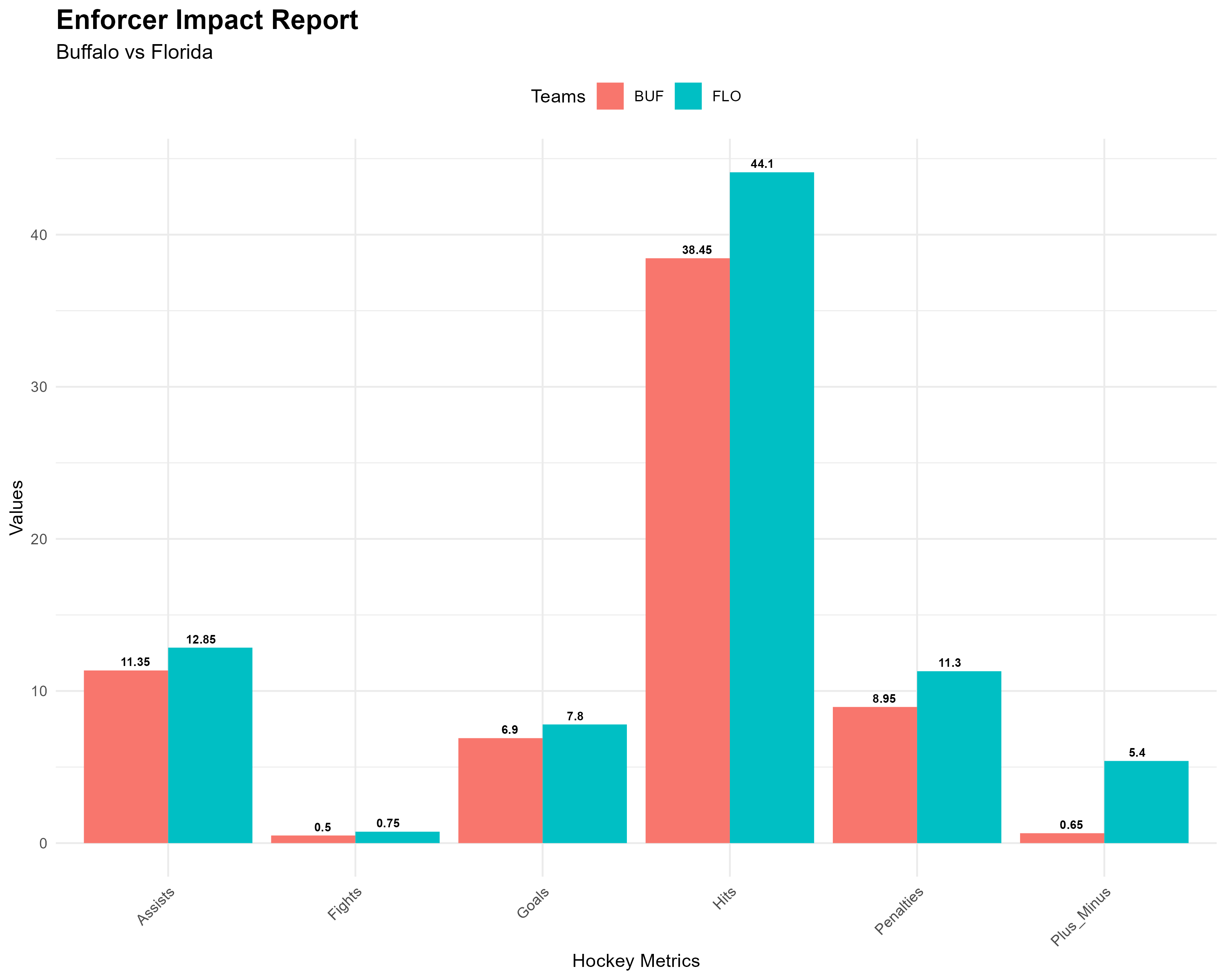
team_comparison_chart <- ggplot(average_stats_long, aes(x = Statistic, y = Value, fill = TEAM_ABBR, label = Value)) +
geom_bar(stat = "identity", position = "dodge") +
geom_text(position = position_dodge(width = 0.7), vjust = -0.5, size = 2.5, fontface = "bold") +
theme_minimal() +
theme(axis.text.x = element_text(angle = 45, hjust = 1),
legend.position = "top",
plot.title = element_text(size = 16, face = "bold"),
plot.subtitle = element_text(size = 12)) +
labs(title = "Enforcer Impact Report",
subtitle = "New Jersey vs Nashville",
x = "Hockey Metrics",
y = "Values",
fill = "Teams")
print(team_comparison_chart)
What emerges from the above is the following Enforcer Impact Report. And this begins to get a bit more interesting. For example, here we can see that while both Florida and Buffalo may be above the enforcer average:
- Florida is better on goal-scoring and assists.
- Florida is also balancing their aggressive game, with more fights, hits and penalties.
- And most stark is the delta in the average plus minus – Florida are way ahead.
In short, Florida are balancing their overall game (across enforcer status, goal-scoring and playmaking) much more efficiently than Buffalo.
So, that was fun right? Well, we're not done yet.
Let's move onto the final part of this week's newsletter.
Walkthrough: Creating an Enforcer Dashboard using Power BI
Much like the reports in the last section, the analytical goal of the dashboard is to provide a holistic picture of the more physical side of a team's performance and areas of impact. We'll target answering four questions through the reports:
- How do NHL teams compare when it comes to physical metrics – e.g., hits, fights and penalties?
- What is the relationship between the Enforcer Index and Goals?
- What are the impacts of other physical metrics on a team's ability to score?
- Are there major differences in metrics, including the Enforcer Index, across different player positions?
The walkthrough this week comprises three steps:
- Source the data
- Load the data into Power BI
- Build the reports in Power BI that will make up the dashboard
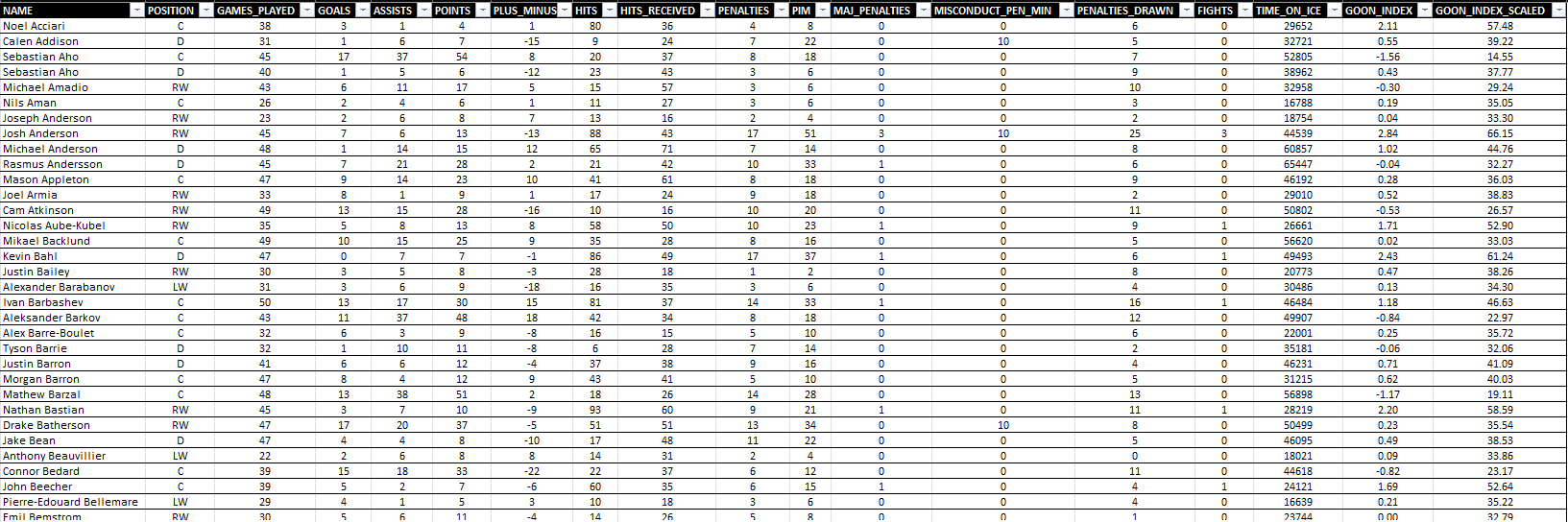
Source the Data
For the data, we'll re-use the data from our last week's newsletter, which you can download from here. The CSV file looks similar to the below when opened in Microsoft Excel.
Load the Data into Power BI
If you've used Power BI before, you're an old pro at this. But, if you're new to this here's how you load the data:
- Open Power BI.
- Click Get Data, select Text/CSV and click Connect.
- Navigate to the CSV referenced above and click Open.
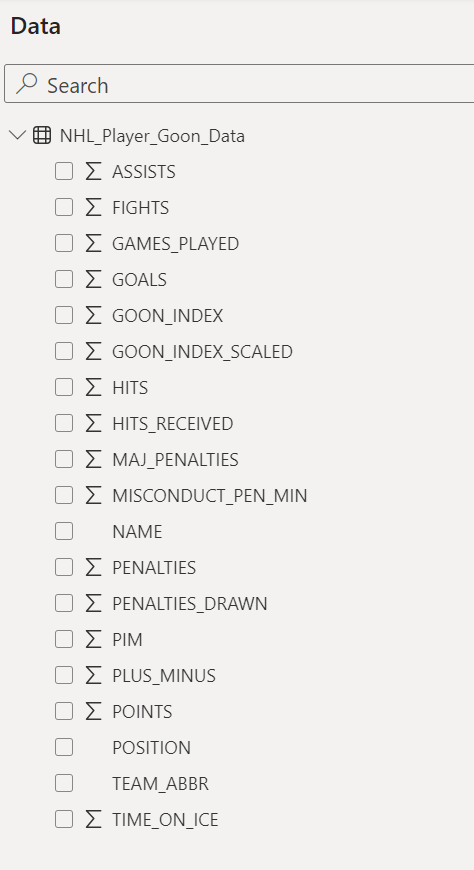
When complete, you should see the following columns in the Data pane.
Build the Reports in Power BI
With the data loaded in Power BI, let's cover each of the reports that make up the dashboard.
- Intro Tab: Provides a introductory view with a menu for the reports that make up the dashboard.
- Summary Stats Tab: Provides summary statistics for Fights and Enforcer Index by Team.
- Enforcer Index vs Goals Tab: Explores the relationship between the Enforcer Index and Goals.
- Team Comparison Tab: Compares Points, Plus/Minus, Hits and Fights by Team.
- Position Comparison Tab: Compares Points, Enforcer Index, Penalties and Fights by Position.
Also, note that we created a background design for the reports (shown below) using PowerPoint.

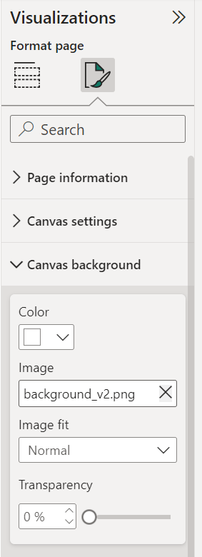
You can create and use your own background and then in Power BI click Visualizations, expand Canvas background and click inside the Image field to find and add your custom background.
Intro Tab
The Intro Tab is straightforward. Choose an image to add as the background to the canvas and then add a menu so you can navigate your dashboard. We added the image first, then added all of our other tabs and as a final step came back and added the navigation bar.
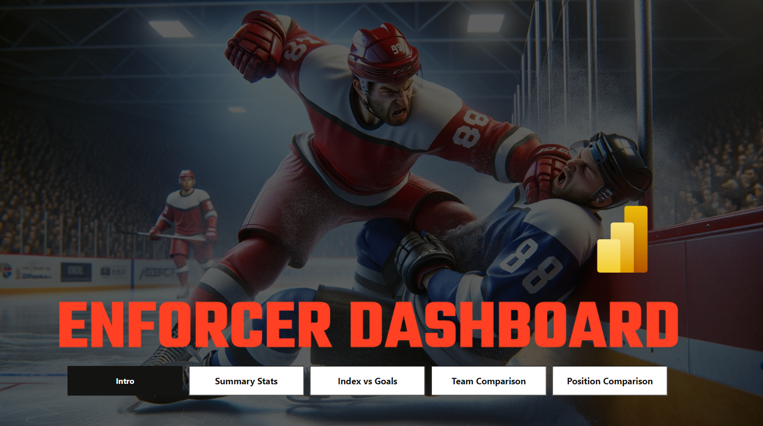
To add the navigation bar, click Insert, select Add a button to your report, and click Navigator and Page Navigator. You can format the look and feel of the menu, and to navigate you click Ctrl and click your button of choice.
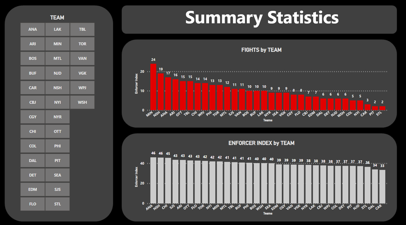
Summary Stats Tab
The Summary Stats Tab comprises three controls:
- One Slicer control - using the TEAM_ABBR data (allows you to filter for specific teams).
- Two Clustered Column controls - where the X-Axis is TEAM_ABBR for both charts and the Y-Axis for one chart is FIGHTS and GOON_INDEX_SCALED for the other chart.
After adding these controls, along with the custom background, your report should look like the following.
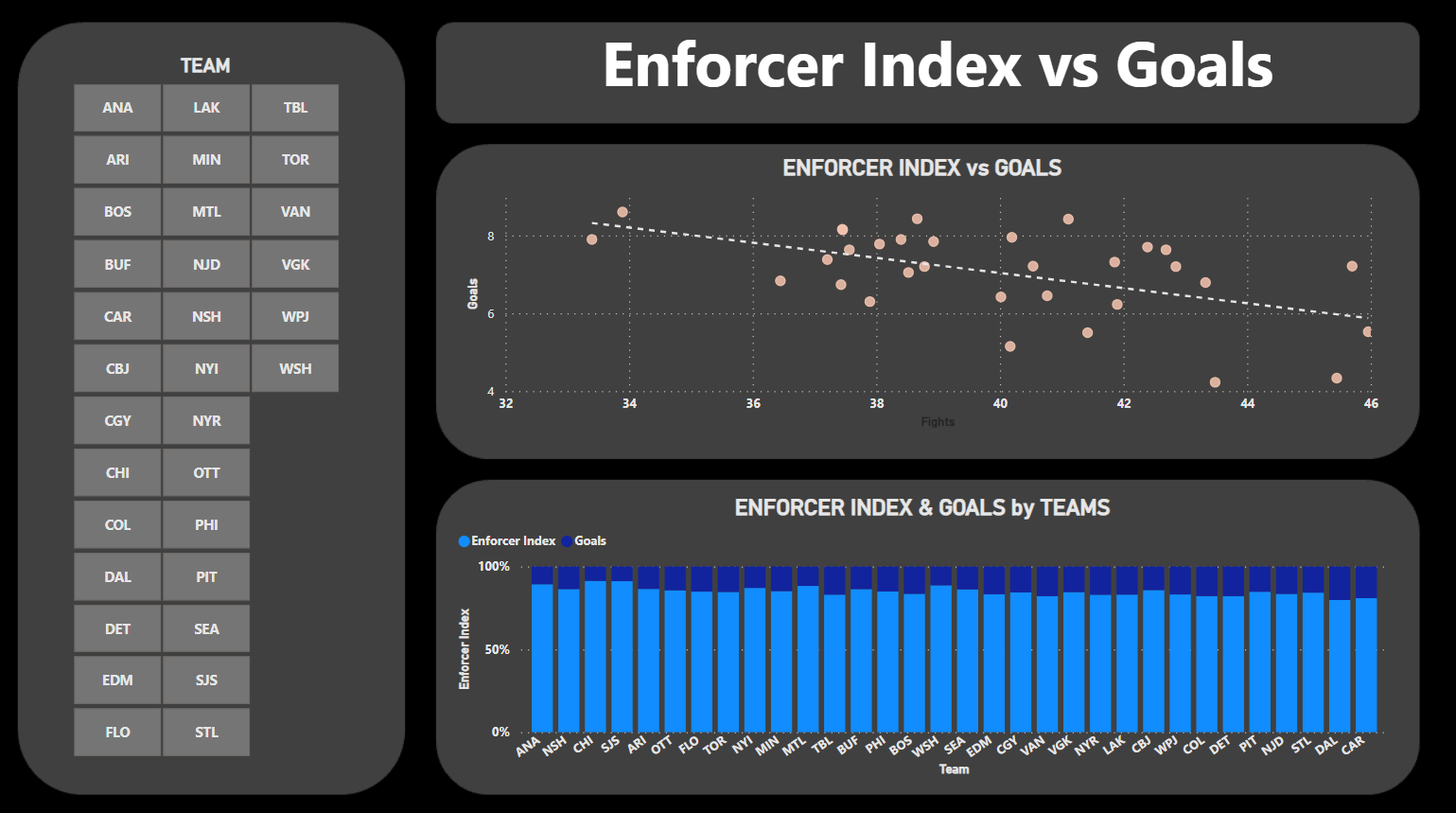
Enforcer Index vs Goals Tab
The Enforcer Index vs Goals Tab also has three controls:
- One Slicer control: Add the TEAM_ABBR here for a team filter.
- One Scatter chart control: Add the GOON_INDEX_SCALED (X Axis) and GOALS (Y Axis) to this chart and TEAM_ABBR to the Values field. This creates a view of the relationship between the index and goals. (Note that we've also added a trend line, which provides a visual indication of the linear relationship.)
- One 100% Stacked Column chart: Add the GOON_INDEX_SCALED and GOALS with the TEAM_ABBR to this control. This shows where teams with a higher or lower Enforcer Index score more or less goals (by looking at the ratio in the column).
When complete, your report should look something like the below.
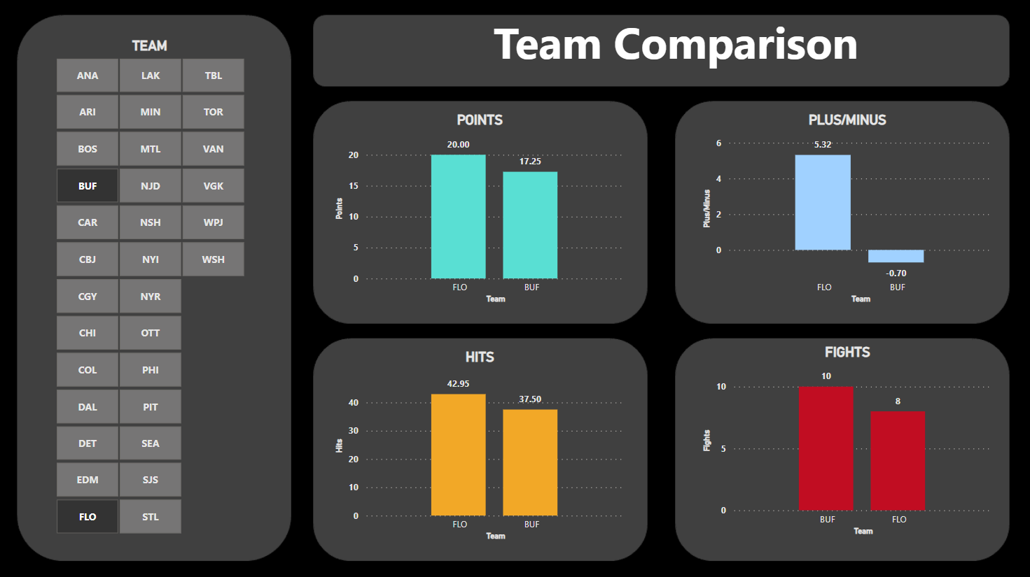
Team Comparison Tab
The Team Comparison Tab has five controls:
- One Slicer control: For the team filter.
- Four Clustered Column chart controls: For different metrics that you can use to compare the teams: 1) POINTS, 2) FIGHTS, 3) HITS, and 4) PLUS_MINUS. Use TEAM_ABBR for the X Axis and the above statistics for the Y Axis.
When complete, you should have a report that looks like the following.
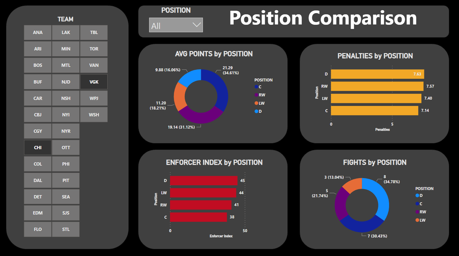
Position Comparison Tab
The final tab is the Position Comparison Tab, which has six controls:
- Two Slicer controls: One for the team filter and another one for the Position.
- Two Clustered Bar charts: One for PENALTIES and one for the GOON_INDEX_SCALED.
- Two Donut charts: One for FIGHTS and the other for POINTS.
These different charts will give you a sense for how each position compares when it comes to specific statistics.
And that's it! After you've added these tabs with the aforementioned controls, you'll have a set of reports that make up your Enforcer Dashboard with a navigation menu on the front tab.
Check out the following quick-hit walkthrough on YouTube.
Summary
In this edition, we continued our coverage of the Enforcer Index – a metric that measures the physicality (or goon-ness factor) of a team. We counter-balanced a team's physicality with their point production, but you might choose to recalculate the index using only physical measures.
We focused this week more on the reports and analyses. We built three reports in R and RStudio (Linear Model for Enforcer Index and Goals, Average Enforcer Index vs Goals by Team, and Team Comparison), moving from higher-level analysis to more detailed, team-by-team comparison. We then used some of the discoveries in the R analyses and built a dashboard in Power BI.
For larger projects, we often implement a workflow that starts in R and RStudio (or Python) and then based on what we discover, we then move a subset of the analyses into a more presentable and shareable platform like Power BI. In some cases, we will build PowerPoint decks or use the R Markdown feature to create HTML pages as well.
If you want to download the data, R code and Power BI reports, check out our resources in The Barn!
Subscribe to our newsletter to get the latest and greatest content on all things hockey analytics!