What is Descriptive Analytics for Hockey?
In this Edition
- What is Descriptive Analytics?
- What is the Process to Create a Descriptive Analysis?
- What are Common Statistics in Descriptive Analytics?
- Walkthrough: Using Chat GPT to Generate a Descriptive Analysis
- Walkthrough: Using Excel to Discover Who's the Toughest Country
- Walkthrough: Using Quartiles to Analyze the Top 25% of NHL Teams
What is Descriptive Analytics?
Descriptive analytics focuses on the analysis and interpretation of historical data to understand past performance, patterns, relationships, and trends to guide future decisions and actions. According to Gartner, descriptive analytics "answer[s] the question 'What happened?' (or What is happening?), characterized by traditional business intelligence (BI) and visualizations such as pie charts, bar charts, line graphs, tables, or generated narratives."
Descriptive analytics typically combine summary statistics, data visualization techniques and generic and custom metrics to describe and unearth patterns, relationships and trends.
Let's look at each of these.
Summary Statistics
Summary statistics provide an overview of the data through, for example, measures of central tendency, such as mean (average), median and mode, and measures of dispersion, such as standard deviation and range. By viewing your data through summary statistics, you can observe the shape of your dataset and discern trends, patterns and areas for deeper exploration.
Using summary statistics, you can answer questions like:
- What is the average Save Percentage of an NHL team?
- Who make up the top 25% of players in the NHL based on total points?
- What country has the players who fight the most in the NHL?
Data Visualization Techniques
After creating an initial dataset summary using summary statistics, you represent that data through a visualization. Data visualizations, such as bar charts, line graphs, histograms, and scatter plots, help present data in a meaningful way and help you spot trends, patterns, relationships, and outliers.
You create visualizations using various methods and tools. As an Armchair Analyst, you likely use popular spreadsheets like Microsoft Excel or Google Sheets. As your skills grow, you'll use more advanced BI and programming tools, such as Microsoft Power BI, Tableau, R/RStudio, etc.
Generic and Custom Metrics
At some point, you will need to go beyond summary statistics and will create specialized metrics to represent different hockey concepts, trends or events. For example, in hockey there's a range of statistics/metrics that are used to represent different aspects of the game – e.g., offensive metrics, and defensive metrics. As an Armchair Analyst, creating an overall picture of your player, or your team, or the league as a whole will factor into your work.
The following are examples of performance metrics for hockey:
- Face off win percentage for a player and for a team
- Save percentage for a team
- CORSI measure for player and for a team
At some point, you will also begin to create your own custom metrics – this takes some practice, but indicates you are maturing as an Armchair Analyst. This might mean combining statistics or creating your own metric through calculations. You can see examples of general and custom metrics we've created on our Reports page.
What is the Process to Create a Descriptive Analysis?
As an Armchair Analyst who is likely looking for something quick and low maintenance (e.g., a tracking spreadsheet for your favorite players and teams), the process is manual, but simple.
To create a descriptive analysis:
- Define the objective of the analysis
- Source the hockey data (preferably a source that can provide "clean" data)
- Explore the data
- Prepare some visualizations that address your objective
To follow is an example:
- Objective: Create a report for the Top 20 Players by Total Points.
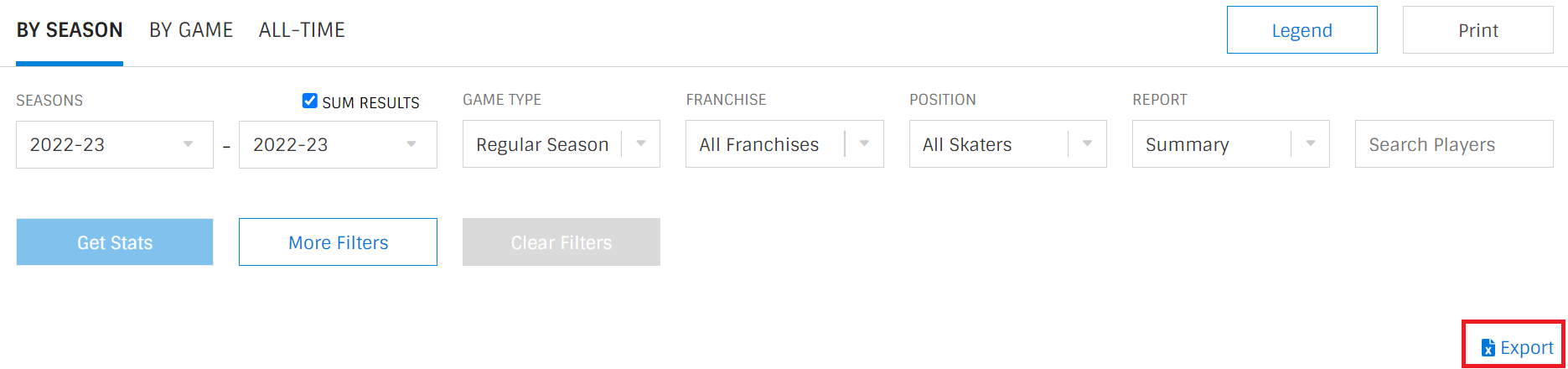
- Hockey Data: Go to the Player Stats page on NHL.COM, sort the stats table by Points (P) and click Export to export the data to an Excel file.
- Explore: Open the Excel file on your local desktop, position the cursor in the top left-hand cell and click Format as Table and choose a table format style. Click Analyze Data (Microsoft's new, automated data analysis feature) and type "Find the top 20 Players (Player) by Points (P)" in the Analyze Data field.
- Visualizations: Click Insert PivotTable when you're presented with the results, navigate to the newly created worksheet, and use the table to create a bar chart.
With this very quick and simple process, the result should be similar to the below.
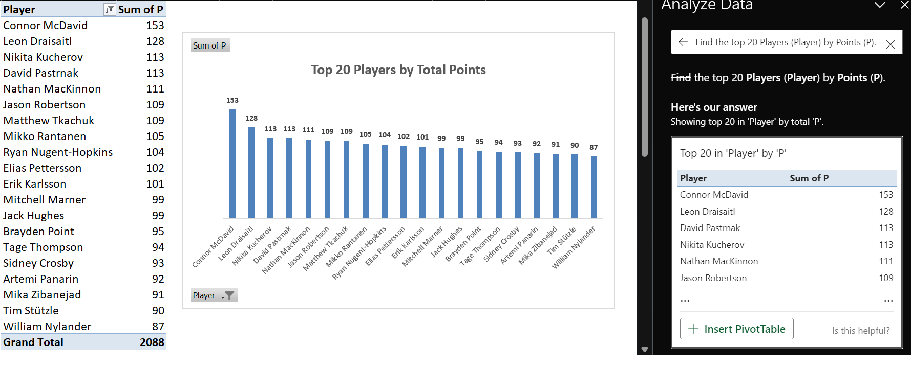
You can type in different questions into the Analyze Data field to create different analyses.
What are Common Statistics in Descriptive Analytics?
If you're interested in hockey analytics, even if it's for basic analyses, you should have some statistical knowledge. The more knowledge in statistics you have, the better. But if you're new to statistics, don't worry! The stats we'll cover below are straightforward and can be used with hockey data (and be generalized to other areas of life).
Here are the most common statistics you'll use when first starting out in hockey analytics:
- Mean: The arithmetic mean, aka "average," is the sum of all values in a dataset divided by the total number of observations. It represents one measure of central tendency.
- Median: The median is the middle value of a dataset when it is sorted from smallest to largest. It is less sensitive to extreme values and provides another measure of central tendency.
- Mode: The mode is the value that appears most frequently in a dataset. A dataset can have one mode (unimodal), two modes (bimodal), or more (multimodal).
- Standard Deviation: The standard deviation measures the dispersion or spread of the data points around the mean. A higher standard deviation indicates greater variability in the data.
- Range: The range is the difference between the maximum and minimum values in a dataset. It provides a simple measure of the spread of the data.
- Interquartile Range (IQR): The IQR is the range between the first quartile (25th percentile) and the third quartile (75th percentile). It is useful for understanding the spread of the middle 50% of the data, excluding outliers.
- Variance: The variance is the average of the squared differences between each data point and the mean. It is another measure of data spread.
- Skewness: Skewness measures the asymmetry of the data distribution. Positive skewness indicates a longer tail on the right, while negative skewness indicates a longer tail on the left.
- Percentiles: Percentiles divide a dataset into 100 equal parts. The nth percentile represents the value below which a given percentage of the data falls.
If you exported the first page of the 2022-2023 Regular Season Player Stats from the NHL site and then applied the Excel formulae for the above common statistics, then you'd arrive at the following summary statistics for the Top 50 Players by Points. (We added the specific Excel formula that corresponds to each of the above summary statistics.)
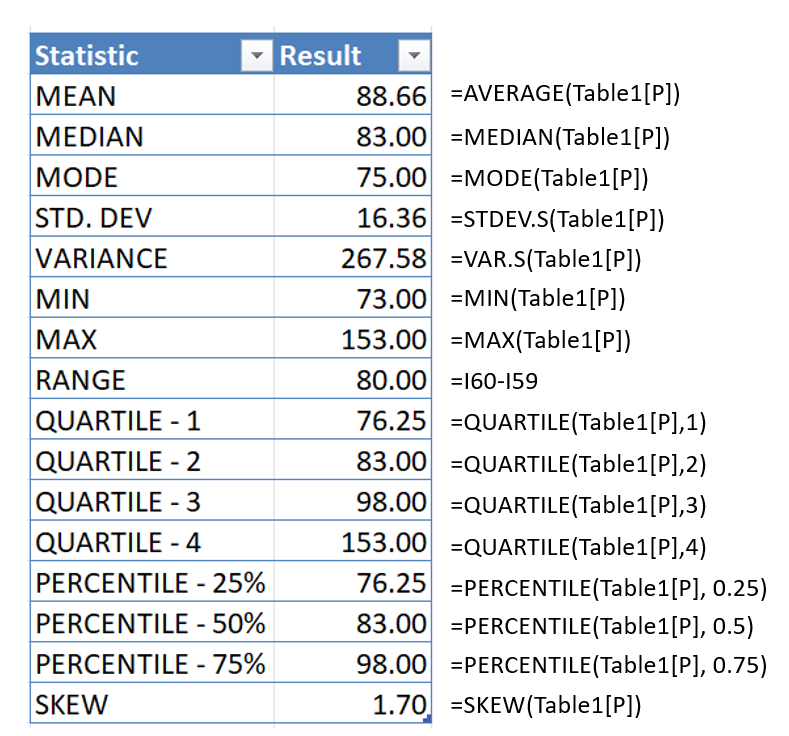
These basic statistics provide a foundation for understanding and interpreting data in a descriptive analysis. They are instrumental in revealing patterns, trends, and important characteristics of a dataset. Descriptive statistics play a crucial role in summarizing complex information concisely and making it more accessible for further analysis and decision-making.
Walkthrough: Using Chat GPT to Generate a Descriptive Analysis
Chat GPT is a quick way to explore hockey data. In Chat GPT 4.0, you can use the Code Interpreter to analyze data that you upload to your session. You can then issue different commands (or prompts) to explore the data.
To do this:
- Navigate to https://chat.openai.com/, click New Chat and select GPT-4. (Make sure you have Code Interpreter enabled.)

- Click the "+" sign to upload an Excel data file with hockey data in it.
- Then type the following prompt in the chat field: "Can you create different examples of descriptive analyses using this player hockey data?"
- Chat GPT will return a set of descriptive analyses of its choosing. In our session, Chat GPT returned five analyses, summarized as follows.
The results from the above are listed below.
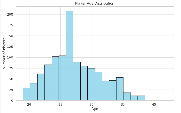
Player Age Distribution: Understand the age distribution of the players
The histogram below shows the age distribution of the hockey players. Most players are between 20 and 30 years old, with the highest concentration around 24-25 years of age. Now, let's move on to player performance analysis. We'll look at the relationship between games played, goals scored, and assists provided.
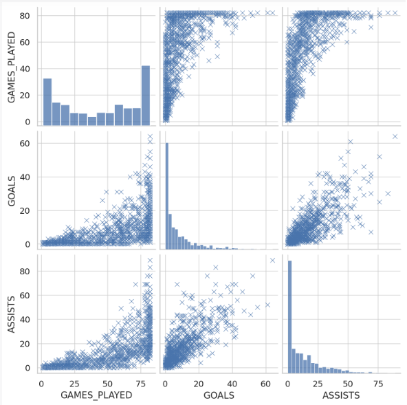
Player Performance Analysis: Analyze players' performance based on their goals, assists, and games played
The scatterplot matrix shows pairwise relationships between "GAMES_PLAYED", "GOALS", and "ASSISTS". From the plots, we can observe the following:
- As the number of games played increases, the number of goals and assists also tends to increase. This makes sense as more opportunities to score or assist are available in more games.
- There is a positive correlation between goals and assists, indicating that players who score more goals also tend to have more assists.
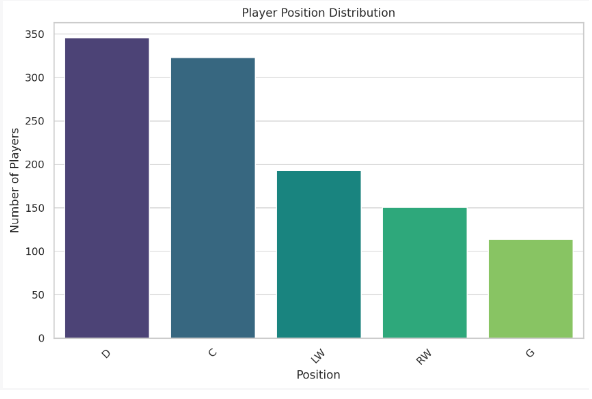
Player Position Analysis: Analyze the distribution of players across different positions
The bar plot below illustrates the distribution of players across different positions.
We can observe that the position "C" (Center) has the highest number of players, followed by "D" (Defense), "RW" (Right Wing), "LW" (Left Wing), and "G" (Goalie).
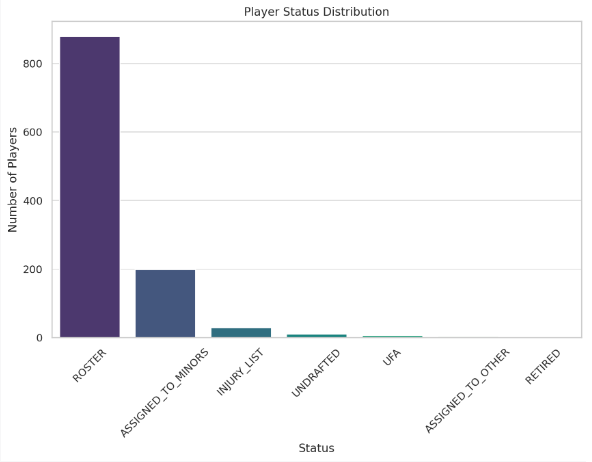
Player Status Analysis: Understand the distribution of players based on their current status
The bar plot below shows the distribution of players based on their current status.
The majority of players are in the 'ROSTER' status, meaning they are on the active roster for their team. A significant number of players are 'ASSIGNED_TO_MINORS', indicating they are currently assigned to a minor league team.
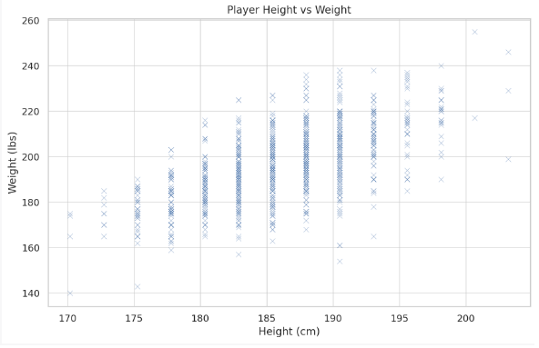
Height and Weight Analysis: Investigate the relationship between a player's height and weight
The scatter plot below shows the relationship between a player's height (in cm) and weight (in lbs). There seems to be a positive correlation between the two variables: taller players tend to weigh more. This trend is logical since height and body mass (hence, weight) are generally correlated.
You can interact with Chat GPT to continue prompt and query for different types of analyses. All told, AI engines like Chat GPT show promise from a learning and exploratory perspective. Furthermore, companies are integrating with Chat GPT through their APIs which will bring a whole new level of analytical capabilities not in market today.
While Chat GPT is a good way to start exploring data, it has drawbacks for the Armchair Analyst. For example, you interact with the results of the Code Interpreter in sessions that expire, it's difficult to integrate multiple datasets into a single data analysis, and you don't have the control and power to pivot, slice and do custom analyses that you could do if the data was in your own environment.
Check out the below to see how you can use Chat GPT to analyze hockey data.
With that in mind, let's explore Microsoft Excel as an additional way to analyze your hockey data.
Walkthrough: Using Excel to Discover Who's the Toughest Country
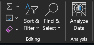
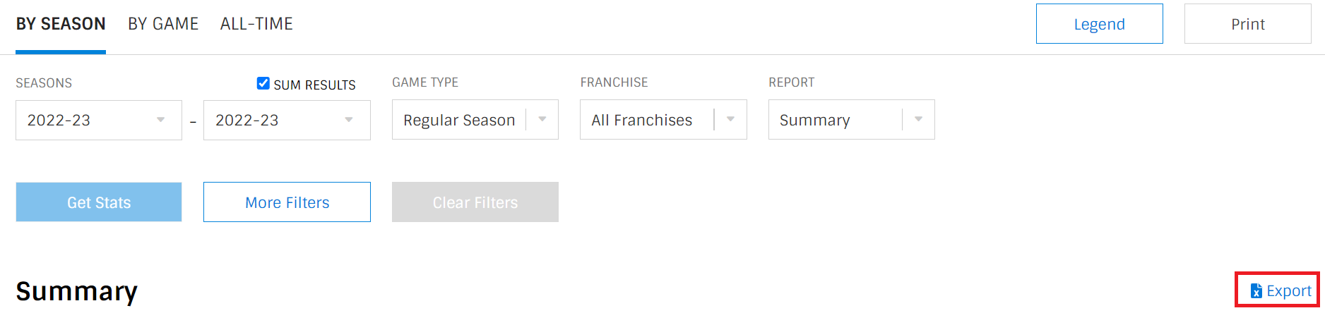
In this next walkthrough, we'll use a new feature in Microsoft Excel called Analyze Data. You can find this button on the Home tab, towards the right-hand side of the ribbon.
To use this feature, select data (or format a table and click in the upper left-hand cell) and click Analyze Data. Excel will automatically explore the dataset providing you different analyses in the Analyze Data tab.
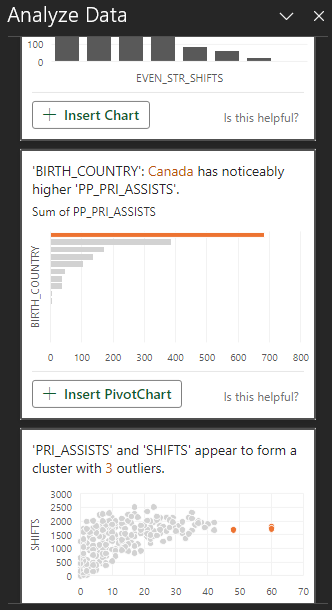
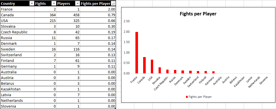
For our analysis, we wanted to understand which country got into the most fights – a question all Armchair Analysts ponder! So, we loaded the player data for the entire 2022-2023 Regular Season and typed the following into the Analyze Data query field: "What country has the highest count of FIGHTS?" The following was the result.
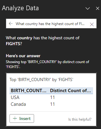
However, this isn't really what we wanted. So, we set about a different path. We created a pivot table in Excel, grouped by Country and then added the total Fights and Players from each country. We then calculated a simple Fights per Player ratio, which you can see below. France comes out on top, by virtue of Pierre-Edouard Bellemare being the only player from France in our sample dataset and he had 2 fights. If we throw out the outlier, then Canada is the scrappiest country in the NHL, followed by the USA.
This gives you a quick way to create an analysis using Excel, so you can conduct the analysis and save it for later use and updating.
Let's look at another Excel example.
Walkthrough: Using Quartiles to Analyze the Top 25% of NHL Teams
No matter what type of analyst you are, you create categories to better separate and analyze your data. There are different ways to do this, and in this walkthrough we'll use the Quartile statistic to create and analyze the total points earned in the 2022-2023 regular NHL season.
- The first step is to get some data. So, go to the NHL.COM team stats page and filter on the 2022-2023 Regular Season, select All Franchises and click Export.
- Save the file locally as an Excel file.
- Delete all but the Team and P column (or copy and paste these two columns in a new tab). Note below, we renamed the Team column to NAME and P column to PTS.
- Using the Excel formulae from earlier, create four quartiles called Q1, Q2, Q3 and Q4.
- Create a new column called QUARTILE and enter the following formula in the first cell. This compares each cell in the QUARTILE column with the Quartiles you created and will automatically assign Q1, Q2, Q3 or Q4 to the teams.
=IF(B2<=$F$2, "Q1", IF(B2<=$F$3, "Q2", IF(B2<=$F$4, "Q3", "Q4")))
- Lastly click the top cell in the bottom right (to get the + sign) and drag your cursor across all of the cells in the QUARTILE column to apply the formula to all cells.
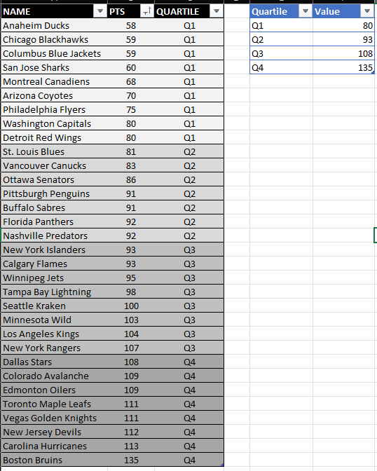
You now have the teams divided into quartiles based on the total points earned in the 2022-2023 regular season. More importantly, you have a Quartile pattern that you can apply to any statistic or hockey data. For example, you can use this pattern for Power Play Percentage, Faceoff Percentage, etc., and then look for patterns within specific quartiles. This can give you clues as key qualities that make an NHL team a top 25% club.
Check out the below video to see how you can create quartiles for team stats data.
Additional Resources
Charles Henry Brase and Corrinne Pellillo Brase. 2017. Understandable Statistical: Concepts & Methods, 11th Ed. Cengage Learning.
Gartner Glossary: What is Descriptive Statistics?
Microsoft Excel's "Analyze Data" Feature
Subscribe to our newsletter to get the latest and greatest content on all things hockey analytics!
Member discussion