Unveil the Secrets Behind the Game: Data Storytelling and Hockey Analytics

In this Edition
- What is Data Storytelling?
- Why is it Important?
- What are Three Examples of Data Storytelling?
- What are Elements of Storytelling to Consider?
What is Data Storytelling?
If you've ever had to translate the results of an analysis (e.g., scouting report, game analysis, team/player performance review, etc.) into a presentation, article, infographic, or other piece of content, you know how difficult it can be to reduce complex statistics into a consumable story. During this process, you're faced with many questions, such as:
- Am I doing the analysis correct?
- What is the data telling me?
- What is an interesting angle for the story?
- Who is my audience and what resonates with them?
- How can I translate a complex model or analytics into a story?
The ability to create a story and communicate it to your audience is not an easy skill to master, but it's important – regardless of your industry. Enter data storytelling.
Data storytelling is a way to communicate insights from complex datasets. It merges data analysis with narrative techniques and visual elements to make information more accessible and engaging. In essence, data storytelling transforms raw data into a coherent story that highlights trends, patterns, and outliers, making it easier for the audience to understand and remember the insights.
Data storytelling starts with the identification of potential stories that emerge from a data analysis. In large part, our newsletter series discusses the process of sourcing, analyzing and forecasting using different tools, technologies and approaches. However, we don't often talk about the patterns, anomalies, trends, or correlations that lead to impactful stories – no less on how to do it. Yet, it's a topic in which we're deeply interested.
In our experience, you can start with a story (or the skeletal structure of a story) before you analyze the data if you understand the subject matter well. For example, if you're writing a story on Sebastian Aho, and you closely follow the Carolina Hurricanes, then you will understand potential angles on the story – e.g., his contributions to the team, him as a well-rounded player, his international start as a Finnish player, and so on. Predefined stories, though, can drive an outcome, rather than the results of an analysis driving your story. So, while it's good to have some shape of the story in your mind as you embark on the analysis, we recommend being open to letting what you discover in the analysis phase shape your story.
Whatever your process, the art of data storytelling lies in translating data insights into narratives that resonate with your intended audience. We've found the following questions are a helpful framework:
- What is the intention of the story? For example, is it to educate, entertain, inform, other? This can impact how you frame the story, the format and medium/platform you use, the tone of the story, and so on.
- Who is the intended audience for this story? For example, is it a business audience, sports science audience, conference? Try and get specific here because the language, tone and references should fit the audience.
- What is the data telling us? And how do you make it interesting and relevant for the intended audience? Think about what an athlete would want to get from a performance report versus what management would want to learn from a scouting report.
- Do you need to abstract the analysis to make it accessible? Or is the audience comfortable with technical concepts? Don't assume the audience knows as much as you, so making the metrics accessible is critical to landing your story.
- How can we best represent the data? What visualization(s) do you use? Visualization best practices are important here, such as removing "chart junk", using colors appropriately, good titles, and so on. Further, you'll need to choose how to represent the data, for example, infographics, interactive charts, and data maps can illuminate relationships, trends, and outliers in the data, making complex information accessible and engaging. Tools like Tableau, Power BI, and D3.js allow analysts, content creators and journalists to create a wide range of visual content, from simple bar charts to intricate interactive web applications.
- What format or medium do you use to tell the story? Many content creators, journalists and artists work across multiple platforms, but keep in mind what works for one platform may not work for another.
- How can you simplify? And then after you've simplified, how can you further simplify? Adhere to a single goal per visualization, and reduce words, distractions in the visualization and use design and color to your advantage.
At some point, you'll realize that answering each of these questions requires a different skill to get to the outcome. For example, you will need to create, execute and validate your analysis to get to a consistent result before you can understand what the data is telling you (and if it's confirming your gut feeling). (You may also want to have it peer-reviewed.) Abstracting the analysis means understanding your audience and re-framing the results in a way that they would understand – for example, this could be simpler or business language, images or video. And selecting a specific format or media may require you to either have or find specific skills – for example, web development, infographic creation, etc. You should feel comfortable working with peers or in a small team such that you can optimize the skills of the team to land a great story.
Why is it Important?
Data storytelling is important because at its heart it fuses data analysis with narrative style (into fact-based content/reporting), offering a way to communicate complex information in an interesting and intuitive way. This approach is important in the realm of sports analytics, including hockey, where the volume of data can be overwhelming, the analyses offering different (sometimes competing) results and its implications not immediately clear to all stakeholders.
Beyond the above, we offer a few more reasons as to why we believe data storytelling is important.
- Attention Spans are Short: Information is being consumed in seconds; attention is the new currency in media. So, crafting a data story that is clean, can be understood quickly and is also interesting, informative and entertaining is becoming an imperative.
- Improving the Understanding of a Topic: Data storytelling is a great tool to educate an audience on specific topics. Hockey, like many sports, is increasingly data-driven, with metrics spanning from traditional statistics like goals and assists to advanced analytics such as Corsi and Fenwick ratings. Not all fans understand these statistics and what they mean. A data analyst can use storytelling to transform these abstract numbers into a narrative that highlights key performances, game dynamics, and strategic insights in such a way that they are accessible to a broad audience.
- Making Content More Interesting: Opinion is not in short supply on the Internet, so crafting fact-based and data-driven content grounds the story in at least one analytical reality. That reality can be debated and proved wrong (which in and of itself can be interesting and fun), but using stats as one character in your data storytelling can breathe life into that story.
- Driving Decision-Making: Data storytelling also informs decision-making. In the fast-paced environment of hockey, coaches and management must make strategic decisions quickly, often under pressure. A well-crafted data story can illuminate the most relevant information, such as player efficiencies, line-up effectiveness, or opponent weaknesses, guiding strategic decisions in training, game planning, and player acquisitions. By presenting data in a narrative format, analysts can direct attention to the most pertinent insights, helping decision-makers to act based on a comprehensive understanding of the data.
- Engaging and Persuading Audiences: The persuasive power of storytelling cannot be understated. For a hockey data analyst, convincing a coach to adjust a game strategy or persuading management to consider a player transaction requires more than just presenting raw data. Data stories can be compelling arguments, weaving together data points to support a recommendation or highlight an opportunity.
- Fostering a Data-Driven Culture: Data storytelling plays a vital role in fostering a data-driven culture within hockey organizations. By presenting data within engaging narratives, analysts can demystify analytics for those less familiar with statistical analysis, increasing data literacy across the organization.
- Enhancing Fan Engagement: Beyond the internal audience of coaches and team management, data storytelling has a significant role in fan engagement. Fans are increasingly savvy about sports analytics, and they crave deeper insights into their favorite teams and players. Data stories can feed this appetite by providing analyses that explain game outcomes, player performance trends, or historical comparisons in a narrative form that is both informative and entertaining. This enriches the fan experience and fosters a deeper connection between the team and its supporters.
In sum, data storytelling is a useful tool for hockey data analysts, bridging the gap between complex analytics and actionable insights. By transforming data into narratives, analysts can enhance understanding, drive strategic decisions, persuade stakeholders, foster a data-driven culture, and engage fans on a deeper level.
What are Examples of Data Storytelling for Hockey?
Exploring the many examples of data storytelling is the fun part; this is where you get to explore what's out there and evaluate what works for you. Before we jump into our three examples, let's head over to Matillion to review one bad example of a visualization and one good example.
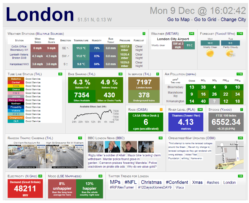
Let's first look at a bad example from the Matillion site. As you can see, this visualization is cluttered and busy, the title is non-descript, the colors are not intuitive, and there's not a good flow from one part of the visualization to the other – you likely didn't know where to start when you first looked at this visualization.
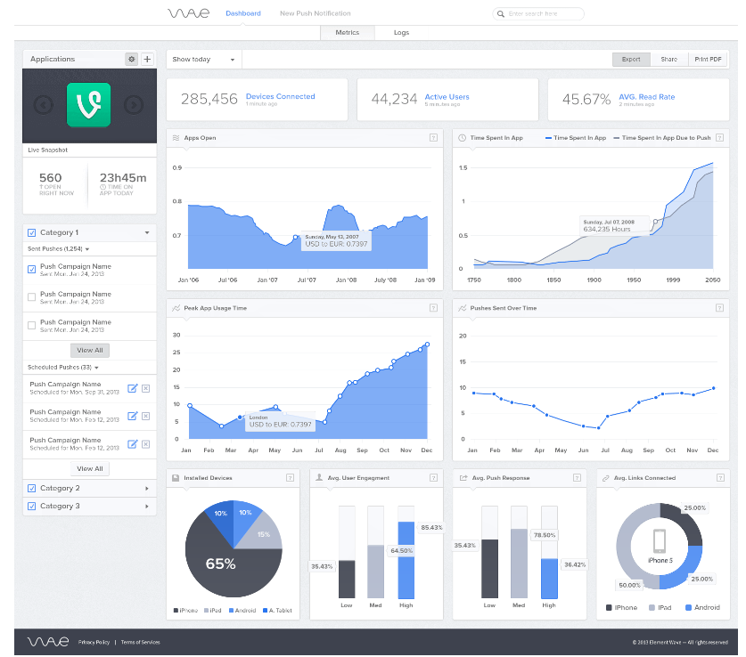
Let's now look at a good example. Here you can see the colors are more consistent, the contrast within the visualizations are effective and blend well, there are summary cards at the top of the report with more details in the body of the report, and navigating the report is easier.
In our projects and working with different companies and professional sports teams, we've seen countless bad examples. Often times it's because the goals of the analysis have not been clear, the author of the visualization hasn't taken the time to iterate and improve (using some of the practices from data storytelling) or they're trying to get too much onto one report or slide.
In the remainder of this section, we'll walk through three examples of data storytelling using hockey data. Two of the examples were created expressly for this edition and the third was one we leveraged from a previous edition. The examples will cover:
- Creating a PowerPoint slide using data from Microsoft Excel
- Creating social media content using statistics and images
- Creating a visualization for a long-form hockey article
These three examples offer different dimensions to contemplate as you craft your own data-driven story.
Data Storytelling with PowerPoint
You've likely had to work through the process of creating and then presenting an analysis to an audience. This is not an easy process – no less thinking about presenting it to a group. So, for this first example, the scenario is: assume the playoffs start today and report out on the top teams that are competing for the playoffs. Let's set aside what you're going to report out on for now and start with the data analysis.
You start the data analysis by getting a snapshot of the latest NHL team stats and rankings. Your main goal at this point is to understand who are the top teams, what's their point structure, what sets the top teams apart, etc. For example, is it success on the face offs? Is it their special teams? Or is it something else?
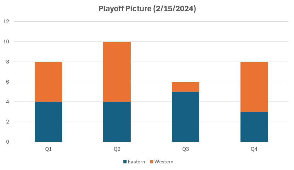
You can choose to do the analysis in R or Python or another tool. We chose Excel and created a formatted table with conditional formatting to create a heatmap as a starting point. We also wanted more categorization to the rankings, so we cut the teams into quartiles – from top-performing to low-performing teams. To do this, we used the QUARTILE() function to create the quartiles and then assigned each team to those quartiles (from Q1 to Q4). In our analysis, Q4 is the category with the most points and Q1 has the least points. If you're following along, your analysis may look something like the below.
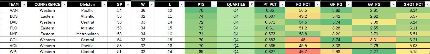
Now while the above is vaguely illuminating (e.g., you can see where the top teams are performing better or worse), it'd be tough to put this in front of a group without managing the burden of their discovery. However, as you look at the data, you might see that the Western conference seems to be over-performing in the higher quartile (Q4). So, let's dig into this as our story angle.
To explore this further, we created a Pivotable and used the QUARTILE column to create a frequency analysis, breaking out the Western and Eastern conference. We then visualized the frequency analysis using a stacked column chart, enabling you to visually compare across the stacked columns. This first chart is shown below.
If you think through the questions we listed earlier, one of the key things that jumps out from the above is improving the visualization. And if you want to show that the Western conference is over-performing, the above stacked column chart doesn't tell the story very well. So, here are four optimizations to consider:
- Remove all ancillary noise from the chart that take the attention from your main story – e.g., remove grid lines, Y axis numbers, title, etc.
- Improve the contrast of colors across the columns to better call attention to your story.
- Add a slide title and subtitle that describe your story; your data will back it up.
- Add graphics, or an improved design, in place of text.
If you take the above and iterate on your stacked column chart pasted into a slide, you'll find that you can not only improve the look and feel of your visualization, but you can do so by calling attention to the main story. The below is our quick pass at taking the Excel chart and making it more consumable for an audience within a presentation.
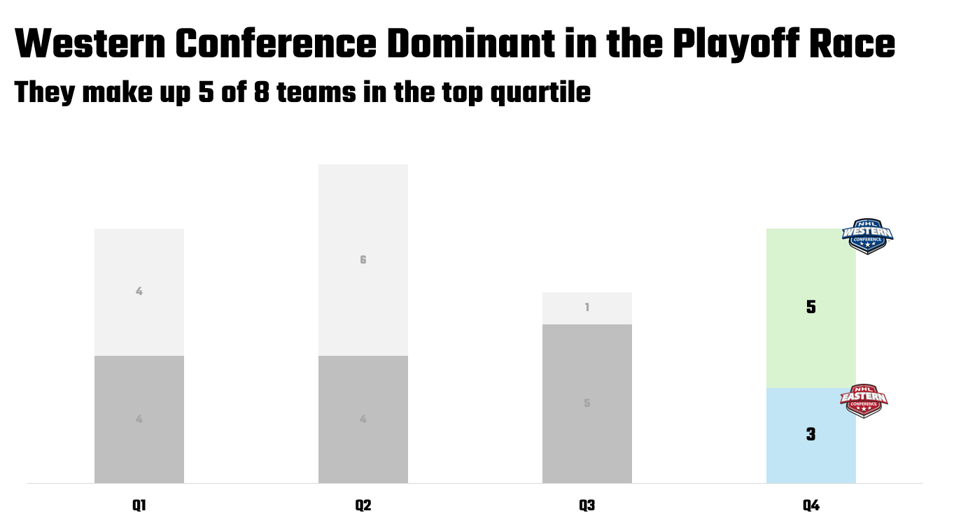
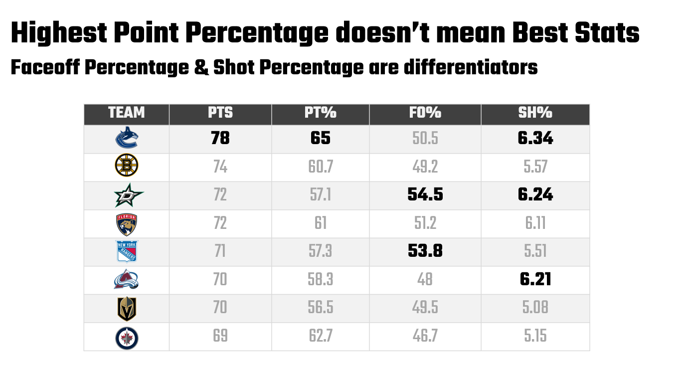
The net result of the above may cost you more time preparing the visualization. However, you show up better when presenting and you change the complexion of the discussion. You lead your audience to the main story, rather than them asking clarification questions when they first see a slide that may have too much information on it. Further, a follow-up slide could be another well-formatted slide with 3-4 key statistics (from the original heatmap in Excel) that differentiate Western conference teams from Eastern conference teams. So, your first slide represents the core of your story, and the second slide gives more context as to why. Below is an example of a potential next slide, following a similar pattern in terms of data and color contrast and title/subtitle structure.
Social Media Content
While creating social media content is different from creating and presenting slideware, similarities exist in the data storytelling process. For example, you'll still need to analyze the data, tease out (or discover) the story, abstract the representation of the data to a story in some way, and then create the story. Note that it's this last step where you may find the most significant departure from the PowerPoint example.
Social media content can be highly visual, so there are more design skills involved in creating the content. For example, in building slideware you can rely on some best practices and a working knowledge of PowerPoint. However, social media content is an altogether separate beast; you may need a range of skills (e.g., image editing, video editing and production, etc.) and tools from design to production that you need to learn (or procure) to build great social media content.
In this example, let's say you want to build social media content that highlights the top five goalies in the NHL. Similar to how we started with the first example, we first took a snapshot of goalie summary stats, filtered it down to the top five (using a key metric for ranking) and then created a view of the stats. The result of this process is below (also filtered by a select number of games played), where we now have the top five goalies ranked by goals against average (GAA).
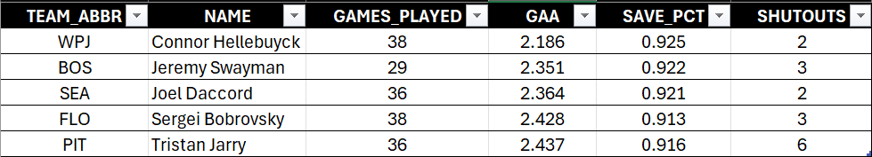
The goal of this story is more entertainment using statistics, so our storyline is these goalies are the last line of defense and they have the stats to prove it. However, a couple of potential stories emerge from the data that may also be interesting:
- Connor Hellebuyck, per our ranking, is from the Western conference (see our first example).
- Tristan Jarry, ranked fifth, got the most shutouts.
- Jeremy Swayman has strong numbers and more shutouts in fewer games.
Point being, you could take the story in different directions depending on the audience and intention – or have more discrete follow-on stories (e.g., have a story that highlights one goalie in particular).
Given the focus of our story, we took the stats and then created some images that fit the tone of the story. For example, we created an image of a tough-looking goalie and another of a goalie making a save – so tough, he doesn't even need a goalie mask! We also included some of the stats that we curated from the goalie stats, text formatting and the logos of each of the teams. The resulting content is below.
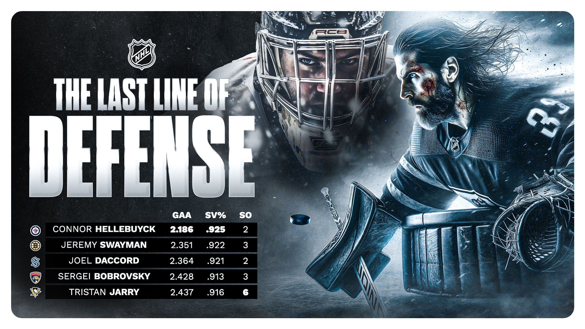
An important call-out here. For the first example, you're likely operating "internally" or from within an organization. So, you won't have to worry about trademarks, copyrights, branding, etc. However, for the second example, you would be operating "externally" in the public sphere. This means that you need to research, consult, respect and have in place your legal protection and/or licensing when using different logos, trademarks and the like – especially if the content is used in a commercial context. So, be sure to consult with the team, league or athletes if you're trying to tie their names, logos or likeness to a product or service before publishing any content.
Sports Journalism
Our last example is one of sports journalism; that is, data storytelling within a long-form sports article. We'll specifically look at a visualization you might create and use within a hockey article and then discuss the structure and narrative around the visualization. For this last example, we'll re-use an analysis we did in a previous edition entitled Using Linear Regression to Predict Goals.
The goal of the analysis was to explore different hockey stats to see which one(s) might be better predictors of goals. The analytical path here was more complex than our first two examples above because it involved programming using R and RStudio and the extra step of predictive modeling using linear regression. The general approach was as follows:
- Source the historical hockey data (which for advanced modeling is typically more granular) and clean and transform the data
- Design and create a series of analyses – running from an exploratory data analysis to correlation analysis to a linear regression model
- Review the results of the analyses and predictive modeling to see what patterns or story emerges
The results produced a small set of potential goal predictors, with three either at or above 50%: shot percentage (50%), power play goals (60%) and expected goals for (73%). So, the story here is that expected goals for could be a decent predictor for goals.
With a more long-form, text-based medium like hockey articles, the question becomes how to structure your narrative and represent visualizations within it. That is, your visualizations should be able to stand alone but also support the narrative. If you imagine an article that explores different goal predictors and why they may or may not serve as good predictors, you might use the following visualization within your write-up.
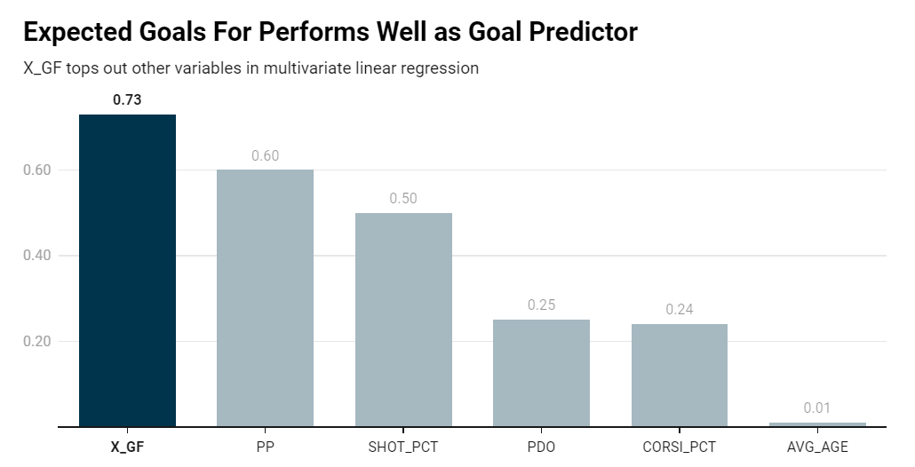
Note that similar to the first example, the title reflects what the core of your data story and the subtitle gives more information about the nature of the analysis. This might slip past a non-technical or non-statistical audience, but an analyst would understand the implications of this type of regression model. Further, we've added color contrasts in the bar chart using a darker color where we want to draw the attention of the reader.
The interesting thing about this visualization is it also leaves open the opportunity for a sports journalist to explore the other predictors in the story. For example, if you take shot percentage as a predictor of goals, it's little more than a flip of a coin. However, if you consider location (i.e., shorter distance to the net), then we may find that shot percentage is higher. Similarly, age is a non-factor in this model. However, if you took age in combination with other variables, such as position, time on ice, or other statistics, you may find a different result. Analytically, this leaves room for you to explore permutations on the predictor variables (or to poke at what is not visible or proved within the model at hand).
Check out the quick-hit YouTube walkthrough below.
What are Elements of Storytelling to Consider?
Data storytelling is a discipline and set of practices unto itself, and we've only brushed the surface in this edition. As you engage more in data storytelling, it's helpful to understand how some of the core principles of general storytelling can fit into how you design your data story.
So, to close this edition, let's touch on five elements of storytelling and describe how they might be leveraged in data storytelling. The elements include characters, setting, plot, conflict, and resolution. These elements can be creatively adapted and employed in data storytelling, especially in contexts like sports analytics, business reports, or any scenario where data conveys a narrative. And you can also employ them when you present the story to a live audience.
Characters
- In Data Storytelling: Characters could be the key data points, stakeholders, or entities involved in the data narrative. For instance, in a business context, characters might be customers, employees, or products. In hockey analytics, characters could be the teams, players, or even specific positions like goalies. You might also treat specific stats as characters, so you can build a sense of conflict around those characters within the telling of the data story.
- Application: Highlighting specific data points or categories that play pivotal roles in the story helps the audience connect with the information on a personal level.
Setting
- In Data Storytelling: The setting involves the context or environment where the data exists. This could include the period, location, environment, or the specific context of a dataset (e.g., a particular hockey season or tournament).
- Application: Establishing a clear setting allows the audience to understand the context and relevance of the data, making the narrative more engaging and relatable.
Plot
- In Data Storytelling: The plot in data storytelling is the sequence of events or data points that create a narrative arc. This involves how the data changes over time, revealing trends, patterns, and anomalies.
- Application: Crafting a compelling plot with data involves showing how key metrics or KPIs have evolved, highlighting significant events or milestones, and guiding the audience through the data-driven journey. You can also extrapolate the plot (especially when using predictive models), such that the model drives where the plot goes.
Conflict
- In Data Storytelling: Conflict represents the challenges, problems, or questions that the data addresses. This could be a business challenge, a competitive sports scenario, or any issue that requires resolution or deeper understanding.
- Application: Presenting data that illustrates a conflict, such as declining sales, increased competition, or a losing streak in sports, engages the audience by presenting a problem that needs solving or understanding.
Resolution
- In Data Storytelling: The resolution offers the solution, conclusion, or insight derived from the data analysis. It's where the data provides answers, demonstrates the outcome of implemented strategies, or reveals insights that resolve the initial conflict.
- Application: Concluding the data story with clear outcomes, insights, or actionable takeaways provides closure and value to the audience, enabling informed decision-making or deeper understanding of the subject matter.
By thoughtfully integrating these storytelling elements into presentations, social media content and data visualizations, data storytellers can create more compelling, memorable, and effective narratives that resonate with their audience, whether they're explaining complex business scenarios, sports analytics, or any data-rich context.
Summary
In this edition, we introduced you to data storytelling – a fascinating and useful field. We defined it as a way to communicate insights from complex datasets that merge data analysis with narrative techniques and visual elements to make information more accessible and engaging.
We also walked through three examples of data storytelling: 1) using PowerPoint presentations to deliver your data-driven story; 2) creating a data story for social media; and 3) creating a visualization for a long-form sports article. These are just a shortlist representing the broader ways in which you can design and deliver data storytelling – e.g., infographic, video, marketing campaigns, and so on.
We closed this week's edition by also covering some core elements of storytelling, which you can use as design and presentation devices within your data storytelling. For example, you can cast data as a character, use conflict as a device to bring the audience in and leverage resolution to apply the results of an analysis to a conclusion within the data-driven story.
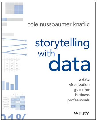
If you're new to data storytelling, then we'd recommend a couple of interesting books. The first is Storytelling with Data, which provides solid, practical advice for creating visualizations for your presentations.
The second is a classic and canonical data visualization book by Edward R Tufte entitled The Visual Display of Quantitative Information. Tufte is often used in data visualization courses to understand the process and design thinking behind data storytelling.
The third is more about the field of data journalism, which employs a lot of the data storytelling practices and also employs data mining, data analysis, and machine learning techniques that are transferrable to sports analytics. The book is called Data Journalism: Past, Present and Future by John Mair and is an introduction to the field through exploring different examples of data journalism.
Note that these are books we've used in our own travels and research. We are not compensated for recommending them.
Subscribe to our newsletter to get the latest and greatest content on all things hockey analytics!
Member discussion