Preparing for NHL Draft 2024: Team Stats Data Discovery

In this Edition
- What is Data Discovery?
- Data Discovery Techniques in Excel
- Team Stats Data Discovery
- Next Steps
What is Data Discovery?
Data Discovery is the process of collecting, analyzing, and summarizing data to gain insights and identify patterns, trends, and anomalies. The ultimate goal is to transform raw data into meaningful information that can support decision-making. However, data discovery can also be used to very quickly inspect and explore the data to find potential stories in it.
If you are familiar with Microsoft Excel, then you can master data discovery. With a few simple steps and some curiosity, you can explore and understand your data. For the more advanced data analyst, you might use a programming language like R or Python.
Data discovery works well if you've got a sense for what you're looking for (or you have good knowledge of the subject matter that the data represents). This might mean you've got a very specific thesis in mind, and you're trying to discover if the data will prove out that thesis, or it might be a set of general statements where what you find will help make those statements more clear.
In this newsletter edition, we'll assume you're a beginner and use Excel to do our initial data discovery on the team hockey stats.
Data Discovery Techniques in Excel
There are several simple and quick techniques you can use in Excel to start discovering patterns and trends in your data. But first, a reminder for where you can download the teams dataset.
Now that you have the data, here are four basic actions you can take to start doing data discovery on the team stats dataset.
Sorting
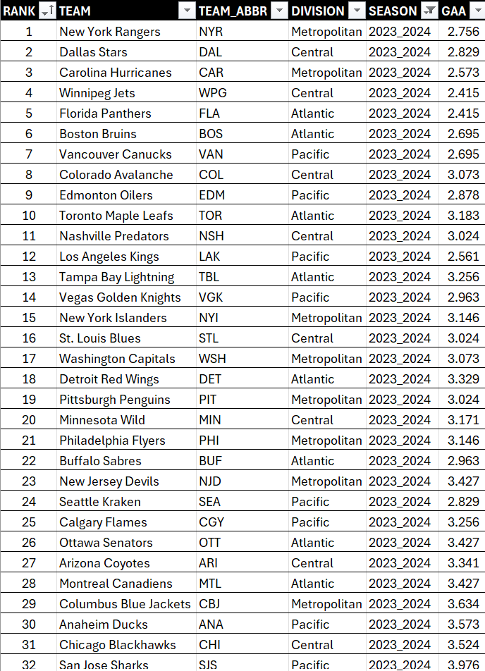
Sorting is one of the simplest techniques to explore your data. For example, in this view we've sorted the data by RANK (rank is determined by points). You can see some team metadata here, but you can also see the corresponding GAA for each team to see how it compares.
To sort on a column:
- Click the column you want to sort and select either ascending or descending order.
Filtering
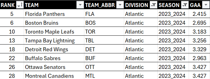
Filtering allows you to view only the rows that meet certain criteria, which helps in focusing on specific segments of your data. For example, continuing with the previous data here we've filtered on DIVISION, so you now see the sorted data (by RANK) filtered by DIVISION. You can now see specifically how GAA is different across each of the teams in the Atlantic division.
To filter on a column:
- Click the column you want to filter and select either ascending or descending order.
- In the Filters area, select the data you want to show.
- Click OK when done.
You can see this in the diagram below.

Conditional Formatting
Use conditional formatting to highlight cells that meet certain conditions. This can help you quickly spot trends and patterns in the data. For example, if we continue with the previous data here you can see we've added conditional formatting to the GAA column. This gives us a simple heatmap and gives you a sense for how well the teams are doing when compared to one another.

To add conditional formatting:
- Select the columns you want to conditionally format.
- Select Home, Conditional Formatting
- Choose one of the available formats (e.g., color scale, data bars, etc.).
PivotTables
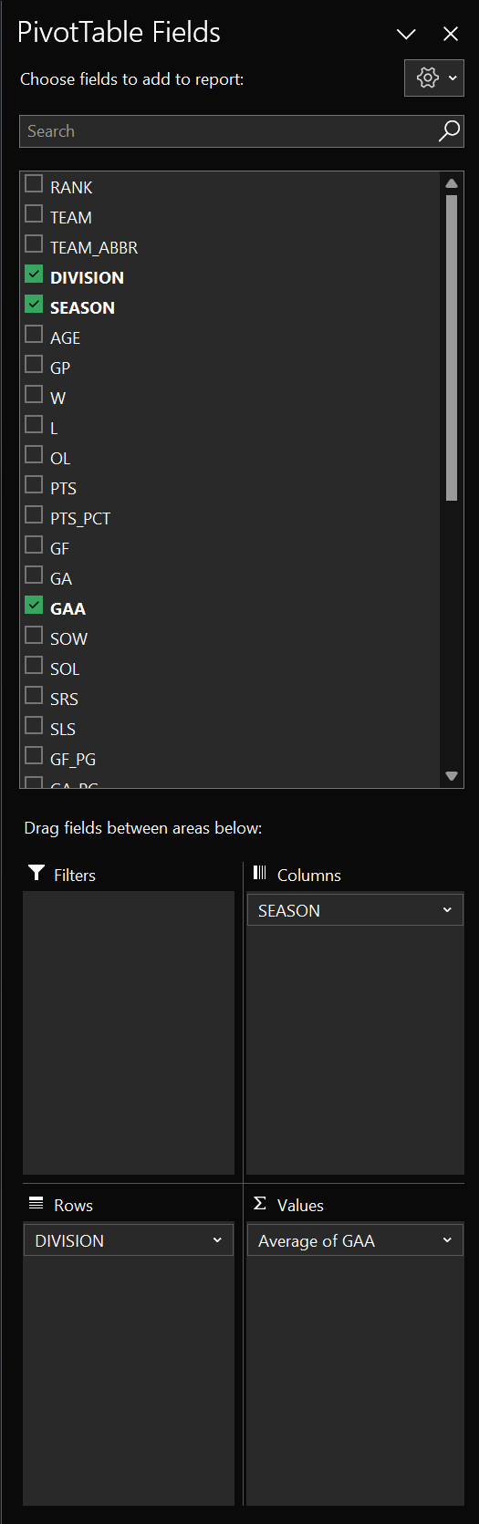
A PivotTable is a great way to summarize large datasets to find patterns. For example, below is a PivotTable we created using the team stats dataset. Here, you can see we've created a table using all seasons and all divisions for the average GAA. You can also choose to insert charts and visualizations with PivotTables, also shown below.

To create a PivotTable:
- Click the upper left-hand cell in your table.
- Click Insert, PivotTable and click From table or range.
- Click OK.
You can then use the PivotTable Fields pane to create different summary views for your data. Below is the configuration for the above PivotTable.
These four basic steps can help you in identifying patterns and trends within your data using Excel. They are quick to apply and provide immediate insights, making them ideal for initial data discovery.
Team Stats Data Discovery
To build on the previous section, let's now turn to do some data discovery on the NHL team stats dataset.
In our projects, we use data discovery as a first step in the data analysis process; it's the broad end of our analytical process, so to speak. That is, we run the data discovery process quickly, using simple steps, templates and our knowledge of hockey to see what we can find. And as we conduct our data discovery, we'll note our findings and then after we're done review the findings to decide which ones we'll follow up on with a deeper-dive analysis. In short, a multi-step process that starts with data discovery.
Blind data discovery (i.e., just exploring without a goal to see what you can find) can work, but we have found the data discovery process works better if you have a goal. So, for this week's data discovery walkthrough, the goal will be to identify where a team is either strong or weak. This will help identify areas for a deeper-level analysis.
Filtering, Sorting & Conditional Formatting
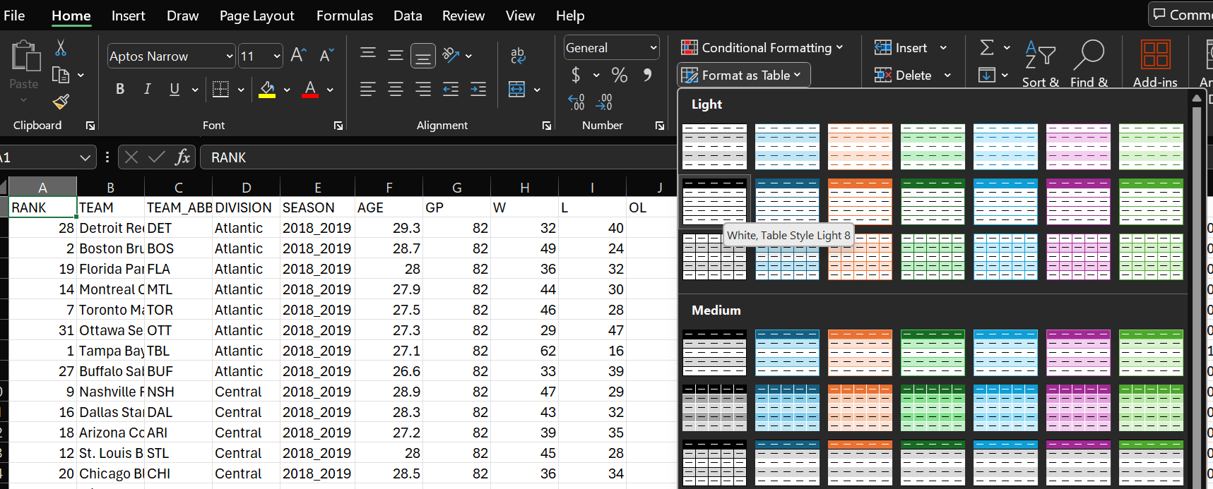
While you can filter, sort and apply conditional formatting separately, it's more useful to combine them when doing data discovery. Before we do this, though, let's first open the file and format the dataset as a table. To do this:
- Open the team stats dataset.
- Click the upper most left-hand cell.
- Click Format as Table and choose a style for your table.
After this, you'll have a formatted table that is easier to sort, filter, input calculations, and so on.
Scoping the Data to the 2023-2024 Regular Season
In the dataset, there are six seasons worth of data; however, for this week's exercise, we'll only look at the most recent season. To filter for the most recent season:
- Click the down arrow in the SEASON column header.
- Click Select All to unselect all of the options.
- Click the 2023_2024 option.

You will now have all of the stats showing for the most recent season.
You'll now want to sort by the RANK column from smallest to largest. To do this:
- Click the down arrow in the RANK column header.
- Select Sort Smallest to Largest.
You should now have the 2023-2024 Regular Season stats, sorted by the top to bottom team.
Creating a Heatmap of Select Offensive, Defensive & Goaltending Stats
We're interested in offensive, defensive and goaltending performance, so we will hide the stats that we don't need. To hide a column, select the column you want to hide, right-click and select Hide. Note that we've hidden all statistics save for those below:
- Offensive: PTS_PCT, GF_PG and SHOT_PCT
- Defensive: GA_PG, PK_PCT
- Goaltending: SV_PCT
- Miscellaneous: RANK, AGE and PDO
Now that you have a filtered and sorted view with select data in view, the next step is to apply conditional formatting to the data. To do this:
- Select the column to which you want to apply the conditional formatting.
- Click Home, Conditional Formatting, Color Scales and select a color scale that suits your needs.
You should now have something similar to the below. (Note that we also calculated the Average of each column – at the bottom of the columns.) This view represents a simple heatmap of statistics representing elements of offense, defense and goaltending. You can also see using the color scale where a metric is performing well (green) to marginal (orange/yellow) to where it's low performing (red).
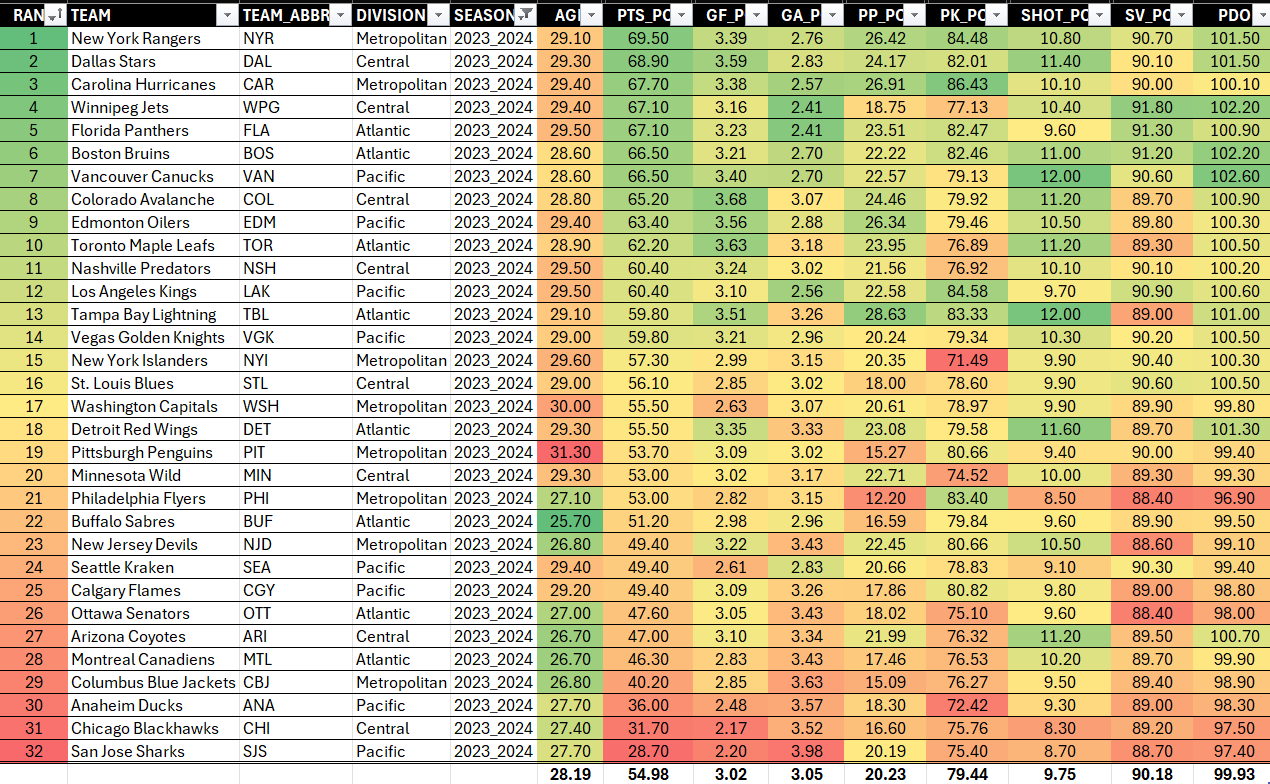
Example observations from this simple data discovery are as follows:
- Higher-ranked teams on average perform better across the stats presented here. We translate this into consistency across these select offense, defense and goaltending stats.
- There are select areas where teams under-performed or performed well in the 2023-2024 season. For example, Winnipeg Jets performed well in goaltending, but did not perform well in their special teams.
- Higher-ranked teams tend to have older players (i.e., players above the average league age). We would translate this to experience, rather than saying age correlates to higher ranking and performance.
You could continue to note general observations or team-specific observations from the above heatmap. You could also expand the stats and include a broader array of stats in your heatmap to get a more comprehensive view. And lastly, you might combine metrics into a 'composite metric' to create directional metrics; this is what we will eventually do within our analysis.
You might find it useful in your data discovery to further filter your heatmap. So, let's take one more step and filter by DIVISION. We can then explore each of the four divisions separately and note some observations.
Exploring by Division
The first division we'll explore is the Atlantic division.

With this view, we note a few observations from the above heatmap:
- The top-performing teams are older (above the league average).
- There was a 20+ point percentage split between Florida and Montreal – this is a sizeable gap between the top and bottom divisional teams.
- Toronto, Tampa and Detroit all had solid goals for per game; however, they were also weak in goals against per game and goaltending.
- Florida was tied for the lowest shot percentage, but had the highest-performing goaltending.
- Boston were near to the bottom two teams on their penalty kill.
Let's now do the same for the Central division.
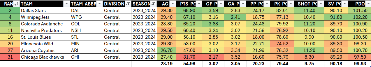
Again, we note a few observations from the above heatmap:
- All but two teams are older than the league average.
- There was a 30+ point percentage split between Dallas and Chicago – again, a significant gap between the top and bottom divisional teams.
- Winnipeg is comparatively weaker on the special teams.
- Arizona is strong on the shot percentage and PDO, but weaker in many other areas of their game and they are a younger team.
- Dallas is strongest on the shot percentage, but weaker on goaltending.
- Dallas and Colorado are efficient at scoring.
Let's now do the Metropolitan division.

Again, we note a few observations from the above heatmap:
- Pittsburgh have the oldest team – by greater than 3 years beyond the league average.
- There was an almost 30 point percentage split between New York and Columbus – again, a significant gap between the top and bottom divisional teams.
- Carolina are as strong as New York, but they're not as efficient on shot percentage and goaltending.
- New York Islanders are the weakest on the penalty kill.
- Philadelphia, New Jersey and Columbus are relatively weak across the board and have younger than average teams.
And finally, let's now do the Pacific division.
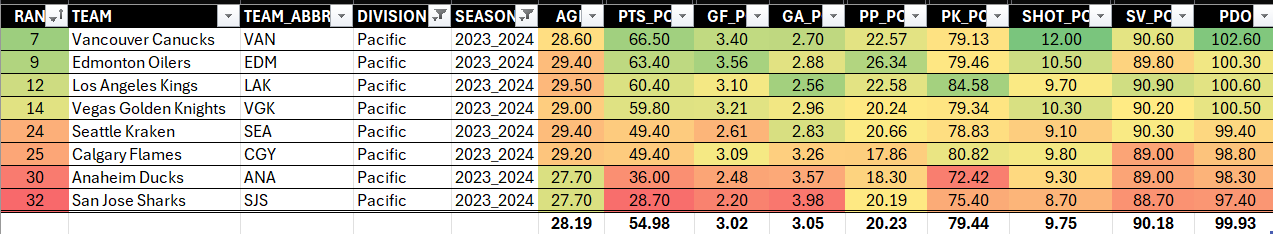
Again, we note a few observations from the above heatmap:
- Los Angeles are strong on the penalty kill, but weaker in other areas as compared to the other top teams in the division.
- There was an almost 40 point percentage split between Vancouver and San Jose. This is twice as much as the Atlantic division.
- Vancouver have the highest shot percentage and PDO, but are weaker on the penalty kill.
- Anaheim and San Jose are weak across the board and have younger than average teams.
- Most teams (save for Anaheim and San Jose) are above the average player age.
Now in and of themselves, these are all observations that may or may not lead to deeper analyses. But, the above exercise (using sorting, filtering and conditional formatting) should give you a simple way to do your initial data discovery and get you to an initial list of observations. Further, the data discovery walkthrough gave you a view through the lens of one season. You'd also want to do a multi-season analysis to see if you can discover trends and patterns.
To watch a quick-hit video walkthrough, check out the YouTube video below.
Summary
This newsletter edition was the second in a six-part series leading up to Draft 24. In this edition, we introduced you to different data discovery methods using Microsoft Excel – namely, sorting, filtering, conditional formatting, and PivotTables. We also walked through an example using the 2023-2024 NHL Regular Season statistics, focusing on sorting, filtering and conditional formatting.
In our next newsletter edition, we'll close data discovery using PivotTables and highlight some of the trends and patterns that are more cross-seasonal. We'll also create three composite scores using the team stats dataset we created for this series – for offense, defense and goaltending respectively. This will give us summary scores for each of these areas, which we'll then use as mappings to the stats of the incoming 2024 draft prospects.
Subscribe to our newsletter to get the latest and greatest content on all things hockey analytics!
Member discussion