Guardians between the Pipes: The Stats Behind Hockey's Top Goalies

In this Edition
- Why is Goaltending Important?
- What are Common Goaltending Analytics?
- Example Goaltending Report
- Walkthrough: Creating the Goalie Dashboard in Power BI
Why is Goaltending Important?
For those of you who have played competitive hockey, you always remember the great ones 'between the pipes'. They bailed you out of those critical games; they gave you confidence when you couldn't get back (yes, we're talking to you lazy forwards); and they were always your first choice when picking a team. You can have all the playmakers in the world, but if your goaltending is subpar, then you're in trouble.
Here are a few reasons why we believe goaltending is one of the most important positions on the ice:
- Last Line of Defense: The goaltender is the final barrier against the opposing teams' scoring attempts. A goaltender's ability to make saves directly influences the outcome of games, distinguishing them as crucial to a team's defensive strategy.
- Psychological Edge: A strong goaltender boosts the confidence of the entire team, allowing players to focus more on offense knowing they have a reliable last line of defense. Conversely, a goaltender struggling to make saves can lead to decreased team morale and increased pressure on defensemen.
- Game Momentum: Key saves, especially in high-pressure situations or during penalty kills, can shift the momentum of the game, providing the team with a psychological advantage.
- Power Plays and Penalty Kills: During special teams play, goaltending becomes even more crucial. A goaltender's performance can significantly impact the effectiveness of the power play or playing shorthanded.
- Foundation for Team Play: Teams often build their strategy around the strengths and style of play of their goaltender, whether it's a more aggressive, high-risk approach or a conservative, defense-first game plan.
- Game Outcomes: Goaltenders can single-handedly win games by stopping a high volume of shots or making crucial saves during critical moments, directly affecting the outcomes of a game and a team's standing in the league. Goaltending is especially important during the playoffs.
- Statistical Significance: Metrics like save percentage (SV%) and goals-against average (GAA) are not only indicative of individual performance but also contribute to team statistics that influence playoff qualifications and seeding.
In short, goaltending is not just about stopping the puck; it's a complex role that involves psychological, strategic, and physical elements, making it indispensable to a hockey team's success on and off the ice.
What are Common Goaltending Analytics?
Goaltending analytics use statistical methods and data analyses to evaluate the performance and impact of goaltenders in hockey. Some of these statistics are raw (e.g., shots on goal) whereas others are calculated (e.g., save percentage). To follow is a breakdown of different goaltending statistics.
Traditional Statistics
- Goals Against Average (GAA): The average number of goals a goaltender allows per 60 minutes of play. It's calculated by dividing the total goals against by the number of minutes played, then multiplying by 60. Lower GAA values are indicative of better performance.
- Save Percentage (SV%): The percentage of shots on goal that the goaltender saves. It's calculated by dividing the number of saves by the total number of shots faced. Higher save percentages are generally better, indicating that the goalie is stopping a higher proportion of shots.
Advanced Metrics
- High-Danger Save Percentage: This metric focuses on saves made against high-danger scoring chances, which are shots taken from areas on the ice where goals are more likely to be scored. It provides insight into a goaltender's ability to stop the most challenging shots.
- Goals Saved Above Average (GSAA): GSAA measures how many goals a goaltender has saved, given their save percentage and shots faced, compared to the league average. A positive GSAA indicates a goaltender is saving more goals than an average goaltender would have, given the same number of shots.
- Quality Start Percentage: A quality start occurs when a goalie achieves at least a league-average save percentage in a game (or at least 88.5% on nights when they face 20 shots or fewer). The quality start percentage is the proportion of a goaltender's starts that are considered quality starts. It provides a measure of consistency and reliability.
Special Teams Analytics
Special teams play (power plays and penalty kills) adds another layer to goaltending analytics. Below are a sampling of goaltending statistics the measure special teams performance.
- Power Play Save Percentage: Evaluates a goaltender's effectiveness at stopping shots while the opposing team is on a power play.
- Short-Handed Save Percentage: Measures how well a goaltender performs when their own team is on the penalty kill. It's a critical metric because teams are at a numerical disadvantage during these times.
- Goals Against Average on Special Teams: Similar to the overall GAA, but specifically calculated for periods when the team is either on a power play or penalty kill. It helps in understanding how goalies perform under the pressure of special teams situations.
Contextual Factors
Analyzing goaltending performance also involves considering contextual factors such as the quality of the opposing team's offense, the defensive capabilities of the goaltender's team, and the location and quality of shots faced. Advanced tracking technologies and analytics are increasingly used to incorporate these factors into goaltending evaluations.
Limitations
It's important to recognize the limitations of goaltending analytics. The performance of a goaltender is influenced by the team in front of them, making it challenging to isolate their individual contribution. Furthermore, the relatively low sample size of games and shots compared to other positions can lead to higher variability in goaltending metrics.
Goaltending analytics offer valuable insights into a goaltender's performance, going beyond traditional statistics to provide a deeper understanding of their impact on the game. These analytics are continually evolving, with new metrics and approaches being developed to capture the complexity of goaltending in hockey.
Example Goaltending Report
The above-referenced goaltending stats and data can be found and downloaded on various sites. For example, NHL and Hockey-Reference are good sources of up-to-date goaltending statistics. We use My Sports Feeds as our sports data provider, and for this newsletter used it to source a recent snapshot of goaltending statistics.
For most projects, we work in R for our data cleaning/transformation and then export the data to other tools – e.g., Power BI, Excel, etc. In the code below, we import all of the goaltending statistics, create a new data frame that is a subset of the original, calculate the average games played (we want to limit the statistics to only those goalies who've played more than the average number of games), and we add three calculated columns for the goals against for even strength, power play and shorthanded shifts. The last line of code writes the filtered and transformed data frame to a new CSV file.
library(dplyr)

all_goalie_stats <- read.csv("msf_goalie_stats_full.csv")

filtered_goalie_stats <- all_goalie_stats %>%
  select(TEAM_ABBR, NAME, HEAD_SHOT, GAMES_PLAYED, GAMES_STARTED, WINS,
         LOSSES, GOALS_AGAINST, EVEN_STR_GOALS_AGAINST, PP_GOALS_AGAINST,
         SH_GOALS_AGAINST, SAVES, GAA, SAVE_PCT, SHUTOUTS, SO_SAVE_PCT,
         MIN_PLAYED)

AVG_GP = mean(all_goalie_stats$GAMES_PLAYED)

filtered_goalie_stats <- filtered_goalie_stats %>%
  filter(GAMES_PLAYED > AVG_GP)

print(filtered_goalie_stats)

filtered_goalie_stats <- filtered_goalie_stats %>%
  mutate(
    EV_STR_GA = round(EVEN_STR_GOALS_AGAINST / GOALS_AGAINST, 2),
    PP_GA = round(PP_GOALS_AGAINST / GOALS_AGAINST, 2),
    SH_GA = round(SH_GOALS_AGAINST / GOALS_AGAINST, 2)
  )

write.csv(filtered_goalie_stats, "goalie_stats_df.csv", row.names = FALSE)
One of our go-to analytical tools is Excel. It's not super sexy, but a simple way to create a report is to import the CSV file and then add table formatting and conditional formatting.
We used Excel and the goalie_stats_df.csv file to create a heatmap through the use of the conditional formatting. Heatmaps are a great way to visually see how data compares to one another, especially when doing a categorical (or cross-variable) analysis like the below.
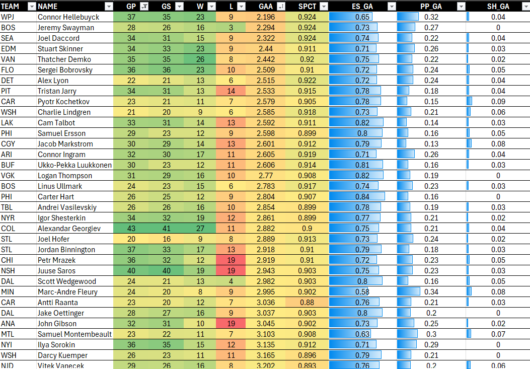
With that in mind, the report is sorted by Save Percentage (SPCT), with Connor Hellebuyck coming in the top spot – seen below in a recent game.
Connor's stats are impressive given the high number of games he's played. That is, his GAA is low, his SV% (SPCT) is strong, and you can see the distribution of his GA stats across even strength shifts (ES_GA), power plays (PP_GA) and shorthanded shifts (SH_GA). (His PP_GA seems a bit higher than other goalies.)
Like many hockey analytics and statistical reports, the above is adequate for a surface report and analysis, but if you want to explore the relationships across variables to better understand the complexities and nuances of a goalie's world, then you need to create more advanced reports.
So, let's go ahead and do that!
Walkthrough: Creating the Goalie Dashboard in Power BI
The goal of the dashboard is as follows:
- Explore which goalies have more shutouts and a higher GAA (player level).
- Analyze the implications of having a good start versus a really bad start (team level).
- Explore the relationship between Age and GAA and SV% (team level).
- Explore the relationship between GAA and SV% and wins and losses (team level).
To do the above will require three steps:
- Sourcing the hockey data
- Designing the dashboard
- Building the reports
Source the Data
We sourced the data for this walkthrough from Hockey-Reference, which is one of our go-to sites for current stats and data. To download the data:
- Navigate to the Goalies stats page on Hockey-Reference: https://www.hockey-reference.com/leagues/NHL_2024_goalies.html.
- Scroll down the page and just above the Goalie Statistics table, click Share & Export and Get as Excel Workbook.
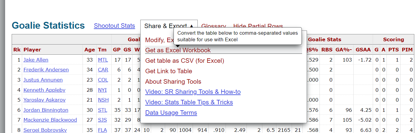
- Save the file locally as a CSV file.
Design the Dashboard
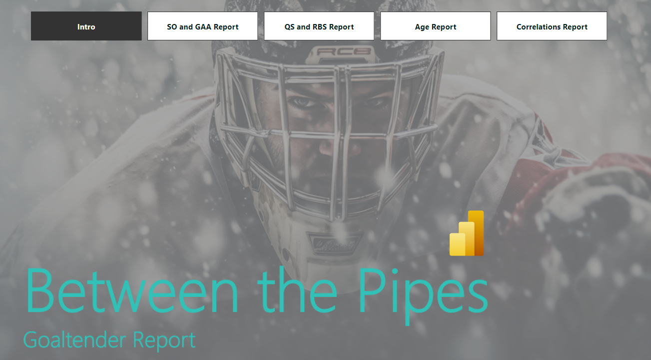
When designing the dashboard, we recommend being clear about the questions you're trying to answer, the goal(s) of the dashboard and the types of charts you would use to tell your data story. Then you can move onto the actual design. For this week, we used a technique we've discussed before; that is, we create an image in PowerPoint to serve as the canvas background in Power BI and save as a PNG file.
The result of our Power BI template is below.

To implement this in Power BI:
- Open Microsoft Power BI.
- Create a new page.
- In the Visualizations pane, click the Format your report page icon, expand the Canvas background section, and click the Image field to upload your canvas background design.
We adjusted the transparency to 79% so the darkness of the background wasn't overbearing.
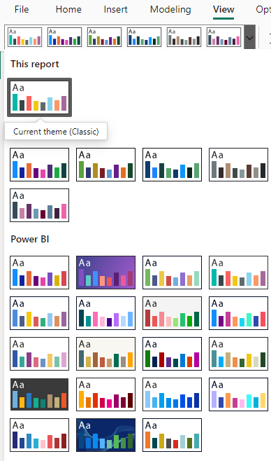
We then selected one of the themes from Power BI's native Themes functionality. To access this, click View and browse and select the theme you want to use.
Create the Reports
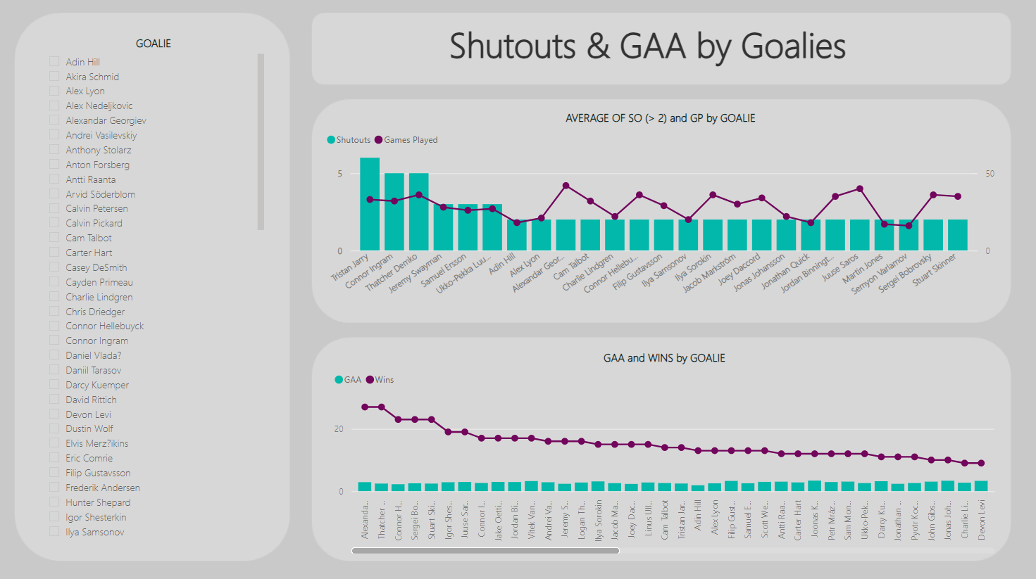
The first report is the Shutouts & GAA by Goalies report. Here we added and configured four controls:
- One Slicer control, configured using the Player (Goalies) data.
- Two Line and stacked column charts. The first one was configured with Player in the X-axis, SO (Shutouts) in the Column y-axis and GP (Games Played) in the Line y-axis. The second one was configured with Player in the X-axis, GAA in the Column y-axis and W (Wins) in the Line y-axis.
- One Text box for the title.
After we configured and formatted the controls, the below was the result. Here you can see a sorted view of the shutouts (filtered on greater than 2 shutouts) with Jarry, Ingram and Demko representing the top three goalies. What's interesting is their ratio of games to shutouts, compared to other goalies on the list. If you sort the second chart on Wins in ascending order, you now see Georgiev as the top goalie for Wins – though his GAA barely breaks the top twenty.
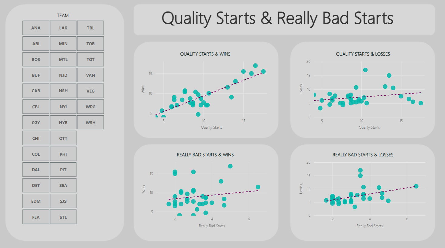
The second report is called Quality Starts & Really Bad Starts, which explores the relationship between a goalie's start in a game with a win or loss. For this report, we'll add five controls:
- One Slicer control for the team, to which we added Tm (Team).
- Four Scatter charts, all with Tm (Team) configured for the Values field. For two of the charts, we added QS (Quality Starts) for the X Axis and W (Wins) for one Y Axis and L (Losses) for the other Y Axis. For the other two charts, we configured RBS (Really Bad Starts) for the X Axis and W (Wins) for one Y Axis and L (Losses) for the other Y Axis.
- One Text box for the title.
The goal of these charts was to explore if Quality Starts lead to wins or Really Bad Starts lead to losses. The line of regression was most positive for Quality Starts – which we roughly translated into when goalies start strong, this bodes well for the win. The other charts also had positive lines, but they were much more slight. You'd obviously want to do a lot more here; a win results from much more than a Quality Start. However, as we mentioned earlier in the newsletter a goaltender's performance can impact multiple parts of a game.
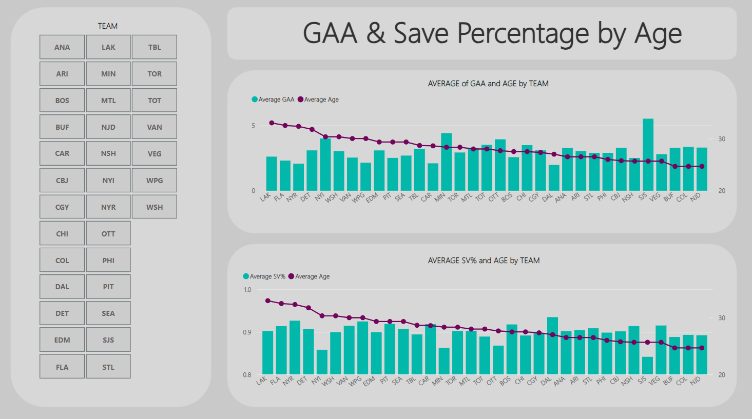
The third report is called GAA & Save Percentage by Age. The goal of this report was to explore if age plays a factor in GAA and Save Percentage. In this report, we added four controls:
- One Slicer control for the team, to which we added Tm (Team).
- Two Line and stacked column charts. The X-axis was Tm (Team) for both charts, and the Line y-axis was Age for both. Then, for the first chart GAA (Goals Against Average) was configured to the Column y-axis and SV% (Save Percentage) for the second Column y-axis.
- One Text box for the title.
The result for this report is below, where both charts are sorted by Age in descending order. And while there are not definitive trends, you can see that older (or more experienced) goalies in the top chart have better GAAs then some of their younger counterparts. SJS, MIN and NYI are also teams that represent outliers.
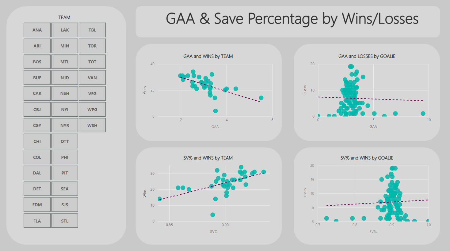
The final report is called GAA & Save Percentage by Wins/Losses. In this report, we added six controls:
- One Slicer control for the team, to which we added Tm (Team).
- Four Scatter chart controls, where all controls had Tm (Team) for Values. And two controls had GAA in the X Axis and W (Wins) or L (Losses) in the Y Axis, and two controls had SV% (Save Percentage) in the X Axis and W (Wins) or L (Losses) in the Y Axis.
- One Text box for the title.
Simply put, it explores the correlation between GAA and Save Percentage and the propensity for a team to win or lose. For example, one interesting takeaway from this report is higher Save Percentages generally correlate to more Wins. You can also see clusters and outliers in the reports – and remember that interesting things happen at the margins!
Lastly, we created an intro page for the four reports. Here we added a background image and used the Page navigator control to create a menu navigator for the dashboard.
And at this point, you have a dashboard with four reports that explores different aspects of goaltending – at both the team and player level!
If you'd like to see the creation of the reports in action, then check out our quick-hit video tutorial on YouTube!
Summary
In this newsletter, we discussed why goaltending is one of the most important positions on the ice. We then discussed common goaltending statistics and created a simple heatmap report using Microsoft Excel from data that we cleaned and transformed using a simple R script. We then built a no-code goaltending dashboard with four reports and an introductory page that explored different facets of goaltending at the team and player level (using data we sourced from Hockey-Reference).
As a follow-on activity, you can take the dataset(s) and Power BI report and change or expand the visualizations in the dashboard. For example, change the team filters to player, look for outliers or anomalies, analyze the top twenty versus bottom twenty to see how these two groups differ across the statistics, explore more correlations to discover potential predictors, and so on.
We'd also recommend reading Everything You'll Ever Need to Know about Hockey Analytics (And a lot More) by Joshua Pollock. The author dedicates a chapter to goaltending and generally has a lot of good analytical nuggets spread throughout the book.

For the companion resource files that go along with this newsletter, check out The Barn.
Subscribe to our newsletter to get the latest and greatest content on all things hockey analytics!
Member discussion